(5 years and 3896 days ago)
9 Sources:
Special delivery 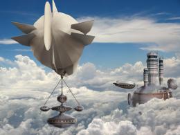 by CMYK46 20131 views - final score: 66.9% | Cloud base  by CMYK46 17707 views - final score: 63.4% | Bi-Pass 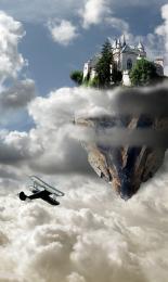 by Missy 14763 views - final score: 62.2% |
crystal city 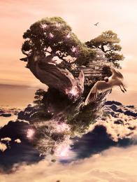 by slayyou 20024 views - final score: 61.3% | Magician Resort 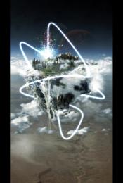 by emel 17176 views - final score: 61.1% | Heavens Castle 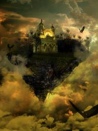 by EvanMugford 12378 views - final score: 60% |
borg cube city floating 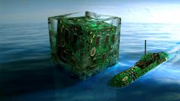 by genuine2009 15867 views - final score: 59.1% | Terraforming City 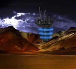 by animmax 8054 views - final score: 58.1% | End of Days 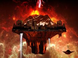 by mithrasr 6897 views - final score: 56.9% |
Semi-Floating City 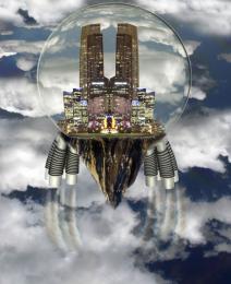 by woodztockr 14267 views - final score: 56.2% | city in the sky 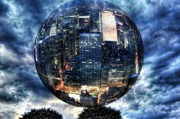 by SHIPLEYGIRL 11271 views - final score: 54.1% | Floating Kingdom 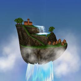 by tapiona 9902 views - final score: 53.9% |
Glinda's Flying Monkeys 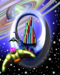 by GolemAura 6987 views - final score: 52.9% | Evacuation 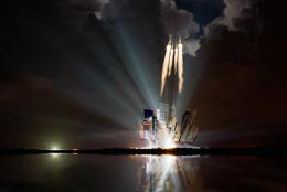 by filantrop 4349 views - final score: 52.2% | life goes green  by fasnaushad 19223 views - final score: 51.7% |
Floating City 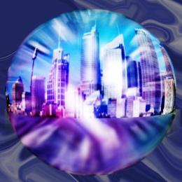 by designedwright 7851 views - final score: 48.3% |
Howdie Guest!
You need to be logged in to rate this entry and participate in the contests!
LOGIN HERE or REGISTER FOR FREE
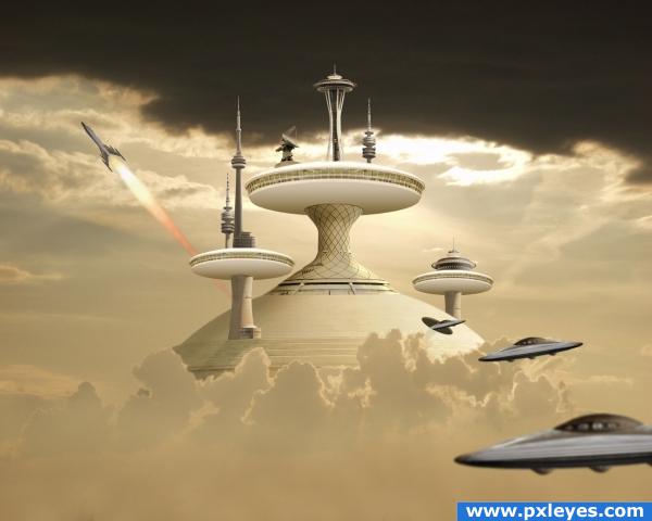
clouds from the bottom look flat, and flame from rocket is not realistic, other than that it's a nice image.
The clouds look just the way they do in the source image
perhaps they look like that because it's photographed from below, but in your image to fit the perspective you shuold have some clouds photographed from above. i'm not even sure i'm right about that, but something is deffinitely not righdt. the way it is now, the clouds have too little detail to give real value to the image. for me atleast.
this is true, one way you could increase definition on those clouds is by duplicating scaling and rotating the existing clouds or the easier way would be to get a free cloud brush from DA. otherwise a dreamy image
edit: i'll explain myself, the clouds in front of the structure that you created look like there is a powerful light source right behind them while in your image there is city behind it even if the light source was there it would cast a shadow on the cloud but now if the light source where to be above everything just like it seems to be in your image the clouds would look like the image here http://alphabettr.com/images/cloud.jpg so that is what i mean when i say i think the clouds need more definition.
Still a very nice and creative image
I think it would look cooler with a brighter sky maybe deep blue...IMO but nice use of your sources the tower thingy looks good the saucer down front right could use some tweaking...nice work
Inanis & slayyou, I'm sure you think you know what you're talking about...I don't.
@ lchappel,, there's no saucer down left. The one down right is blurred because the background is in focus.
Looks nice!
this looks awesome! all the sources are combined pretty well. the color is great too, it matches the sterile-looking cloud city idea
very nice mood
Lovely image, futurism ftw
Nice, rocket does look a bit dull.
Wow...Well done
cool...gl
Very Nice Author
Very nice entry.
and congrats again.
And also congrats for the second!
Congratulations for 2nd too, nice one.
Congrats!
Howdie stranger!
If you want to rate this picture or participate in this contest, just:
LOGIN HERE or REGISTER FOR FREE