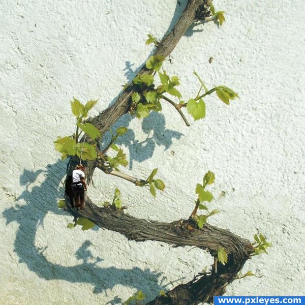
Climber edges up the branch, not realizing there is a potential problem ahead.
Thanks to David Niblack for the climber and bee images. (5 years and 3900 days ago)
1 Source:
Forest Meditation  by jaskier 14680 views - final score: 67% | Branca Vinum  by Stowsk 10609 views - final score: 60.4% | Vino vines  by unkskitty 19272 views - final score: 58.8% |
Solitude  by nasirkhan 10331 views - final score: 58.2% | cursed 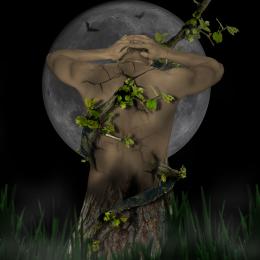 by KEVIV 12607 views - final score: 57.1% | The Creatures 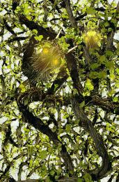 by mqtrf 3556 views - final score: 55% |
Tatoo 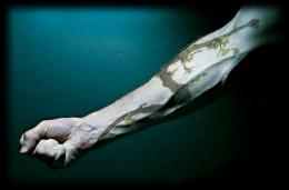 by Arryko 8429 views - final score: 54.2% | Branch 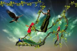 by Mario 4748 views - final score: 54.2% | Special Snake  by switch 9453 views - final score: 53.9% |
girl in wine tree  by nehayash 6168 views - final score: 53.9% | Save Our Earth  by mithrasr 5870 views - final score: 51.8% | Growing  by aaronrad 4715 views - final score: 51.7% |
Don't go in woods in underwear  by woodztockr 5651 views - final score: 51.1% | Eye of the Genie 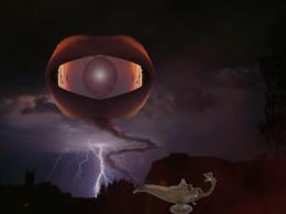 by woodztockr 4918 views - final score: 49.8% | Tough Climb 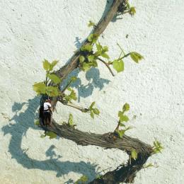 by designedwright 6361 views - final score: 49.5% |
Howdie Guest!
You need to be logged in to rate this entry and participate in the contests!
LOGIN HERE or REGISTER FOR FREE
Nice image, the shadow is completely wrong.. i myself am not the best person to ask but i'm sure someone else will comment. As for the bee, it's a bit distracting from the main point you're trying to get across. Good entry otherwise. Good luck!
ponti's right. the bee shadow is too blurry (compared to the branch), it's not positioned right (should be directly in front of the bee) and it's not the same color as the branch shadow.
Would be better without the bee, and the climber's shadow needs to match the angle of the vine shadow...
Funny . If there's a shadow from the vine on the wall, then I also expect a shadow from the climber on the wall. Not the whole climber, but at least some of the body. Compare it to the leaves, just above the climber. Good luck!
Ok, I think I am getting the hang of the shadows -- obviously still a weak area for me. I put the climber's shadow on the branch itself (hard to see) and overlapping on the wall. Removed the bee, since it seemed to be distracting. Thanks for the constructive criticism -- helps me learn.
very good editing---
he he cute.
Howdie stranger!
If you want to rate this picture or participate in this contest, just:
LOGIN HERE or REGISTER FOR FREE