Credits to:
- longstock: longstock.deviantart.com
- linwoodstock: linwoodstock.deviantart.com
- isostock: isostock.deviantart.com
- darkresources : darkresources.deviantart.com (5 years and 3899 days ago)
4 Sources:
The Aftermath 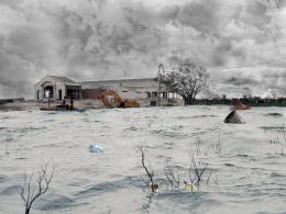 by Norman 12193 views - final score: 59.6% | Windy Day  by Akassa 19522 views - final score: 58.5% | hurricane winds 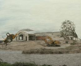 by k5683 15679 views - final score: 58.5% |
Mobile Foilage  by mithrasr 11084 views - final score: 57.2% | The Storm Worsens  by designedwright 11032 views - final score: 56.4% | Out of the water came the..  by thomasms 7271 views - final score: 56% |
Water Pump  by aaronrad 7082 views - final score: 54.3% | Green Destruction 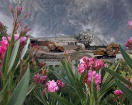 by invasorsl 9360 views - final score: 54% | Siege 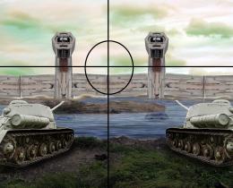 by woodztockr 4007 views - final score: 53.7% |
Ecomagination 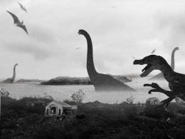 by mithrasr 3761 views - final score: 53.5% | after the storm 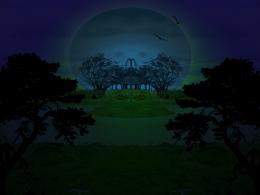 by spygirl1978 5104 views - final score: 52.1% |
Howdie Guest!
You need to be logged in to rate this entry and participate in the contests!
LOGIN HERE or REGISTER FOR FREE
Yet another collage of DA images....(yawn).
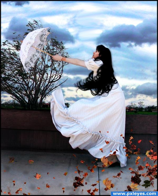
C'mon CMYK, that's not really fair. I think the image is great, there are a couple of parts around the model that makes it look like she's casting a shadow on the sky, but it's a great find. It's a very creative use of a difficult source to work with, so good job on that. G'luck!
It's ok ponti, cmyk46 doesn't really like my style... sorry i can't draw like you o.o so i stick with manipulations... Anyway i think the shadow you're refering to are hairs...
LOL...where would we be without the great folks at DA?
We would get stocks from other sites like sxc?
Sorry, I have nothing against this author. I'm just sick and tired of DA images that have been pre-posed and costumed being used for their prefab WOW factor.
images from DA don't look as sterile as the images on SXC. Images from DeviantArt are pre-posed, but in most cases it's the only place to find what you're looking for.
I think the picture is quite lovely... good luck author... I love how you mapped out the idea and made it come together quite well
I have to admit, DA has made me lazy. I try to use as many of my own images as possible in manipulations (because I can't draw, either), but DA is so tempting with all of its available photos to use. I think that you've done a beautiful job, Author. But I think that you should mask out the "hair/halo" behind her head.
Very lovely idea and beautifully done. Two minor things draw my attention away from the main subject of this work. The power line thru the bush should not be there and if the leaves were toned down a little bit our attention would be drawn to the main subject. I do like this a lot!
Thanks for the help laulei. Removed the light and decreased the saturation of the leaves.
i hear you, downoffthedragon. one thing you can fix: those leaves' shadows look almost like blurry stains on the image.. almost like the healing brush gone wrong if you know what i mean.. pay a bit more attention to them (especially on the bottom left part of the image)
You have masterfully put the sources together, I especially like the way the leaves look to be floating and the transperancy of the lace in the umbrella...nice work
I would have to agree with laulei - that powerline is distracting, use the eraser and chop it up a little, make it look like leaves?? Also your buildings in the background are sharper than your tree? Maybe blur them some more?
What power line? The one down? I remvoe a strong pwoer light at the top of the fence (left). I'll remove the down one too. Might remove the leaves shadows or make them less visible, thanks.
The powerline runs through the tree horizontally.
honestly CMYK46 there is more to photomanipulation than just geting images from deviantart a lot of work goes into it and i find it insulting to all photomanipulators that you would call his work "prefab" especialy since not everyone has a good camera that is capable of taking high quality images to use!
it always stinks when ya get blown away reminds me of Mary Poppins.
Sources for the background and sky etc? The line is running through the tree horizontally.
The background and sky are from he source pciture too o.o
Sorry author: thought you merged in another part of sky in there for depth.. My bad.
No problem, i've enlarged the sky, clone etc came up nicely.
Gotta agree with CMYK....although the idea is good and its fairly well put together, i hate seeing DA stock constantly used by artists that couldnt be bothered searching for the right source pics on Flcker, sxc etc.
@freejay and CMYK... what does it matter where the stock came from. I can find pre posed stock on plenty of stock sites. Your not here to judge where we get the images from but how we put it all together... this is an art contest not a stock site contest. Some of us are not so naturally blessed to draw or take photos. Some of us have no where to go to take photos, our worlds are very different. Author, I think its a nice image, and have to agree the first thing I thought of was Mary Poppins as well lol
Congrats for your second place, Akassa!
Congratulations for 2nd
Congrats Akassa!
Congrats!
Congrats!
congratulations on ur win
Howdie stranger!
If you want to rate this picture or participate in this contest, just:
LOGIN HERE or REGISTER FOR FREE