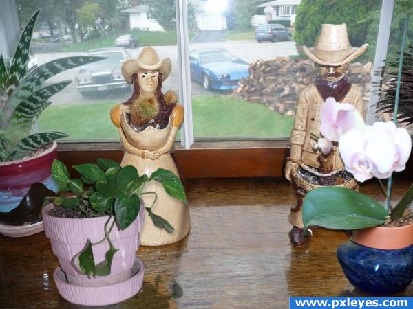
My own photos and source. (5 years and 3895 days ago)
El Gato Loco 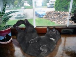 by lchappell 7769 views - final score: 58.2% | Prickly Heat 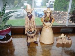 by sjsmiuk 9130 views - final score: 56.2% | A hangin 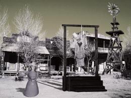 by vapaholic 7119 views - final score: 55.8% |
Little House on the Prairie 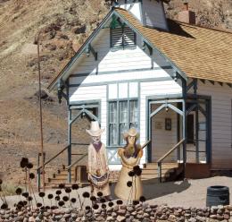 by rikigoft 11802 views - final score: 54.7% | Window Ledge 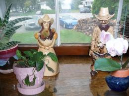 by lchappell 6674 views - final score: 54.4% | New ceramic doll 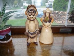 by misoo83 8310 views - final score: 52.7% |
Replicas 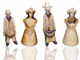 by Arryko 3224 views - final score: 52.7% | Bigger Cactus 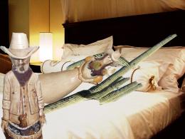 by woodztockr 4119 views - final score: 46.7% |
Howdie Guest!
You need to be logged in to rate this entry and participate in the contests!
LOGIN HERE or REGISTER FOR FREE
Your thinking in the SBS is ok, but I recommend to make the pictures again. If you do, think well from what angle you'll take the pictures. Look at the perspective and distortion in the original, try to put your camera more or less in a same position so that the plants will fit better in the image. The dolls swap is funny, it's optional to adjust also their perspective/distortion. Check the window pane to have a clue what the distortion should be like. Good luck!
Well thanks for POINTING that out Wazowski...I'll try and adjust my perspective yes the window pane, which one the one I fixed?
My english is a disaster . I mean the white vertical strokes in the window are a good guide to see how the perspective/distortion for the plants (and if you want, but not necessary the dolls) should be. The dolls are partly covered by the plants, you dont see how they're standing, so their pose IS possible. But if you want them to stand straight in that perspective, especially the guy needs a bit of distortion (skew and then the top moving to the right). Good luck!
 . Certainly already improved, especially the left plant. The cowboy fits there better too
EDIT: I understand you have to do it with the sources you have, so then better make the best out of that
Nice image, but it looks like on tha vases there are shadows where there shouldn't be, such as around the edges of the leaves .I like the image otherwise. Good luck!
Also try to fix the dark edge around the left plant and in this case turn down the contrast cause the colors are to vivid.
OK commentors I have tried to implement your sugestions thanks
How about introducing a Flying Dragon with a fairy on it's shoulder carrying a Lightning rod with the moon in the back ground eating a hamburger with an angel shooting stars out her aw hoo hoo?
giggle snort (is it 420 yet?)
GolemAura, How 'bout a babe in a bikini washing the Camaro ...

Howdie stranger!
If you want to rate this picture or participate in this contest, just:
LOGIN HERE or REGISTER FOR FREE