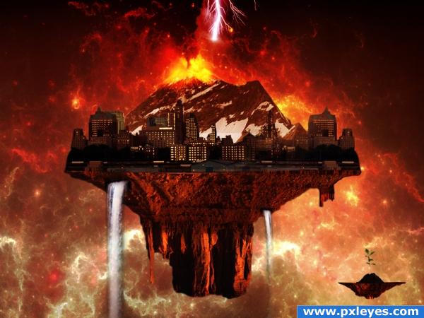
Let's Dine In Hell.....!
Buildings Image Credit - grngobstpr (http://www.sxc.hu/photo/1151912) (5 years and 3894 days ago)
- 1: Cosmos
- 2: Base Land
- 3: Snow Mountain
- 4: Buildings, grngobstpr
- 5: Volcano
- 6: Waterfalls
- 7: Plant

Let's Dine In Hell.....!
Buildings Image Credit - grngobstpr (http://www.sxc.hu/photo/1151912) (5 years and 3894 days ago)
Special delivery  by CMYK46 20130 views - final score: 66.9% | Cloud base  by CMYK46 17705 views - final score: 63.4% | Bi-Pass  by Missy 14761 views - final score: 62.2% |
crystal city  by slayyou 20023 views - final score: 61.3% | Magician Resort 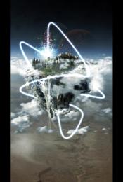 by emel 17174 views - final score: 61.1% | Heavens Castle 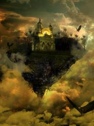 by EvanMugford 12376 views - final score: 60% |
borg cube city floating 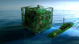 by genuine2009 15865 views - final score: 59.1% | Terraforming City 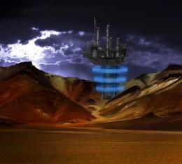 by animmax 8053 views - final score: 58.1% | End of Days 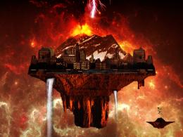 by mithrasr 6896 views - final score: 56.9% |
Semi-Floating City 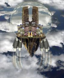 by woodztockr 14266 views - final score: 56.2% | city in the sky 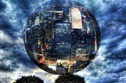 by SHIPLEYGIRL 11270 views - final score: 54.1% | Floating Kingdom 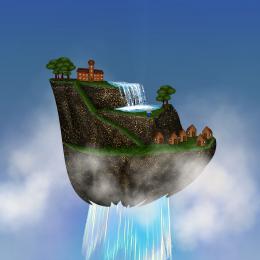 by tapiona 9902 views - final score: 53.9% |
Glinda's Flying Monkeys  by GolemAura 6986 views - final score: 52.9% | Evacuation  by filantrop 4348 views - final score: 52.2% | life goes green  by fasnaushad 19219 views - final score: 51.7% |
Floating City  by designedwright 7850 views - final score: 48.3% |
Howdie Guest!
You need to be logged in to rate this entry and participate in the contests!
LOGIN HERE or REGISTER FOR FREE
A hi res would be nice.. but without it - hard to tell, are those factories or hangars in the front needed/. Maybe colour match them to the background buildings? I would remove the lightning too - it just looks incomplete..
hey Animax...thanks for the comment...i have adjusted the lighting...
that young plant is HUGE!
I agree with elficho, try enlarging it and bringing it closer to the camera to make it look like it's closer.. maybe even blur it a bit to show depth.
another thing you could do is burn and dodge the city using the mountain you turned upside down as a reference
Hi elficho....thanks for your comment. I have trimmed the plant now...!
i think the focus is the problem... the little rock with the plant looks like it's right next to the big one. that makes the plant seem very unrealistic (i know, i know the image is unreal but this is silly). the one thing i think might help is (lens) blur. blur the plant and it's rock or blur the city. not too much! just to get that feel of depth. both can't be in focus.
hi all i understand that that plant is not suitable...but imaginatio has no end. The plant was not far behind, it was a small base which is down safe from the destroying world. The concept is one world is getn destroyed, while other is born. got it..!!! cheers...! anyway thanks for your suggestions.
gl
Howdie stranger!
If you want to rate this picture or participate in this contest, just:
LOGIN HERE or REGISTER FOR FREE