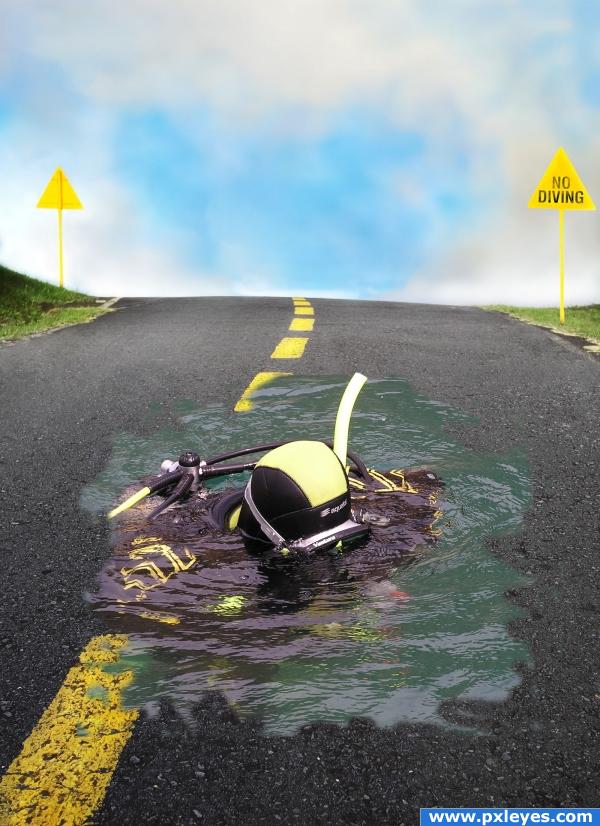
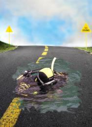
Diver pic was put on a masked layer with a mask. I then I used the no diving sign on a copy of the left sign with sampled colors off the original. Touch ups included the sign shape, snorkel and water shapes all done with masking. A clone layer was use to remove the people. (5 years and 3893 days ago)


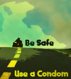


Interesting image.. good luck!
wow this looks awsome man
this is neat
I like this, but I think the edges of liquid are too soft. If you make them a bit more crisp with a slight, tight shadow it'll rock! Good job!
nice and well done
good work here, only the edges of the pond could use a bit of a better blending
Howdie stranger!
If you want to rate this picture or participate in this contest, just:
LOGIN HERE or REGISTER FOR FREE