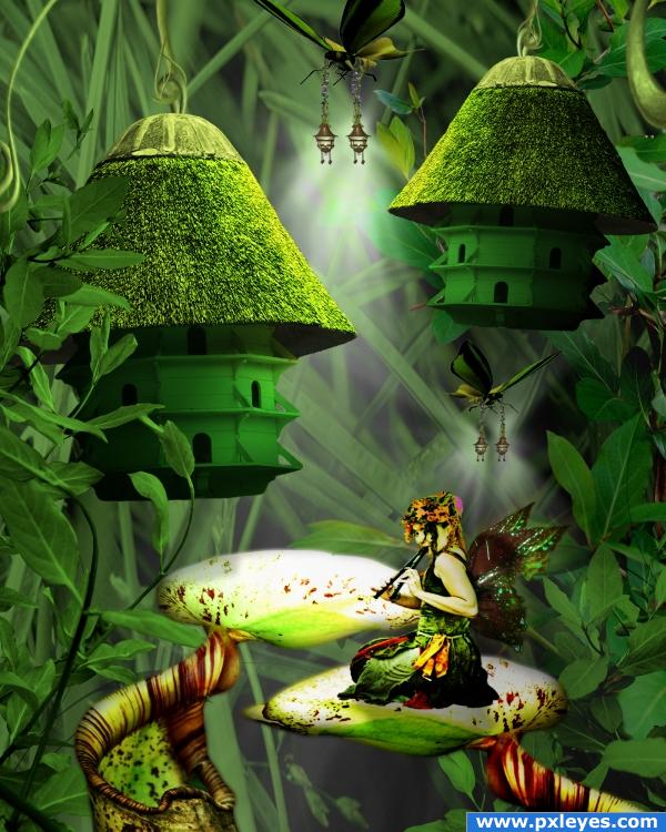
***I had to change my background grass texture, the new source is listed below as #2*****
Not as long a source list as I thought:
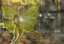
"Fairy Tunes" by ~atistatplay at deviantart.com: http://atistatplay.deviantart.com/art/fairy-tunes-71319411
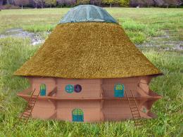
"Grass " by DaveNeukirch on Flickr: http://www.flickr.com/photos/davidneukirch/2826098046/
"Carnivorous" by ~super-chicken-stock at deviantart.com: http://super-chicken-stock.deviantart.com/art/carnivorous-89290026
"Plant 1 PNG" by *Sammykaye1sStamps at deviantart.com: http://sammykaye1sstamps.deviantart.com/art/Plant-1-PNG-80179019
"Plant 2 PNG" by *Sammykaye1sStamps at deviantart.com: http://sammykaye1sstamps.deviantart.com/art/Plant-2-PNG-84121939
"Plant Parts 2" by ~ssumenona at deviantart.com: http://ssumenona.deviantart.com/art/plant-parts-2-105045923
"Fairy Taxi Stock 4" by *Shoofly-Stock at deviantart.com: http://shoofly-stock.deviantart.com/art/Fae-Taxi-Stock-4-38193710
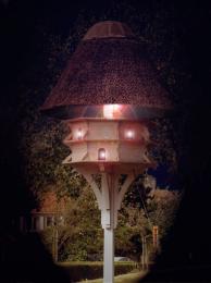
"Miscellaneous Objects 23" by *unholy-stock at deviantart.com: http://unholy-stock.deviantart.com/art/Miscellaneous-objects-23-121510215
****made some minor adjustments upon suggestion; changed color tones slightly and incorporated new wings for the fairy*****
Wing Source: "Wild Autumn Fairy 4" by *mizzd-stock at deviantart.com: http://mizzd-stock.deviantart.com/art/Wild-Autumn-Fairy-4-72695580 (5 years and 3886 days ago)

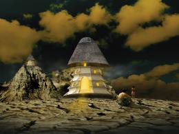
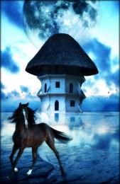
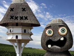
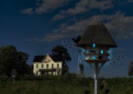
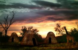
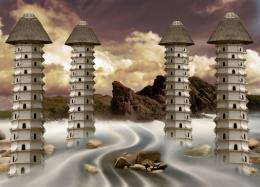
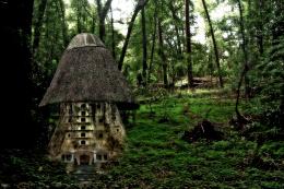
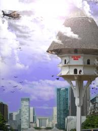
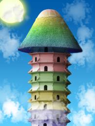


I like the lighting! Good job!
the mod who has to check your sources is just going to LOOOOOOOVVVEEEEEE you... hehehe.. very beautiful image and result... good luck author.. hehehe
I really like the atmosphere! g/l
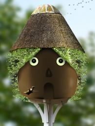
I like this a lot, my only problem, and you can write this off as nit picking if you like, is that the houses are not hanging level. Any object hanging from a single support like that will seek level due to gravity unless the object is lopsided in some way which the houses are not.

Feel free to tell me I’m over thinking this and they are just swaying in the breeze an I’ll shut up.
awesome
Beautiful image! Great Job!
Nice image! The background looks really good, you could improve the colors of the foreground, they don't really blend in IMHO. Try this: 'image > adjustments > match color' on the foreground layers. There's some extra points in this for this image
To Draskinn: Well, they ARE supposed to be swaying a little, but upon what you told me about objects hanging from a single support (great info, thanx), now i feel the need to straighten them out!! It will have to wait, though, as i have a project to finish for my mom...
and robvdn: thank you, as well, for the tip...i actually didn't even know i could do that. will definitely give it a go.
The unseen Faerie village within the Emerald City. I love it!
Sometimes I get "fairy'd out", but this is a cool scene and a nice overall pic.
Congratulations
Congratulations for 1st
Congrats for your first place!
congrats
This is so inspiring, congratulations!
Congrats, beautiful work
Congrats!
congrats!!
congrats for 1st place
Congrats!
Congratulations!!!
Howdie stranger!
If you want to rate this picture or participate in this contest, just:
LOGIN HERE or REGISTER FOR FREE