
my eMotions.
To simple! not very creative! I hear pre-estimated.
But it´s simple as that.
Sourrounded by dakness.
EDIT:
woops, something has changed.
well, now it´s been one day since i´v made and posted my entry.
starts from black over grey to finaly white.
What has happend?
short explained, ... i have sleped.
My emotional darkness, fear, hate and disappointments inverts
everytime to survive and actually to took the next wave over and over.
about the Entry:
I started with my superficial emotion, Black. Thats how the world
sees/treats me.
Now it´s White because thats how i see me-, and my emotional base.
about the SBS:
thats symbols "how i fight the darkness inside and outside of me"
about that one colored "hard to vote" entry: :-p
To me, there is nothing else to express the most powerful emotions
inside of me.
!!!PLEASE TAKE A LOOK AT MY SBS BEVORE VOTE!!! *thanks (5 years and 3888 days ago)

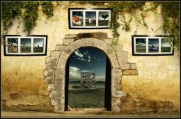
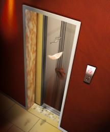
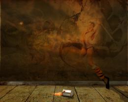
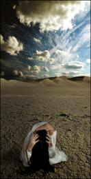
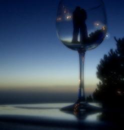
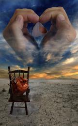
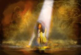
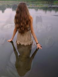
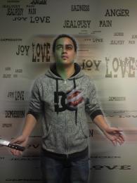
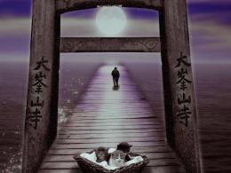
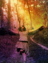
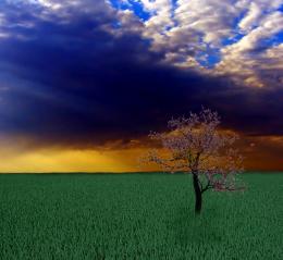
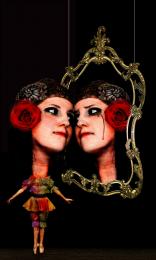
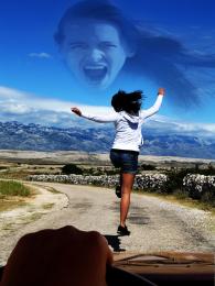
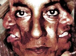
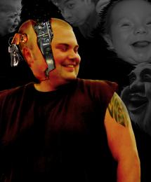
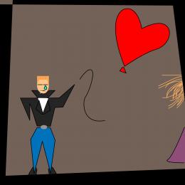
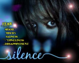
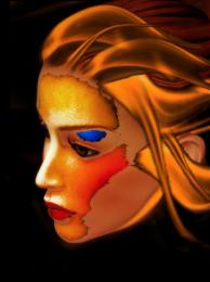
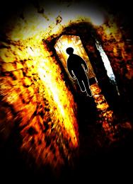


let me add, there is a alternative end, but thats privat.

Edit: alternation is in progress.
..wow....
almost reminds me of spongebob squarepants drawing a circle..... I love it.... so humorous
reminds me of sand drawings. i would suggest to make the sbs files low-sized and make a gif out of them (loosing the text), just to see what would come out of it, post it somewhere (i don't know if pxleyes allows gifs to be submitted or not) and leave us a link.
HIgh marks for the SBS!

really clever, well done.
It sure was a clever and creative SBS, but the end result is just meaningless. So, sorry, really low marks for the entry. Higher for the SBS though.
it WAS a creative sbs, but i was sad to see darkness win in the end...):
@ dka120: Meaningless???? good joke! I gave you a simlpe black image, and your still to blind to see. To bad that your horizon is limited, but thats ok in my horizon @inanis: i thought about to let it run as my avatar for a while (+the alternative end) after the contest, will see.

@spygirl: well, will see
My question is why did you add a high res version of the black image? SBS is great but the end result is still what we're judging, not the SBS.
Author: My so called "horizon" may be limited, who knows.. but I do know that a completely black image, that would take 1 second for anyone to reproduce, isn't impressive at all in a photoshop contest. Apart from the great SBS it's a complete waste of space compared to your previous entrys (in your portfolio). Since it's the end result that counts, not the SBS, I gave you low marks.You should turn the comments off if you don't want criticism.
dka120: i like criticism, make me think about things. May i sounded a bit harsh, that wassnt my intention. I appoligize.

Im fine with you vote. maby i would vote the same.
i really should be quiet now, have said to much allready.
you guys are not getting it, the image itself is so clever that it's almost a joke, there is really no point criticizing it..
and describing one's emotions simply with a black canvas is so meaningful and it only proves that you have not thought deep enough about it if you say it's meaningless.
Again, good job author
Maybe a stupid question (and well, maybe also something that you dont want for your idea), but your psd file has different layers (with what you show in your sbs)? Otherwise, to give it more depth, you can make some very subtle steps of black in your final image (a bit like in the Black Album cover from Metallica). Good luck!
A lot of effort to get nowhere...
neverlander: thanks alot Wazowski: there are no stupid questions, but im not shure if i get yours
  first, jes every step is on a different layer. after every liquify i made a copy to save the original for the sbs. ...you mean let some layers shine throu at the final? I thought about something like that, but it wont match til now. Actually it´s time for me to work on the second part.
  But what do you mean with "very subtle steps of black" sounds interesting, but i think you dont mean a gradiant right?
Uhmmm...well, see it like that on first look the whole entry is black, but that if you look closely you see the things you made in your SBS (which is only possible if some parts are less black than others. Or if you use 90%opacity for each layer. Or I dunno what), Compare it with a huge painting in blue that's done with a very small brush; has another effect than if you'd paint with a paint roller . Good luck!
Great Visual Story. The verbiage and rigmarole lose me. Every frame deserves one word. That would create a masterpiece.
Well, the SBS is good. The entry is ultimately too plain for me to even vote. Ya know what though? There is a lot of emotion here and I feel bad for you. It sounds like there is some spiritual issues you may be going through. The pic does say a lot and the making of it is good, but again I cannot even vote because i wouldn't know what to vote.
waz: ah! now i get you. great idea, i´ll think about that. @Stowsk: i get what your meaning, and i think your right. in that way it could have potential for a masterpice. @k5683: I know i have brought you voters into a strange situation. Actually thats also a part of my entry. The week issnt over. Something is already in progress. So for all who arent shure how to vote, just hold it for the votingdays.
yayyy!!! i don't know exactly what the gray represents, but in my mind, it means that dark and light have come to a middleground, which is duality!
why did you change it? I personally think that black bring a more surreal feel to the theme of emotions than gray, because now it really seems kinda meaningless...you know what I mean?
image, description and SBS has been updated. now im courious
not too sure about white either, but awesome sbs....
i still believe that you should ask the mods if uploading a gif is possible or not, and if it is, you should upload a small gif instead of a large white nothing, that way people could vote the end entry not the sbs...
inanis: i understand your suggestion, but that would not match for me and my idea for that entry. (a gif would also be to fast) Missy: you see a big part of the puzzle another thing i should say now is: The white image is the final, and it IS very well thoughted. Even the dare to poste a one colored image, and the resulting vote problems for voters are a part of the entry, on from the beginning. More than you think maby. A small hint: "did your show emotions by asking yourself how to vote here?" If so, your getting closer to some thoughts behind. No matter how you will vote.
well, the decision is yours. good luck.
Doesn't matter to me whether the final image is white, gray, or black. There's a difference between the concept (Which I Admire) and the result, which is just a blank screen. So I vote on Photoshop skill alone...I don't give much of a vote to a white, gray, or black screen.
sorry but I still can't vote
hmmmm, i am at a loss... there are multiple ways to come up with a color screen, and to me is the result that counts when it comes to judging. don't get me wrong, i am a sucker for process, that is how i learn and enjoy creating, but that is for myself. when it comes to sbs, i think it looks more like a story board for an animation, a completely different medium. to me, if you have to give an extensive explanation, or an explanation at all, of your work, then the message is not coming out right. " a picture is worth more than a thousand words" is key.
k5683: your maby have the answer. yahidithmonnalisa: im totally with you, but if i had explained nothing, would you had understand that there is a idea behind? ...well i couldnd shut my mouth as i said so in comment 3. But it´s a controversial entry so i think it was needed to expain some things, maby not. Now it´s Friday, deadline, the final is a plane white image for you to vote or not vote. Im quiet now and enjoy the results in silence
High marks from me. love the sbs. I don't believe we always vote on photoshop skills alone. :P Even if we do, sbs plays a big part in affecting the final vote doesn't it? lol..
what a finish
 may it sounds strange, but i like the result.
thanks alot for your votes
Howdie stranger!
If you want to rate this picture or participate in this contest, just:
LOGIN HERE or REGISTER FOR FREE