
Some people are willing to pay almost anything to look beautiful. (5 years and 3885 days ago)
Death takes a break 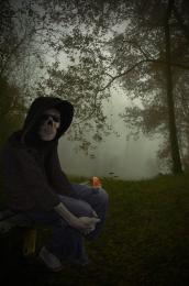 by isoflow 13357 views - final score: 59.4% | Cursed Wand  by dka120 13345 views - final score: 58.8% | the mighty skelton 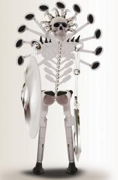 by hereisanoop 9466 views - final score: 58.6% |
Nurse! Wait for me 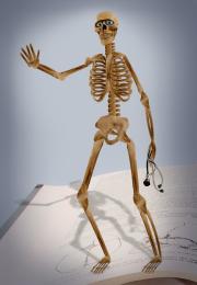 by nasirkhan 9901 views - final score: 58.2% | Just Freaky... 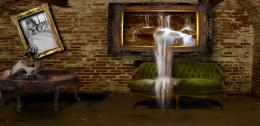 by kyluvlee 10427 views - final score: 57.3% | Garish Fish  by GolemAura 8690 views - final score: 55.8% |
intruder  by puppetized 4452 views - final score: 55.1% | Again  by cafenaderi 5553 views - final score: 54.2% | The Good Doctor 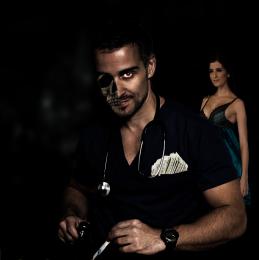 by ice 9846 views - final score: 52.7% |
Skull Wallpaper  by Keiley22 8489 views - final score: 52.4% | up in flames  by SHIPLEYGIRL 4431 views - final score: 52.2% | Optical Illusion  by designedwright 8356 views - final score: 51.5% |
Life and death  by isoflow 4940 views - final score: 51.3% | the evolution of the skull....  by spygirl1978 3354 views - final score: 51.1% | Rotten skull  by Palaekman 6936 views - final score: 50.5% |
Grim Knowledge  by visba 5569 views - final score: 49.9% | Burn!  by sjpeters 5525 views - final score: 49.8% | Deadly Perfume Ad  by designedwright 5819 views - final score: 49% |
The Surgeon 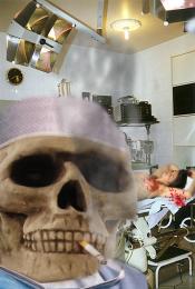 by woodztockr 5167 views - final score: 48.9% | face off 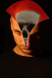 by buttle88 6524 views - final score: 48.9% | Wanted 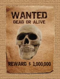 by noorbaduk 6082 views - final score: 47.5% |
who?  by buttle88 6783 views - final score: 45.1% |
Howdie Guest!
You need to be logged in to rate this entry and participate in the contests!
LOGIN HERE or REGISTER FOR FREE
If he kept his head turned to the right I'd be more than willing to.... Oh, wait. This is family friendly? Uh, in that case, nice job. High points for Doc McDreamy.
Maybe rotate the blade so the cutting side is facing downwards?? Maybe feather the opacity around the skull into the face some more? Looks just a bit sudden.. GL.
yeah, i thought of the blade after i did it.
I think u can better integrate the skull with his face; now it seems a little to the side; it should be in the direction of the man's features (nose, eye, mouth) so I would move it more to the right and lower it and rotate to the right; sexy man by the way
This is really good and has a lot of meaning to it. The skull seems to come out a little too far by his eye but I could be wrong.
setting is good but scull on the head need some more work ,out of face and need some wrap.good luck
It's a good idea, but the skull doesn;t quite match up with the doctor. Good luck, though!
Thank you Hisks for the scapel picture. I put a link from your page the other day to here http://www.sxc.hu/photo/992504
Howdie stranger!
If you want to rate this picture or participate in this contest, just:
LOGIN HERE or REGISTER FOR FREE