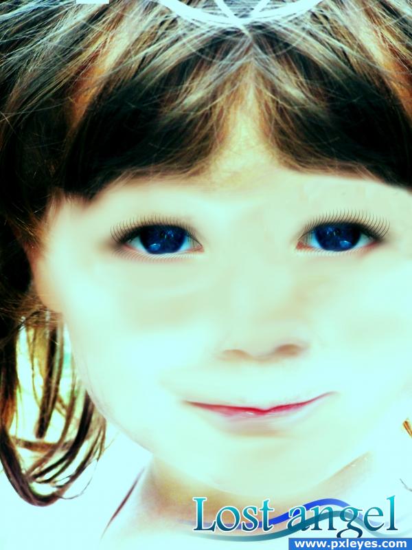
Losted angel (5 years and 3885 days ago)
Vampire Child  by SweetSue 22921 views - final score: 57.5% | Mudy face  by athenya 16211 views - final score: 57.5% | What a doll.  by Anjii119 15044 views - final score: 56.3% |
after taking a bath 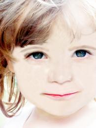 by SilvanaDD 15937 views - final score: 56.2% | Muddy Playground Fun 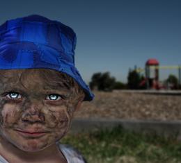 by ice 22545 views - final score: 55.6% | war tear 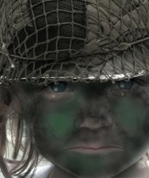 by mariosilva 7007 views - final score: 55% |
camuflage 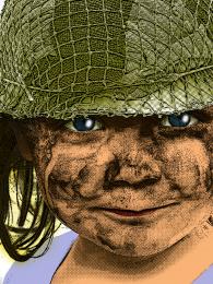 by mariosilva 5316 views - final score: 54.8% | Princess  by dydier44 5717 views - final score: 54.4% | Lost Angel 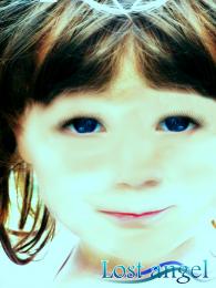 by albevolution 5729 views - final score: 54% |
Are You Kidding Me ? 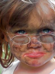 by Tedzik 13522 views - final score: 53.9% | Mutation 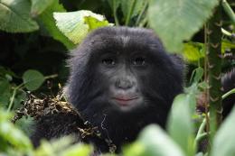 by HavingFun 4586 views - final score: 53.8% | Tulip 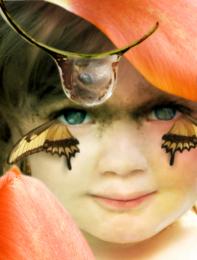 by angeluzend 7897 views - final score: 52.7% |
Truffles 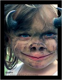 by Drakkonnen 16348 views - final score: 52.4% | Raised By Wolves 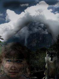 by donh 5690 views - final score: 52.3% | CUTE LITTLE ALIEN 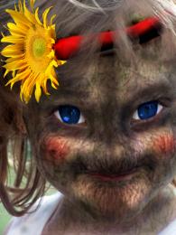 by cterraza 8640 views - final score: 52.3% |
Do you want some? 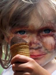 by woodztockr 6054 views - final score: 51.7% | Huntress 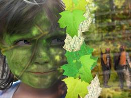 by aaronrad 4916 views - final score: 51.2% | instant makeover 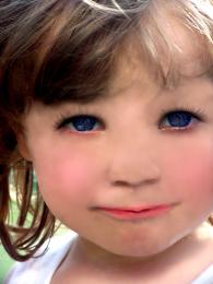 by chino705 4942 views - final score: 50.9% |
Magical Swamp Creature 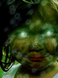 by visba 9032 views - final score: 50.5% | Pretty Face 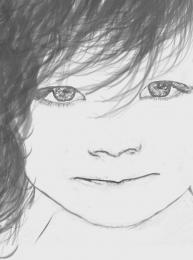 by 1wkdwmn 7566 views - final score: 49.5% | little evil 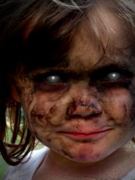 by freshflesh 8298 views - final score: 48.8% |
Young Innocence 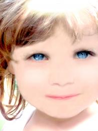 by glizzta 5976 views - final score: 48.6% | Evolution at Work 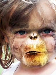 by BUMFEATURES 12285 views - final score: 48.3% | Hipnose 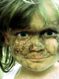 by invasorsl 6369 views - final score: 47.6% |
Babe Bite 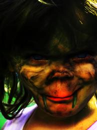 by juanchios 8499 views - final score: 46.9% | Angellic Little Girl 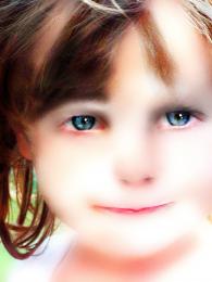 by zariazinza 7081 views - final score: 46.6% | Really Muddy! 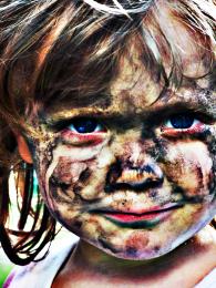 by downoffthedragon 9236 views - final score: 46.3% |
why me? 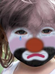 by KEVIV 4605 views - final score: 45.4% | Reptile Baby 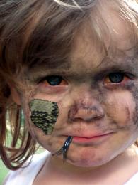 by jamaycaman 13533 views - final score: 45.2% | Muddy face 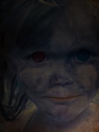 by ea8322 6133 views - final score: 44.7% |
Metamorphosis--A Child's Dream 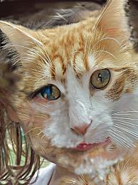 by wildwings 11513 views - final score: 43.6% | muddy face 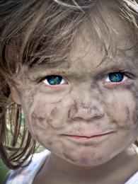 by isoflow 11380 views - final score: 42.6% | emotive eyes 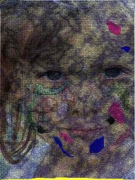 by preeth64 5267 views - final score: 41.5% |
Star Girl 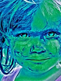 by downoffthedragon 4933 views - final score: 41.3% |
Howdie Guest!
You need to be logged in to rate this entry and participate in the contests!
LOGIN HERE or REGISTER FOR FREE
Very n9ice, but i think you've made her too bright, your image is starting to loose detail, like around the nose. i would also try to make the lips a bit larger, they look a bit thin. Good luck though, you did a very nice job!
Edit: ahh, i'd also remove the text from the image, the title speaks for itself
Don't put the text IN the picture.. it lessens the effect put it in a frame around the image if you want but it's already in the title.. clean the lines around the eye area.. it will conform the idea.. but other then that..you've got a great work here (cleaning the dirt was the biggest job and you did that brilliantly)
YIKES you got a double attack from PONTI and me at the same time.. sorry about that... (we are just trying to help..your overall image is very good) I'm cuter then ponti.. hehehe.. he's only 15 and I'm 42.. so that makes me the big guy LOL.. but he's right as well.. you have a great chop on your hands... and plenty of time.. refine and make it AWESOME.. you have the talent.. use it)
And i think that i can do it more good , i will start now to make bit changes. Thanks for coments and suggestions.
big hugs and smooches author.. and good sportmanship is a gem LOL
ponti.. giggle snort
Cuter than ponti? DREAM ON BUDDY!! You may be older, but i feel like the adult compared to you! xD
Hey, I'm cuter than them both and I'm some where in the middle as far as age. So I'm going to tell you to use a soft round brush at about 40% opacity to bring through the eyes from the background layer. Bring the eyes through a little bit at a time this way. I think that this should eliminate the choppiness around the eyes.
Sweet. You may want to fix the visible rectangle around her left eye (and well, I also think that the text is a bit distracting ). Good luck!
looks like a chunk of her nose around the nostril is missing. her right part.
I'd fix the right eye.. it's higher than the left one.. it gives a weird effect to the face..
i dont mind the text but i would of let the text glow more like the girl... in her face next to ther right eye (for the viewer ) i can spot a clear line
Howdie stranger!
If you want to rate this picture or participate in this contest, just:
LOGIN HERE or REGISTER FOR FREE