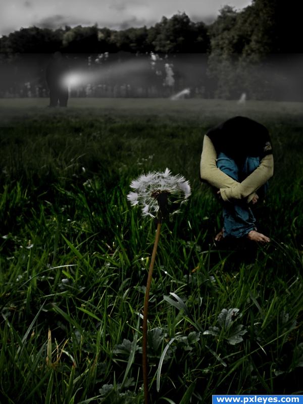
I copied sections of the background and changed the saturation and lighting then blended the layers together. I used dodge and burn for the lighting. (5 years and 3878 days ago)
hawkbit invasion  by puppetized 8710 views - final score: 63.5% | The Flower Mountain  by vertigo 10285 views - final score: 62.6% | Dandelion girl  by isoflow 11040 views - final score: 60.3% |
???  by vicspa 4709 views - final score: 58.5% | Run Beetle Run 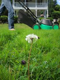 by woodztockr 6019 views - final score: 55.2% | underwater flower  by scratzilla1 5316 views - final score: 54.7% |
vision of night glow 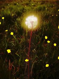 by preeth64 5866 views - final score: 53.7% | Grub 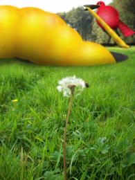 by etherwarrior 4714 views - final score: 53.6% | Nastalgic Walk 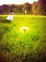 by downoffthedragon 7010 views - final score: 52.6% |
Favorite Pastime 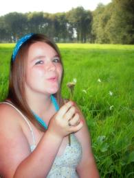 by k5683 4838 views - final score: 52.3% | Last Hope 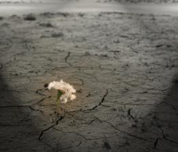 by danBuonocore 6989 views - final score: 52.2% | Weeds 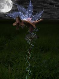 by Anjii119 4430 views - final score: 51.6% |
Molly!... 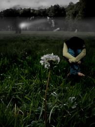 by blaine2nd 3456 views - final score: 51.6% | Old Oak Tree 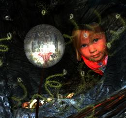 by woodztockr 5971 views - final score: 51.5% | Love meeting 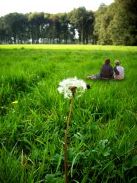 by jamaycaman 6725 views - final score: 49.7% |
moonlit madness 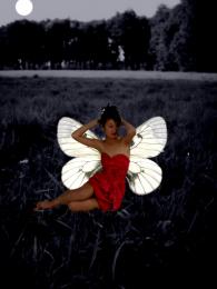 by SHIPLEYGIRL 3222 views - final score: 48.6% | Death Warriors  by visba 4813 views - final score: 48.1% | Problem Downloading The Source 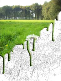 by nemanja 4875 views - final score: 45.7% |
Howdie Guest!
You need to be logged in to rate this entry and participate in the contests!
LOGIN HERE or REGISTER FOR FREE
I love the idea, but the perspective is off. the back has the depth of field, and for the girl to be so small compared to the flower she would have to be way back and blurry too. Unless you were going for a gigantic flower
She should be bigger and more in perspective with the picture, I don't mind the perspective as much as... the fog is what draws my attention... too much of a straight line.... other than that... great image I think it's awesome
Howdie stranger!
If you want to rate this picture or participate in this contest, just:
LOGIN HERE or REGISTER FOR FREE