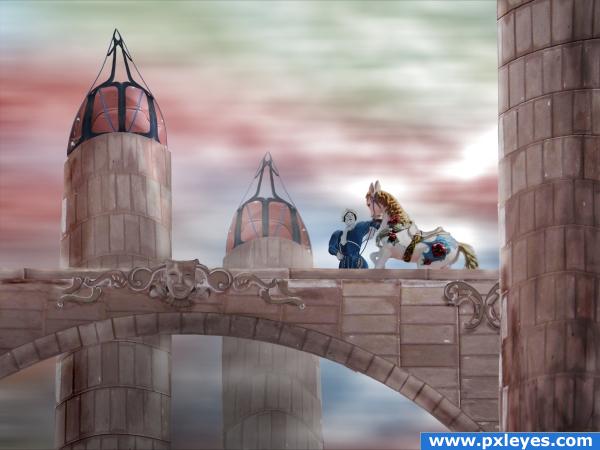
I'm not quite satisfied with the end result, but it has to do for now.
All source. (5 years and 3881 days ago)
"Il Circo" - a tale  by angeluzend 20446 views - final score: 62.9% | Clown Bridge  by dustfinger 10336 views - final score: 59.7% | Lady style riding  by isoflow 11881 views - final score: 58.9% |
Creepy Circus 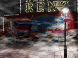 by Anjii119 9371 views - final score: 53.5% | zen'r'us 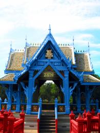 by rikigoft 6396 views - final score: 51.7% | A Rainbow Day 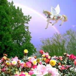 by artgirl1935 3859 views - final score: 51.2% |
Warholesque Clowns 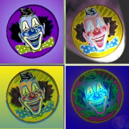 by visba 4656 views - final score: 48.6% | A Charmed Place 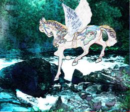 by artgirl1935 4457 views - final score: 46.5% | modern texi 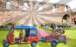 by niravbond1 5501 views - final score: 46.4% |
Howdie Guest!
You need to be logged in to rate this entry and participate in the contests!
LOGIN HERE or REGISTER FOR FREE
Awesome job! Good Luck
Awesome job!
very nice author
Nice and ethereal.
Author, I like your idea, so permit me to nitpick. The foreground tower & arch should be darker than the others to create depth, and the tower at front right is leaning in...otherwise it's an admirable effort. Good luck.
very odd in a wonderful way... but the source has so much to offer that this entry really pays tribute to it... good luck!!
Did a wonderful job with a difficult source image.
Love the colors! Great job! The horse and clown could have had that same pinkish/peachish tone to it but it is still great!
I have no idea why you're not satisfied with this beautiful image!
@ponti: I did a lot of experimenting on the horse to make it more 'drawn' (like the horse and the bridge) -without success. The horse is more 3D/photographic compared to the clown and the buildings. Other (minor) points where the perspective of the towers and the blending of the ornaments. But is was very pleased with the mood of the image.
gratz!
Congrats for your second place!
Congratulations for 2nd
Congrats!
Congrats!!!!!!!
Congrats!
Howdie stranger!
If you want to rate this picture or participate in this contest, just:
LOGIN HERE or REGISTER FOR FREE