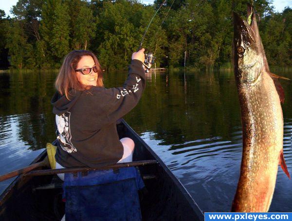
(5 years and 3877 days ago)
The Last Unicorn 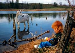 by FairyGardens 14834 views - final score: 59% | catching the loan-shark 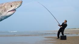 by Derivatix 17698 views - final score: 58.5% | Gold fish 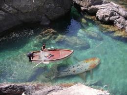 by blaine2nd 15962 views - final score: 55.7% |
I told you it was in here! 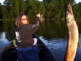 by k5683 12580 views - final score: 55.3% | You Should Have Seen It 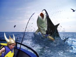 by lchappell 12016 views - final score: 53.7% | Came Straight to Me I tell You 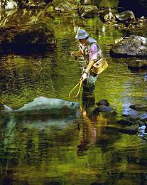 by wildwings 12370 views - final score: 53.3% |
Amanda's Imagination? 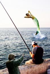 by woodztockr 6049 views - final score: 51.6% | First Time Fishing  by visba 7267 views - final score: 51.3% | but he did't get away 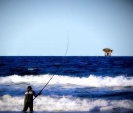 by SHIPLEYGIRL 4871 views - final score: 45.9% |
Howdie Guest!
You need to be logged in to rate this entry and participate in the contests!
LOGIN HERE or REGISTER FOR FREE
Nice montage - but your light sources are from different directions.. Maybe flip the background? GL
A pike is very light on its underside. I put the lightsource on the left side. I'm not sure what to do--I tried to darken the RGB on the belly side of the fish and it looked funny. I tried to bring the lightness down on the belly side of the fish and it looked funny also. I'll try your suggestion.
Thanks animmax, I took your advice and it seemed to work out.
All good - much better.. GL
This is not a montage it's just a real picture.... Nice job!
http://en.wikipedia.org/wiki/Photomontage it would be considered a montage
good job, looks like the real thing!
Howdie stranger!
If you want to rate this picture or participate in this contest, just:
LOGIN HERE or REGISTER FOR FREE