(5 years and 3860 days ago)
1 Source:
What?  by Siminho90 29656 views - final score: 61.2% | nap time  by yahidithmonnalisa 29122 views - final score: 59.4% | Help me!  by Siminho90 26789 views - final score: 59% |
Sardines? 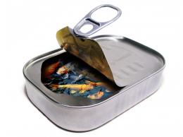 by Siminho90 25191 views - final score: 58.8% | Fishhead 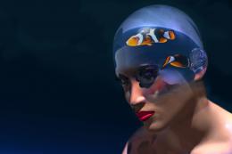 by robvdn 24915 views - final score: 58.7% | head light fishtank 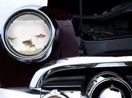 by mariosilva 8276 views - final score: 57.9% |
Bio washing 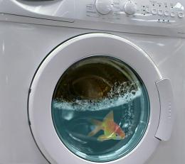 by filantrop 6885 views - final score: 57.6% | Betta Fish  by HavingFun 14672 views - final score: 56.3% | Fish bowl  by donh 10877 views - final score: 56.1% |
Pipette  by filantrop 5487 views - final score: 55.6% | Fish Tank Truck  by Draco 20602 views - final score: 55.1% | stuck  by tommo08 5126 views - final score: 54.8% |
Dog(fish) house  by angeluzend 11260 views - final score: 54.6% | how?  by mariosilva 4480 views - final score: 54.4% | Fish Sticks and Bubbles 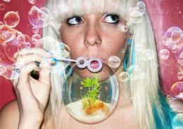 by RickLaMesa 5888 views - final score: 54.2% |
Dinner is in the Microwave...  by Nellista 8482 views - final score: 54.1% | Test Tube specimen  by donh 4879 views - final score: 54.1% | magnifiquarium  by spygirl1978 3505 views - final score: 53.8% |
Fishtank App 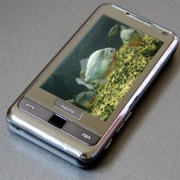 by theskepticaldesigner 8583 views - final score: 53.1% | Swallowable Fish tank 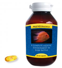 by theskepticaldesigner 8374 views - final score: 53.1% | Breakthrough 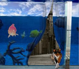 by isoflow 4411 views - final score: 52.9% |
FISH POD 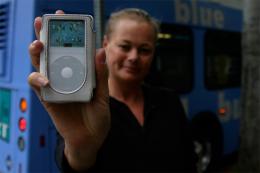 by xwd 11041 views - final score: 52.6% | Bulb  by JustinCase 4727 views - final score: 52.4% | Forget That Fishy Screensaver!  by k5683 6235 views - final score: 52.2% |
Bowling  by woodztockr 5261 views - final score: 49.7% |
Howdie Guest!
You need to be logged in to rate this entry and participate in the contests!
LOGIN HERE or REGISTER FOR FREE
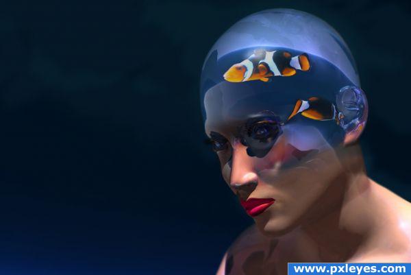
Good idea, good blend, but clear part of head looks better in step 4...
I like step four also...cool idea
Pretty cool idea! If you can manage to make the darker parts of the fish some more darker (but watch out that the orange wont get too saturated, in fact like how the fish looks like in step 4), the fishes may look even more part of the image. Good luck!
 !
!
Edit: better
wow!nice idea and excellentty implemented.this way it looks good but i also liked the fourth step more than this
I've adjusted the clear part of the head more towards step 4 and darkened the fish. THX for the tips
very cool! gl
There's something kind of intense about her eyes. I love it!
I love the image.. very clever
wow...that is a very creative place fr a fish tank! would have never thought of it; it looks like porcelain
Brilliant work. Step four should be the final result. I think its more effective without the skin.
Love it!
Howdie stranger!
If you want to rate this picture or participate in this contest, just:
LOGIN HERE or REGISTER FOR FREE