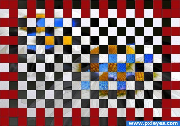
"Son... if you think you're gonna play chess on that board, you're out of your skull." (5 years and 3945 days ago)
TeddyBear  by jsk123 24177 views - final score: 66% | chamomille and the prince  by yahidithmonnalisa 25946 views - final score: 63.6% | Photosynthesis  by Stowsk 22033 views - final score: 61.8% |
Feeling lonely 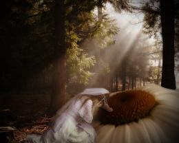 by nasirkhan 25881 views - final score: 60.4% | How to fix this petal? 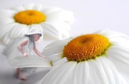 by hereisanoop 24315 views - final score: 59.6% | Little Miss Daisy 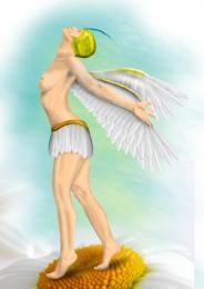 by Missy 6478 views - final score: 59.6% |
Bird 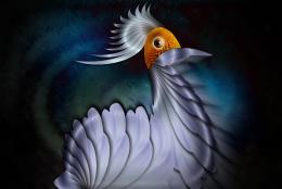 by lahiripartha 4692 views - final score: 58.8% | Live and In Concert...  by GolemAura 6976 views - final score: 58% | Petals of Greed 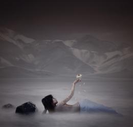 by ponti55 8852 views - final score: 57.6% |
kakatua 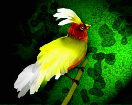 by nehayash 14569 views - final score: 57.6% | The Meeting  by Akassa 5985 views - final score: 56.8% | Flower of Carnage 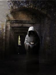 by ponti55 8270 views - final score: 55.7% |
Lullaby 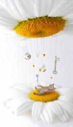 by angeluzend 10808 views - final score: 55% | UFO 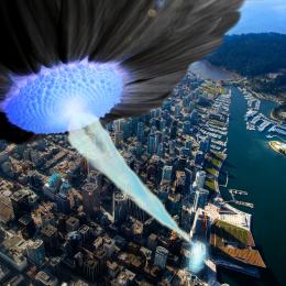 by visba 7437 views - final score: 54.1% | New Quilt 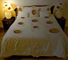 by JustinCase 5464 views - final score: 54% |
Daisy Angel 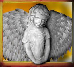 by GolemAura 5516 views - final score: 54% | Sequoia Daisies 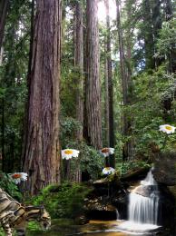 by lchappell 6478 views - final score: 53.9% | Pollination 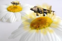 by filantrop 4853 views - final score: 53.9% |
A dancers dreamland 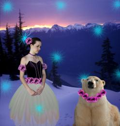 by ice 13957 views - final score: 52.5% | Daisy fairy  by shaiju1974 5630 views - final score: 52.5% | Underground facility 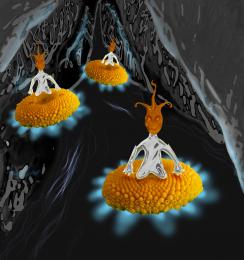 by marina08 5186 views - final score: 51.6% |
Capitulum Collecting 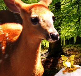 by woodztockr 4950 views - final score: 51.5% | umbrella 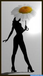 by wtfayla 5975 views - final score: 51% | Forgive My Evilness 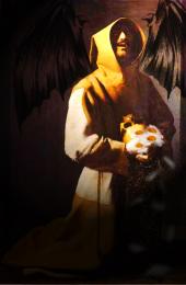 by woodztockr 5116 views - final score: 50.4% |
Checkered 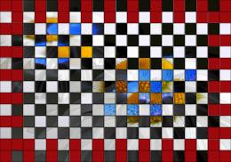 by visba 4830 views - final score: 49.3% | Head Chief 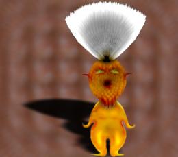 by k5683 4635 views - final score: 47.8% |
Howdie Guest!
You need to be logged in to rate this entry and participate in the contests!
LOGIN HERE or REGISTER FOR FREE
You can't even see the source image...
Yes you can, very clearly.
I get what you are trying to do, but it could have been executed better, that's all I'm getting at....
Well, you could explain HOW it could be done better; that's what constructive criticism is.
I'm sorry... those colors are NOT very healthy for the human eye.
Well I chose the red as opposed to another color because it would give this image a primary color scheme; sorry if it's a bit harsh.
For starters, it wold be helpful if you could see the image on the red and blue dots. You can see it but it doesn't mesh with the other blocks well.
The Red dots don't actually have the image: those were blank spaces. And the blue dots you can very clearly see parts of the flower. This isn't just the image verbatim: I offset everything.
i dunno all the complaining here o.o; as a piece of art it works for me.. not my style and not something i hang on my wall but theres plenty of other art thats been created id never wanna se eon my wall either XD including some of my own lmao
Howdie stranger!
If you want to rate this picture or participate in this contest, just:
LOGIN HERE or REGISTER FOR FREE