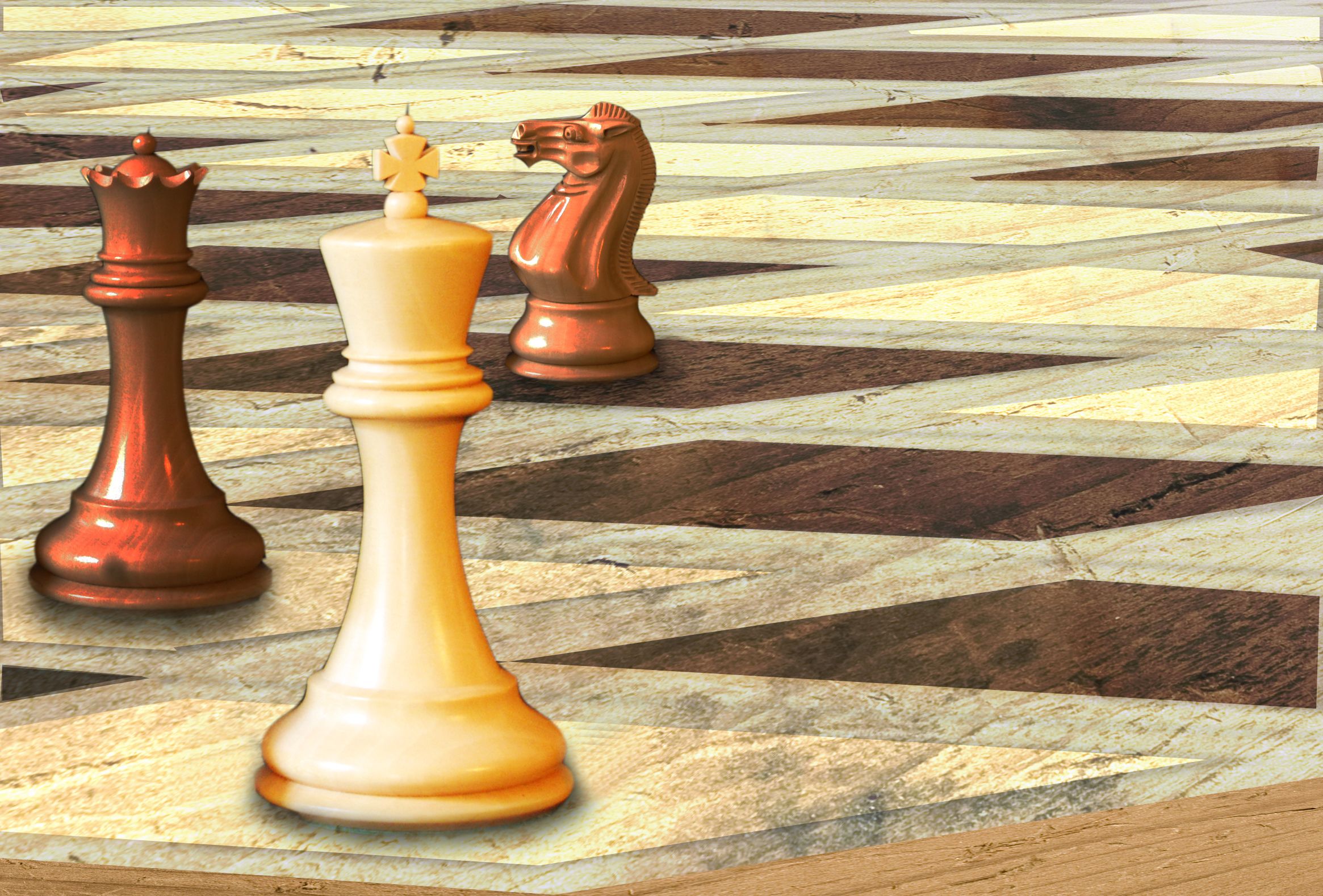
Thanks:
http://commons.wikimedia.org/wiki/File:ModernStaunton.jpg
chesspieceswhite
jud mccranie
http://www.sxc.hu/photo/1221254
woodtexture
yoyojaw (5 years and 3813 days ago)
- 1: chess pieces
- 2: woodtexture
Thanks:
http://commons.wikimedia.org/wiki/File:ModernStaunton.jpg
chesspieceswhite
jud mccranie
http://www.sxc.hu/photo/1221254
woodtexture
yoyojaw (5 years and 3813 days ago)
pop up ![]() by imdb 10987 views - final score: 59.8% | space cube ![]() by prof 10749 views - final score: 56.7% | MMMMLAAAAAAHHHHHH!!! ![]() by GolemAura 26006 views - final score: 56.5% |
Alien SpaceShip inspection ![]() by HavingFun 10432 views - final score: 56.3% | Checkmate ![]() by woodztockr 10110 views - final score: 56.3% | Chalk It Up ![]() by JustinCase 5078 views - final score: 55.7% |
open windows ![]() by prof 7705 views - final score: 54.6% | surrender ![]() by Happy14U 3849 views - final score: 53.9% | Take me out from here !! ![]() by ndufoto 6865 views - final score: 53.2% |
Marbles ![]() by Oriel 4679 views - final score: 51.5% | kite ![]() by wtfayla 3391 views - final score: 49.6% | No place for me ![]() by vosya 4167 views - final score: 49.5% |
Misterious Castle ![]() by shaiju1974 4246 views - final score: 49.3% | Gigantic Squirrel ![]() by visba 4783 views - final score: 48.6% |
Howdie Guest!
You need to be logged in to rate this entry and participate in the contests!
LOGIN HERE or REGISTER FOR FREE
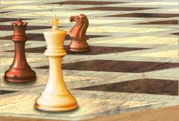
I like this alot. Well done.
This is a nice image. I would like it more if it didn't have the corner lines of each diamond showing depth. Right now, the chess pieces are floating. If you remove the lines and give the chess pieces a set down shadow it will really help.
EDIT: I was liking the less saturated previous version more, but I DO like the edits to those lines mentioned above. Your set shadows are currently wrapping too far around bottom of pieces. Cut them off where the piece width ends softly.
great
Texture doesn't follow the different planes...
I dont like this new version. too much contrast. better the way it was.
good use of source.good job
Howdie stranger!
If you want to rate this picture or participate in this contest, just:
LOGIN HERE or REGISTER FOR FREE