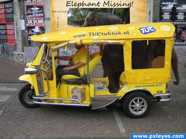
Here's my entry...
Hope you like it =P (5 years and 3869 days ago)
3 Sources:
- 1: source1
- 2: Elephant
- 3: grunge paper

Here's my entry...
Hope you like it =P (5 years and 3869 days ago)
Tuc ads with smoking penguin  by Furanku 56347 views - final score: 60.5% | Pimp my cab  by jfba7 35185 views - final score: 59.8% | Day-O  by ice 26358 views - final score: 59.4% |
Elephant Missing 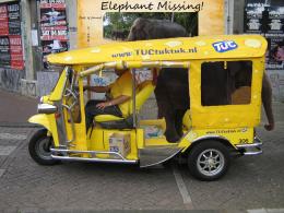 by TripleJ 25677 views - final score: 55.6% | Mules_On_Wheels 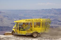 by Happy14U 29084 views - final score: 55.1% | double tukk 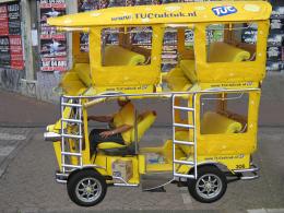 by chandershekhar 23624 views - final score: 54.5% |
Hop a board 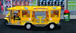 by Chuck 7568 views - final score: 53.4% | tukkk 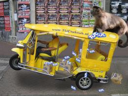 by chandershekhar 11155 views - final score: 53.1% | TucTukRacer 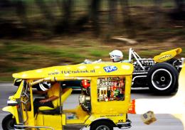 by woodztockr 5672 views - final score: 53% |
Making Deliveries  by Chuck 7417 views - final score: 50.6% | lets play that tuc!! 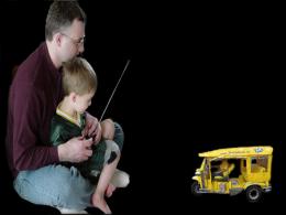 by dimas86 9152 views - final score: 50.2% | Splish Splash 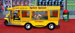 by Chuck 7368 views - final score: 49.7% |
Story Behind this Vector  by tahseen 14068 views - final score: 49.1% |
Howdie Guest!
You need to be logged in to rate this entry and participate in the contests!
LOGIN HERE or REGISTER FOR FREE
high res please!!!! I really want to see this up close... go to MY STUFF and MY CONTESTS and re upload a HIGH RES image (it will get you higher votes as well
Looks like there are some shadows missing - high res would be good.
Well, I'm just 14 and I'm kinda new to this =P
Hi author! Not bad for 14. I just wanted to give you advice... don't take to heart comments people will leave. Alot of people are excellent artists and they give lots of opinions and suggestions and it might feel like your being picked on. . And some people are far more picky and blunt then others. Take anything people say as creative critism. And if you agree with their comments try changing your picture and reupload it. If not... just enjoy your work and learn from others work .
.
Haha thanks for the advice, Hopefully my future entries will be better. =]
Funny idea . Masking is not bad, maybe on top of the car could be a bit more smooth. I'm not sure how you made the selection, but in case you use a mouse you can use the pentool to create a path and turn that into a sweet mask. Elephant itself needs some shading. Make a new layer above the elephant layer, make it a clipping mask, fill it with a gradient black 100% on top to 0% down and put the blending on overlay. And then see if you like the effect or not...otherwise play a bit with the blending modes. Idea is that the elephant gets some shading on top of his back, so it looks more he's in the car. If you give the poster in the background a little bit blur, it will fit better with the rest.
Good luck!
very cute and funny
That elephant is mad small... also ice is definitely right. I'm 17 and kind of in the same boat as you; for example, I don't understand 75% of the things wazowski told you in his comment.
Very cute! The elephant is too dark. Try to make it lighter. GL
Well lets just say that the elephant is umm.....A child? xD
nice idea, like it! Some shadows under the elephant would help, but I like this nonetheless
way to go! I think you did great, especially for a 14 years old
Howdie stranger!
If you want to rate this picture or participate in this contest, just:
LOGIN HERE or REGISTER FOR FREE