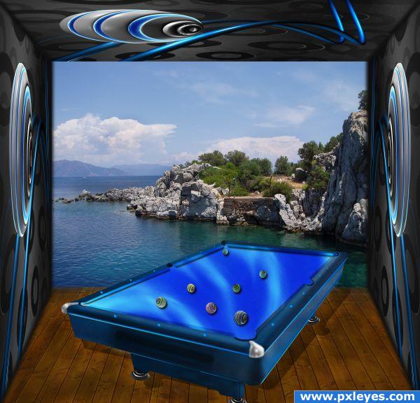
i used the source for the pool table and room. i am waiting your suggestions for improvements. thx. (5 years and 3943 days ago)
Recycle :)  by loopyluv 14953 views - final score: 71.1% | Show time  by krigios 14384 views - final score: 71% | Nonstop Joy  by Verikakis 12447 views - final score: 68.4% |
Lonely  by lahiripartha 10420 views - final score: 65.4% | Study #AZ 14 (Preclusion)  by GolemAura 12448 views - final score: 61.6% | The Car  by gotmeamuse 8226 views - final score: 61.4% |
ball collectors  by blackmagic1 5306 views - final score: 60.9% | Moto  by unphazed 5571 views - final score: 60.6% | Dreamy Old Alien Statue  by lahiripartha 6074 views - final score: 59.8% |
Snail  by bluesk8r 7699 views - final score: 58.4% | Guitar men  by vosya 7999 views - final score: 57.8% | Metpago  by lahiripartha 4148 views - final score: 57.6% |
Light Fight  by bluesk8r 6447 views - final score: 57% | Sea Nessie and her Kissy Fish  by GolemAura 8677 views - final score: 56.3% | Ninja michelin  by Goberphoto 5189 views - final score: 55.6% |
Fairy  by chakra1985 4110 views - final score: 54.9% | futurist racing !  by prof 5982 views - final score: 54.1% | Marble Togo  by 1wkdwmn 7884 views - final score: 54% |
pool table... 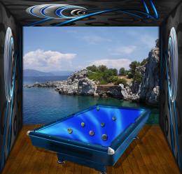 by sebykxxx 7208 views - final score: 52.8% | Flower  by chakra1985 3876 views - final score: 51.3% | show time!!!  by swordfish 4574 views - final score: 51.1% |
Special Agent H1 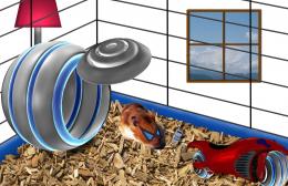 by sundevil356 5652 views - final score: 50.9% | football 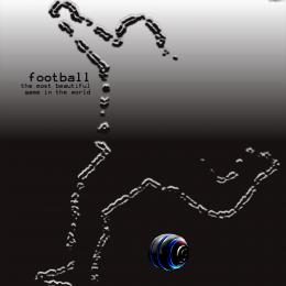 by smsm 5556 views - final score: 45.2% |
Howdie Guest!
You need to be logged in to rate this entry and participate in the contests!
LOGIN HERE or REGISTER FOR FREE
interesting work. The balls look a bit distorted and, most important, the shadows do not have the same direction.
the blur on the pool table in high res is very heavy compared to the fantastic resolution of the floor and the walls (the poolballs are very blurry) But the overall image is FANTASTIC) though I think alot of the players are going to be hitting there cue sticks against the wall trying to make shots.. hehehe.. but the overall concept is quite beautiful.. I'd hang this in a game/pool room in a nanoscecond...good luck author!!!!
EDIT: great fixes... still and more elbow room.. woo HOO
thx for suggestions. i fixed the shadows and the balls, and enlarged the room .
.
Howdie stranger!
If you want to rate this picture or participate in this contest, just:
LOGIN HERE or REGISTER FOR FREE