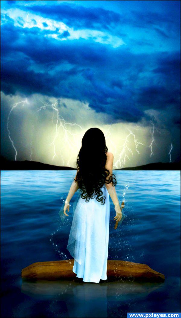
Credits to:
- strwberrystk (http://strwberrystk.deviantart.com)
- night-fate-stock (http://night-fate-stock.deviantart.com)
- faestock (http://faestock.deviantart.com)
- rl-brushes (http://rl-brushes.deviantart.com)
- danigranger (http://danigranger.deviantart.com)
- darkresources (http://darkresources.deviantart.com) (5 years and 3859 days ago)




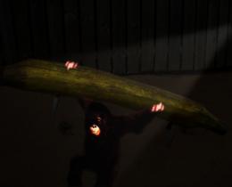


What's the stuff on the arms? No ripples in the water?
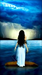
Some kind of gloves, i made it from the dress... and why should there be any ripples? Calm water, it's not really moving.
love the colors and the mood very dreamy
Very mystical and serene, in my opinion, the waterline in the horizon is a bit too harsh, try softening it with a lyer mask and a soft round brush. (just my opinion) Very detailed work, especially around her hands. Good luck!
Talking about fantasy, this chop reminds me of a dream of mine. I like the magic in the picture. Beautiful!
Blurred more the horizon line.
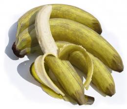
The compostion is really lovely, just like the colours! But maybe you could try to lift the model a bit or give her her feet back, cause right now the proportions doesn't look right. Considering, that she's standing on the "banana" (she is suppose to stand there and the back of the dress is hanging over the "banana", right?) her legs are too short, at least IMO
  And maybe an idea to make the gloves look more like gloves: you could try to attach them closer to her arms, so they are directly on her arms without space between and widen on her hands (like they do now)...
So they don't look like they could fall off every minute. I hope, that can help a little Good luck!
Great composition!
Love the hair! Great image. GL
Edits you've made have helped and this is a really nice image! Good advice all.
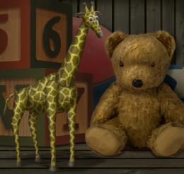
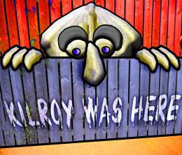
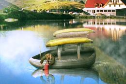
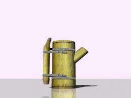
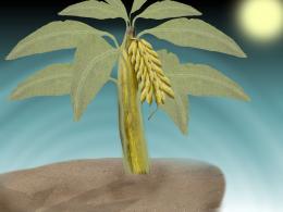
First I must say the image in general is quite nice. However as for use of the source all you seemed to use is the banana bench for her to stand on. She could be standing on anything there's no significant use of the source image, why is this lovely girl standing on a banana? As I said it's a nice image...it just doesn't relate well to the contest source IMO.
I agree with spaceranger. Nice image but not enough work with the source in my opinion. For some reason this type of nice image always wins tho.
Fixed the body propootions... she looked too small before compared to the head.
Howdie stranger!
If you want to rate this picture or participate in this contest, just:
LOGIN HERE or REGISTER FOR FREE