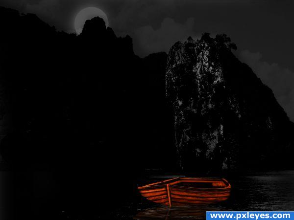
used source to create the boat.hope u like it.... thx to ColleenT for the stock image. (5 years and 3825 days ago)
- 1: by ColleenT

used source to create the boat.hope u like it.... thx to ColleenT for the stock image. (5 years and 3825 days ago)
D-N-Abakus  by SOLARIS 11352 views - final score: 65.1% | dreamwatcher  by SOLARIS 8528 views - final score: 64.4% | Model T  by jawshoewhah 9911 views - final score: 62.5% |
You're the Most Beautiful!  by CorneliaMladenova 10014 views - final score: 60.6% | OOGIE BOOGIES  by GolemAura 9436 views - final score: 59.7% | A Halloween Supper  by donh 5100 views - final score: 57.7% |
Magic  by CorneliaMladenova 3359 views - final score: 56.8% | Colorflow  by Stowsk 3265 views - final score: 55.9% | Abstract Art  by lahiripartha 5045 views - final score: 55.3% |
reconstruct:)  by sebykxxx 4901 views - final score: 54.8% | Flying Spaghetti Monsters  by GolemAura 4894 views - final score: 54.2% | OMG WHERE DID THAT WITCH GO ?? 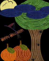 by Aniiolek 6461 views - final score: 53% |
boat... 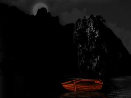 by sebykxxx 3824 views - final score: 52.8% | eye of the soul  by locxoul 5010 views - final score: 50.8% | Where I have to Aim?  by shaiju1974 4797 views - final score: 50.7% |
The little house  by Tylerboston 4409 views - final score: 49.2% |
Howdie Guest!
You need to be logged in to rate this entry and participate in the contests!
LOGIN HERE or REGISTER FOR FREE
step by step please !!!!!!!!!!!! need to know how u created boat for proof that this boat was created by you and the amish chair. because the wood grain of the chair looks a bit different than wood grain of the boat. ill vote once i see step by step, if no step by step i will red flag
step by step is in progress. wait for it.
neat
needs work on the shadow also the oars are out of scale compared to the boat
honestly it doesn't really look like it fits on this beach. Plus, with the shadow on the boar, it almost looks like it's floating on air.
I meant boat.
Decent creation of boat, bad placement & shadow.
You did a wonderful job creating the boat ... but I think you could do a much better job blending it with the background. Take a another look at your shadow , good luck!
thank you all for suggestions.i changed the background.in my oppinion looks more interesting now.
quite nice (I saw the original submission and this is much better as well... good luck author
changes are much better...
very nice
Howdie stranger!
If you want to rate this picture or participate in this contest, just:
LOGIN HERE or REGISTER FOR FREE