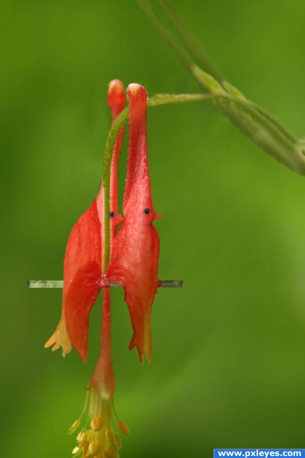
I used one external source
of birds thanks to
http://www.sxc.hu/photo/1213697
Author:fds
Modified. (5 years and 3833 days ago)
1 Source:
- 1: birds
Flower fairy  by marina08 22548 views - final score: 65.8% | Delicate  by siderismaris 18839 views - final score: 65.5% | Bouguereau Reborn  by Glockman 19225 views - final score: 64% |
The Red Ant 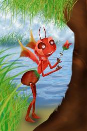 by darkshellie23 16818 views - final score: 61.9% | Strange Flower Field 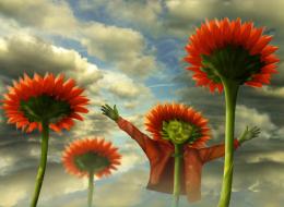 by vertigo 19340 views - final score: 61.4% | Rare Red Sunflowers 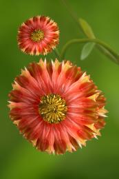 by Goberphoto 15152 views - final score: 60.4% |
Flower dragon 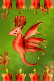 by chakra1985 6374 views - final score: 60.3% | Red Flower Swans 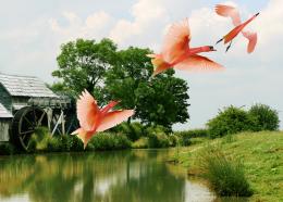 by erathion 11393 views - final score: 60.1% | birds in love... 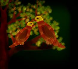 by sebykxxx 9550 views - final score: 56.8% |
The Corner  by sophia 5536 views - final score: 56% | Flower Fairy  by Hopelessromantic 7499 views - final score: 55.1% | red flower birds 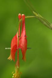 by shaiju1974 6271 views - final score: 54.7% |
Cock 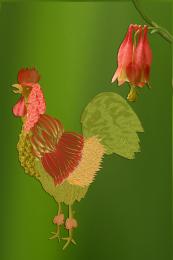 by vosya 7904 views - final score: 54.7% | Fat Head Jester Pup 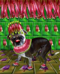 by GolemAura 8047 views - final score: 54.3% | Magical Flowers 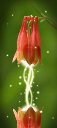 by numbsock 13222 views - final score: 54.2% |
Flower Angel  by ladybug 8401 views - final score: 53.7% | flower with bee  by andyar85 5473 views - final score: 53.2% | Street light  by Deki 6859 views - final score: 51.7% |
The Dance into Oblivion  by GolemAura 7499 views - final score: 51.4% | crabby  by wtfayla 4023 views - final score: 49.3% | Black Thumb  by Hopelessromantic 6924 views - final score: 48.5% |
Howdie Guest!
You need to be logged in to rate this entry and participate in the contests!
LOGIN HERE or REGISTER FOR FREE
author... this is absolutely brilliant... but just IMHO could you maybe soften the edge of the first bird ..or burn it a little... it's looking a little sharp (could be just my eyes.they aren't very good... I'm just thinking of the needed roundness) but still a very brilliant and engaging chop.. GOOD LUCK
This is a good start, you could start painting on more detail and using the doge and burn tools to create some depth, you have quite a while to change this, so i suggest you try playing around in photoshop.
wow! nice idea
Nice one. The only thing that bothers me a bit is the stick and the part inbetween the birds that are both red. If you'd give them another color (like green?), it would have more contrast with the birds and look less flat (as it is now, the stick and birds are one, including the flower's texture...makes it flat, imo). Good luck!
LOL - I want one, I want one! Agree with Wazowski - the perch would look better if it was a different colour to the birds, but a great idea and well executed!
thanks for your valued comments and I will do the changes.
Everybody already said what I was going to so I’ll wait until you make the changes to vote. Unique idea though.
Really like this one. Good luck
great idea
very nice work gl
Howdie stranger!
If you want to rate this picture or participate in this contest, just:
LOGIN HERE or REGISTER FOR FREE