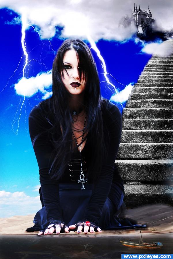
(5 years and 3820 days ago)
Big pigeon  by DML 39159 views - final score: 65.8% | a morning swim  by elficho 18161 views - final score: 64.4% | Giant Elephant  by nasirkhan 12969 views - final score: 63.7% |
somewhere....sometime 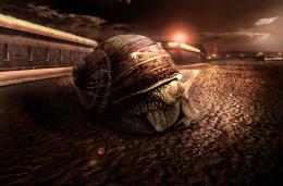 by genuine2009 10169 views - final score: 60.1% | Big sucker 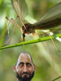 by CMYK46 11127 views - final score: 58.9% | Eve of Destruction 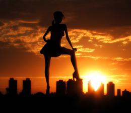 by pixelkid 5846 views - final score: 58.3% |
NewToy 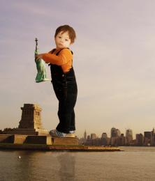 by nasirkhan 3815 views - final score: 57.5% | giant deer skull.... 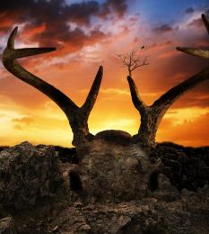 by spygirl1978 9144 views - final score: 57.5% | dreaming in daylight 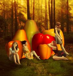 by niks1351 4791 views - final score: 56.6% |
he stole my foodbowl 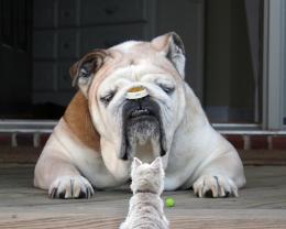 by demi 5049 views - final score: 56.4% | Bio 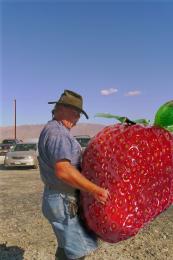 by filantrop 4249 views - final score: 55.6% | The slug monster 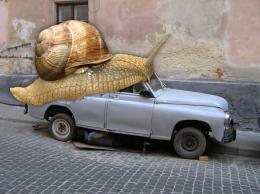 by sosipatra 6145 views - final score: 52.2% |
Fee-Fi-Fo-Female  by woodztockr 4177 views - final score: 51.8% | Mouzilla 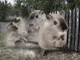 by mithrasr 3739 views - final score: 51.6% | Mollusk Bay 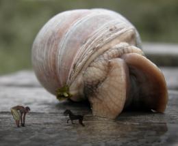 by RickLaMesa 6002 views - final score: 51.3% |
Ginormous Musician 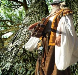 by artgirl1935 5233 views - final score: 49.2% | big banana 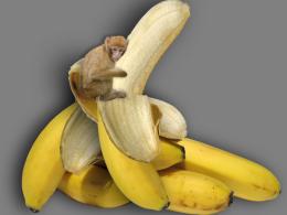 by demi 10739 views - final score: 48.3% |
Howdie Guest!
You need to be logged in to rate this entry and participate in the contests!
LOGIN HERE or REGISTER FOR FREE
I think you should work on the lighting and overall feel to the image, right now it looks like a collage of photos, so i suggest trying to match colours and create lighting from only one direction.
ponti55 is right. You would do well to take the advice because you could have a GREAT image with a few changes! Good luck!
I think more visual clues of ginormity such as a sailor and trees would add clarity and drama. Also, the reflection in the water should be the same size as the original, not squished.
nice idea : D.
when its 1 thing that is the size difference it appears as if that one thing is what size has changed... the theme is to make something big, not small, like what youve done with your boat.
i totally agree with ponti. you could create a new colored overlay layer with low opacity so everything on the image gets at least the same tones. kinda like sepia or something
love this
i just want to make the point that making an overlay of a single color will not fix the issue, it will just change the hue of everything here. that isnt a great suggestion. instead match the blue on top with the blue on the bottom, and get rid of the lightning. take that layer, and make some minor levels adjustments, and open hue and saturation on it, select only the blue channel in the hue and saturation and lighten it up a bit and adjust the hue so thats its more of a cyan like you have on the bottom.
nice job
Howdie stranger!
If you want to rate this picture or participate in this contest, just:
LOGIN HERE or REGISTER FOR FREE