
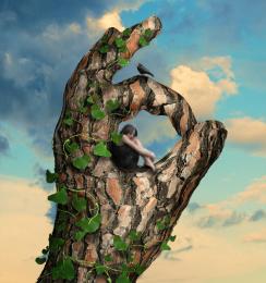
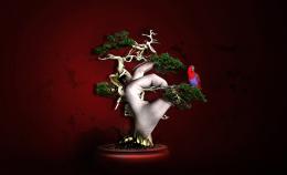
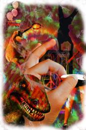
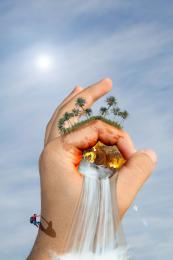
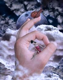
looks kind of like a motivational poster for effort... tried entering it into competition yesterday but doesn't seem to appear.. my first one...
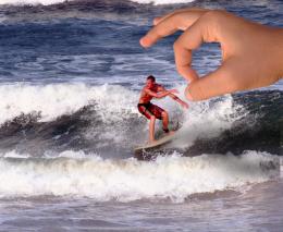
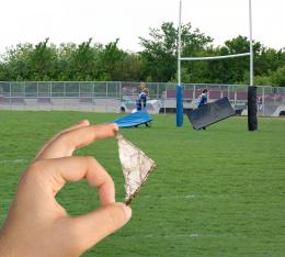
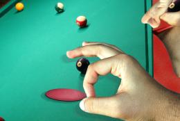
used blend modes/gaussian blur to blend pasted images
Thanks to Stockstill, Dracoart and midnightstouch from deviantart for the use of their materials. They're linked below.
Thanks to morguefile for the "climber"
edit: Thanks everyone for the great, and really useful, comments.
(5 years and 3816 days ago)
- 1: Cave
- 2: Trees
- 3: Waterfall Brush
- 4: Climber








really nice work. Should think about a step-by-step guide though.
the tree shadows are too much.
Your shadows are in the wrong place according to the son the hand! Yours should be on the other side. It's a cool idea....just needs a bit of correction. GL
I love the idea - this has some great potential. You just need to be a little more careful with your masking (look around and under the clumber, and on the right half of the trees). Fix that up and take another look at the shadows and youve got a great piece of work. I'll hold my vote for now. GL
really nice
@junkieball: gd point! will add it soon
@sparklen: haha thanks for pointing that out. I played around a bit, but i wasn't good enough to make it look nice soi just added a sun behind to hand to compensate :p. Thanks. @RayTedwell Thanks alot. I'll practice more. @elficho haha my gf thinks the same :P. @lycra thanks
Nice addition of the sun - that looks great. But to continue the constructive criticism, draw a straight line from the sun to the object (ie the climber) to see where the shadow will fall. Simple method but can add a whole lot of realism, and try to have the opacity of all the shadows looking dimilar too.
gl
great use of source. l like the addition of the climber.
Nice idea.....A little work on the shadows....fading and softening the edges. Over all, good job. GL
very nice job
Howdie stranger!
If you want to rate this picture or participate in this contest, just:
LOGIN HERE or REGISTER FOR FREE