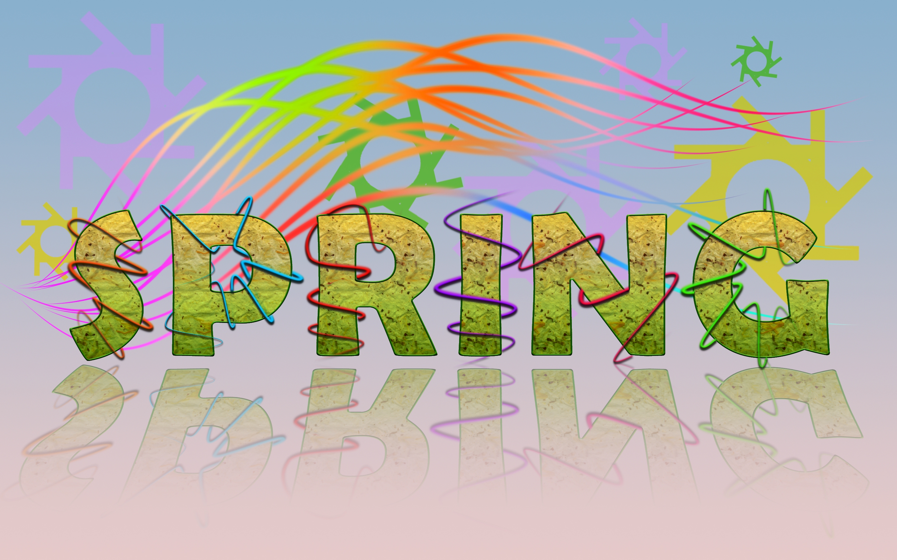
Changed the background. Brushes were taken out. Used pen tool to draw the lines and then stroked them. Flowers were drawn using the letter 'd' from Arial. (5 years and 3813 days ago)
City  by DML 40683 views - final score: 64.8% | FontFace Portrait.  by dollmommy 29738 views - final score: 64.4% | Type Portrait  by SulliGirl 35538 views - final score: 63.3% |
funny 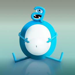 by coeff 26926 views - final score: 60.6% | Adam,Eve & The Forbidden Fruit 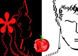 by metalhips 31351 views - final score: 60.3% | Merry Crimbo 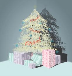 by tommo08 9181 views - final score: 59.6% |
Paris 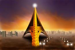 by fezjez 8683 views - final score: 59.6% | I GOT FISH 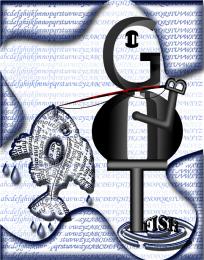 by closedeyes 7269 views - final score: 59.5% | Binary Sunset 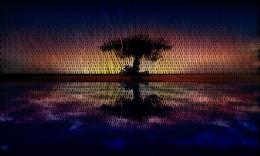 by artist3001 12320 views - final score: 59.5% |
type 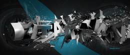 by neverlander 10521 views - final score: 59.1% | FontAll Boxed Up 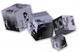 by dollmommy 5664 views - final score: 55.1% | Snake Charmer 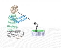 by nasirkhan 6966 views - final score: 54.9% |
woof club! 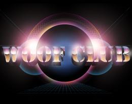 by bddesign 8669 views - final score: 54.4% | Dog 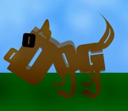 by Keiley22 9030 views - final score: 53.9% | the hills. 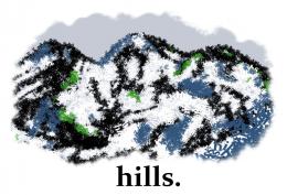 by elficho 5483 views - final score: 53.9% |
Dog! 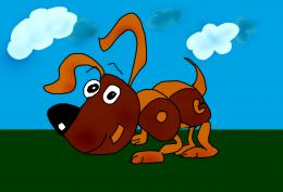 by Keiley22 5554 views - final score: 53.8% | Butterfly 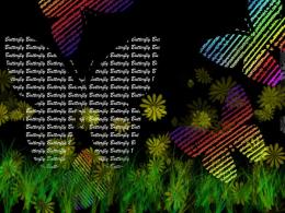 by alexstephen 8138 views - final score: 53.6% | is this on theme?  by neverlander 8203 views - final score: 53.4% |
A walk in the Park 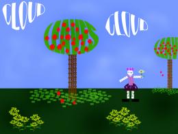 by Keiley22 6532 views - final score: 53.3% | Spring  by divair 6259 views - final score: 53.2% | Mandala  by CMYK46 5081 views - final score: 53% |
Pxl typography  by chakra1985 8048 views - final score: 52.8% | Shattered  by gwoodyii 6222 views - final score: 52.1% | Typo  by lahiripartha 5592 views - final score: 51.7% |
Demolition 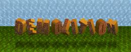 by divair 5521 views - final score: 51.7% | Simple Typography  by bedic 7477 views - final score: 51.3% | Creative Typography 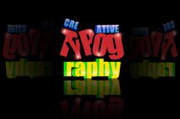 by bedic 7220 views - final score: 51.2% |
Psychedelic Swirl 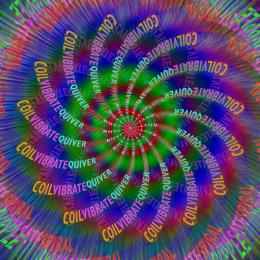 by jawshoewhah 18404 views - final score: 51.1% | Checkered  by jawshoewhah 4808 views - final score: 50.8% | typography  by ramananjv 7614 views - final score: 50.6% |
Crashed  by erathion 5343 views - final score: 50.3% | Kiddo!  by maXed 4307 views - final score: 50.2% | honey 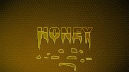 by ramananjv 5152 views - final score: 49% |
Typo  by swapna 5217 views - final score: 48.7% | stay tuned ..... 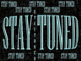 by preeth64 5997 views - final score: 48.6% | Fire 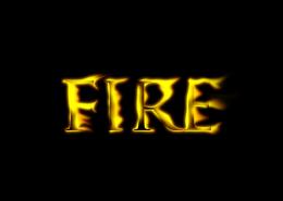 by Nator 6645 views - final score: 48.4% |
Nature  by sosipatra 5124 views - final score: 47.8% | Craters 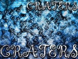 by alexstephen 3674 views - final score: 47.6% | love struck 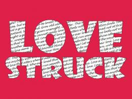 by sjpeters 6807 views - final score: 47.4% |
Unalienable Right 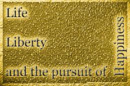 by aworld 7373 views - final score: 47.2% | Typography spherical  by Goberphoto 6900 views - final score: 46.5% | Owl of the night  by Allan 6296 views - final score: 46.3% |
SNOWY NIGHT... 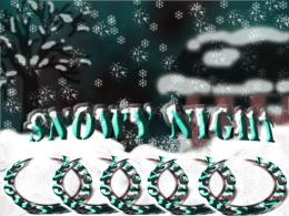 by preeth64 4951 views - final score: 45.9% | Simple Typography 2  by bedic 6129 views - final score: 44.6% | Leopard  by JEN750 5198 views - final score: 44.5% |
Howdie Guest!
You need to be logged in to rate this entry and participate in the contests!
LOGIN HERE or REGISTER FOR FREE
Photography and photoshop contests
We are a community of people with
a passion for photography, graphics and art in general.
Every day new photoshop
and photography contests are posted to compete in. We also have one weekly drawing contest
and one weekly 3D contest!
Participation is 100% free!
Just
register and get
started!
Good luck!
© 2015 Pxleyes.com. All rights reserved.


Too much space between SPRING & reflection...
if u might have added a dark back ground and some glow to the line..i may look better..any way gud work and i go with cmyk the distance to the reflection is high
reflection aside, this is a very good and refreshing entry
Thanks for your comments and suggestion people! Well, SPRING is supposed to be floating, hence the space between the word and its reflection. Besides, there is some lines that go beyond the border of some letters at the bottom. Ramananjv, I don't think that dark background goes well with spring I did ad glow to the lines, but it seems that the layer styles I applied spoilled it. I'll see about it.
The background is made with brushes? I dont think brushes are allowed?
MaXed: "It is allowed to design a creative background for your image, but this also has to be build from scratch, without any source images." Well, I built the background from scratch, creating my own brush. I used the letter "O"
@author. Then lot cooler
Very unique and color ful entry. I think people forget in this particular kind of contest, it's ok if the type looks floating because that's what I though of it when I saw it and no rules of gravity really apply so Well done.
I like this entry. although a dark background has been raised as an idea i like the brighter background. I think the spring idea has been presented well and i think the textured letters work in this creation. GL with your entry
Very bright and colorful entry, Good job with it! GL
very nice
Howdie stranger!
If you want to rate this picture or participate in this contest, just:
LOGIN HERE or REGISTER FOR FREE