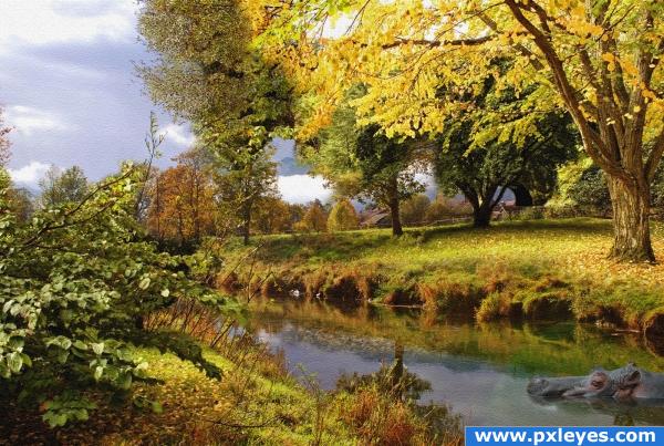
(5 years and 3814 days ago)
3 Sources:
- 1: autumn mornings
- 2: Hippo
- 3: Frame
Vintage Hollywood  by Feodora 29908 views - final score: 62% | Canvas  by velkanx 16484 views - final score: 60.8% | the crazy sluggish band  by ImmerVerloren 19002 views - final score: 59.6% |
Seasons 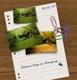 by divair 14308 views - final score: 58.7% | Autumn Along the Creek 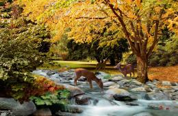 by artgirl1935 15851 views - final score: 58.4% | a sunny day 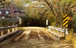 by ramananjv 8167 views - final score: 57.6% |
Peaceful Brotherhood 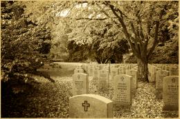 by bf2015 8923 views - final score: 57.4% | Four!  by woodztockr 4354 views - final score: 56.6% | Gone Fishing  by donh 4929 views - final score: 56.6% |
Piper and guitarist  by nasirkhan 7467 views - final score: 56.4% | Dream holiday  by basamferrari 5063 views - final score: 55.4% | Coldness  by siderismaris 4008 views - final score: 55.3% |
resting....  by adeincyprus 6009 views - final score: 54.3% | Moonlit Glade  by sparklen 10917 views - final score: 53.8% | Treebeard takes a stroll  by dustfinger 8675 views - final score: 53.6% |
Autumn change 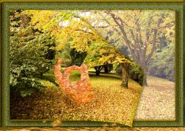 by shaiju1974 5467 views - final score: 53% | Stone Angel 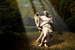 by divair 7041 views - final score: 53% | Fantasy Tree  by orientallad 5904 views - final score: 52.8% |
dog's secrets  by lankavatar 5222 views - final score: 52.7% | lovers  by blaine2nd 5265 views - final score: 52.7% | Free to Run  by Keiley22 5020 views - final score: 52.4% |
Fall Foliage  by Chuck 5501 views - final score: 52.4% | Blown Away  by Chuck 5674 views - final score: 51.3% | Are you afraid of the dark 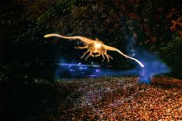 by aworld 8011 views - final score: 51% |
TEENAGER 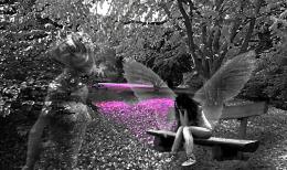 by lolu 4110 views - final score: 50.6% | moon light  by ramananjv 7903 views - final score: 49.9% | Autumn Beast 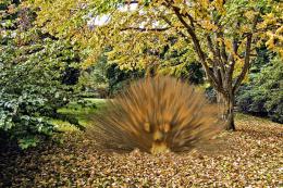 by descendent 5443 views - final score: 44.1% |
Howdie Guest!
You need to be logged in to rate this entry and participate in the contests!
LOGIN HERE or REGISTER FOR FREE
The frame is really distracting...pretty good blend of the other images...
Edit: Looks better to me now...
I agree (dare I say) with cmk about the frame. Other then that great image.
I agree with CMYK too. The first thing you notice is the frame and not your really great image. So I would really suggest to get rid of it or to use one, that is not that big. The blending is very good indeed! But maybe you could try to adjust the colour of the water around the hippo. It looks like a green circle around the hippo and I think, that it could look even better, if the area around the hippo looks more like the colour from the little river. Good luck!
Thanx 4 all ur comments. I got rid of the frame...
Beautiful composition and great blending, although the hippo bothers me. It seems he is more of a distraction than an addition to this beautiful piece. The reflection of the tree should be larger. Good luck!
gud composition andlooking good
I also think this hippo is a distraction...the first thing i did was checked in HR to make sure i wasn't seeing it incorrectly, and then questioning the hippos presence in the environment, not to mention the green halo around it...otherwise this is a beautiful image.
There is no green halo or something around the animal. I dont know why you think that its a halo or some1 says the water is really green around him..Its just the original shadow from the original source which i kept it during the manipulation ..thats it
author, there is green round the hippo.....it is not our imagination, and, imo it doesn't do this picture any justice. The image would have as much impact, if not more, without the hippo in it at all!!
Man I didn't even SEE the hippo at first, but after reading the comments, it made me wonder "What is a hippo doing doing in this fall scene in Ohio?" You really should take the hippo out. Also the blend of the yellow tree with the one to the side is not a smooth blend. That would be a good change for you to make. I must say that I DO like the texture you put over the image, it looks really good!
I m not going to remove the hippo!! I mean its a bit bizaarre that u always r thinking everything in real..This is photoshop, its all about art, forms, manipulations...Its not about the animals which are living in ohio or bla bla! I can put a dino or rhino etc..I can put what i want to...I dont understand what you think when you really look at a Salvador Dali painting or an Elsa Schiaparelli Dress??? Just tell me..I would appreciate any kind of your comments about my images and I do correct them when i have time, but pls no comments abt the imagination!
Extraordinary!
Actually you cna really see that it's from 2 pictures.. cause the heaven behind the autumn tree doesnt match the one from the other pic.. And its much more yellow. otherwise really cool
nice, don't know what to think about the hippo though.
I agree with the hippo comments about him not quite fitting but this is one of the best I've seen as far as how you put it all together and made it look like a painting so well done!
Very very nice,i like this one so much....
Nice blend...imaginative use of sources...good job!
COOL A HIPPO.mine is missing ,( this is not mine thou , he is pink),!!!!!! weird, yes! belongs geographically NO! creates a discussion point YOU BET! apart from a pretty scene what would be the focus of this image?Is it not a mark of a true artist if ones art work can create conversations?
beautiful image
Congratulations for 2nd
YEA!!! and the HIPPOS have it..... second place well done
Congrats for your second place, Velkanx!
congrats!
congrats
Howdie stranger!
If you want to rate this picture or participate in this contest, just:
LOGIN HERE or REGISTER FOR FREE