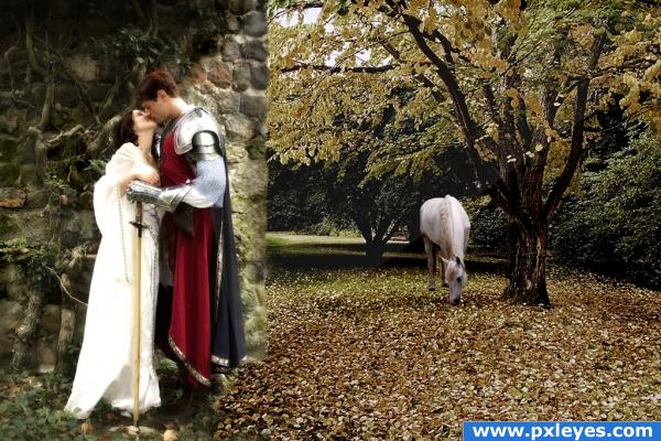
I blended the two sources, and maipulated the colors. I wanted to tone down the yellow. I also used Highpass+overlay to create a more sureal look to it.
equineator - photo of horse
and has been notified. (5 years and 3788 days ago)
Vintage Hollywood  by Feodora 29857 views - final score: 62% | Canvas  by velkanx 16459 views - final score: 60.8% | the crazy sluggish band  by ImmerVerloren 18938 views - final score: 59.6% |
Seasons 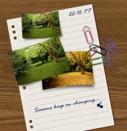 by divair 14283 views - final score: 58.7% | Autumn Along the Creek 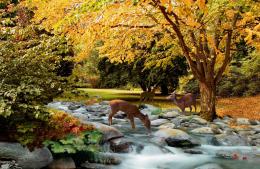 by artgirl1935 15820 views - final score: 58.4% | a sunny day 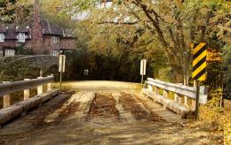 by ramananjv 8129 views - final score: 57.6% |
Peaceful Brotherhood 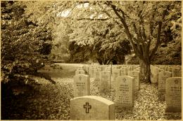 by bf2015 8873 views - final score: 57.4% | Four!  by woodztockr 4327 views - final score: 56.6% | Gone Fishing  by donh 4890 views - final score: 56.6% |
Piper and guitarist  by nasirkhan 7419 views - final score: 56.4% | Dream holiday  by basamferrari 5033 views - final score: 55.4% | Coldness 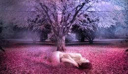 by siderismaris 3984 views - final score: 55.3% |
resting.... 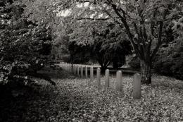 by adeincyprus 5985 views - final score: 54.3% | Moonlit Glade  by sparklen 10841 views - final score: 53.8% | Treebeard takes a stroll 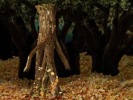 by dustfinger 8610 views - final score: 53.6% |
Autumn change 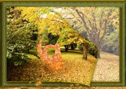 by shaiju1974 5441 views - final score: 53% | Stone Angel 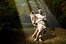 by divair 7012 views - final score: 53% | Fantasy Tree 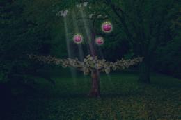 by orientallad 5881 views - final score: 52.8% |
dog's secrets 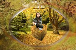 by lankavatar 5189 views - final score: 52.7% | lovers 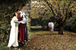 by blaine2nd 5245 views - final score: 52.7% | Free to Run  by Keiley22 4994 views - final score: 52.4% |
Fall Foliage  by Chuck 5473 views - final score: 52.4% | Blown Away  by Chuck 5636 views - final score: 51.3% | Are you afraid of the dark 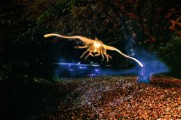 by aworld 7962 views - final score: 51% |
TEENAGER 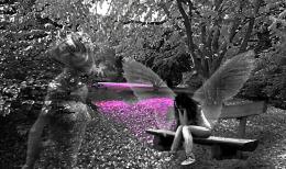 by lolu 4084 views - final score: 50.6% | moon light  by ramananjv 7878 views - final score: 49.9% | Autumn Beast 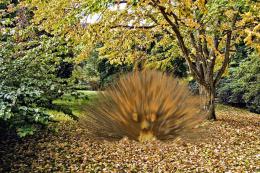 by descendent 5420 views - final score: 44.1% |
Howdie Guest!
You need to be logged in to rate this entry and participate in the contests!
LOGIN HERE or REGISTER FOR FREE
try to blend in the wall in so it looks natural
Yes the wall just looks strange being in front of the tree...just not convincing...but very good nonetheless
the leaves on the ground don't match and there is a white line running through your image. You also need to play with your lighting and shadows goodluck.
Sharpen the edge of the wall & duplicate some leaves so they continue beneath the figures...(Also the light source on the wall & figures is opposite that of the source pic...).
the idea is good, but i agree with they because the edge of the wall is.... don´t natural and the ground too. The hourse look good.
Awesome!
nice idea but the perspective doesn't match. The persons plus the wall are either too big or too high. They should be either smaller or move it down to around their knees. I guess that would make it fit.
Good attempt but yeah I agree with everyone. Just keep trying author, you'll get it.
has a few challenges in its creation that have already been highlighted.. however, i love your ideas.Cant wait to see what you create when you develop more skills.GL>
great idea
Howdie stranger!
If you want to rate this picture or participate in this contest, just:
LOGIN HERE or REGISTER FOR FREE