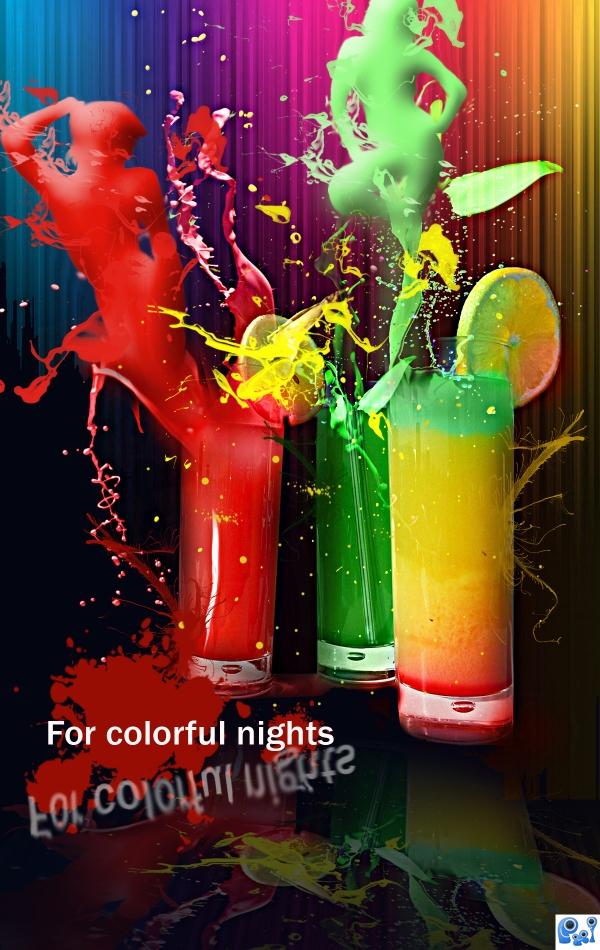
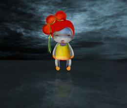
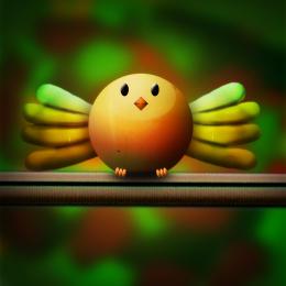
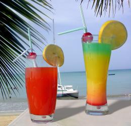
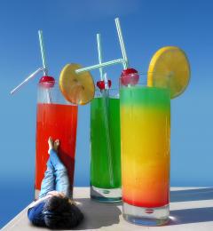
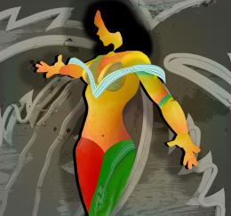
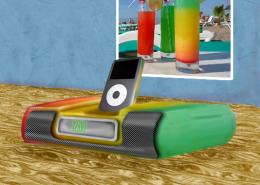
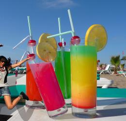
Used the threshold option for turning the images into opaque silhouettes. Than, in order to offer them a glossy effect I've used the bevel and embross option. The paint splashes made by http://mediamilitia.com are gorgeous and have been very helpful. The colorful lines in the background have been created using the gradient tool, modified after that with the waves distortion filter. the rest is simple :P
I have been inspired by this tutorial.
http://10steps.sg/tutorials/photoshop/making-of-the-imaginary-paint-dancers/
Check it! Is great!
credits and thanks:
http://katanaz-stock.deviantart.com
http://mediamilitia.com
http://emelody.deviantart.com (5 years and 3871 days ago)

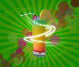
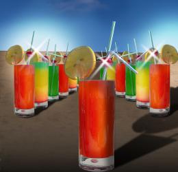

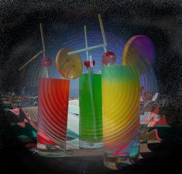


Interesting image. Type & reflection not so interesting...change or remove it, get higher vote.
this would be a great poster for a night club or something awsome work.
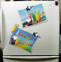
I agree with CMYK, i dont see why the text is there at all. Take that off and fix the reflection and youll have a great image. I think you should pay tribute to the paint dancers (or whatever its called) which clearly looks like the inspiration for this piece. This should really have a proper SBS too - I dont think you can get away with your brief description.
I like it a lot, but in my opinion the splashes should be a little bit more transparent, they are still drinks and no paint.
u should make the shapes a little more defined with a bit of strong shadows and not just bevel and emboss the layer. Doesn't look realistic. The idea is great. Also u should make the liquid a bit more transparent give it some reflections. Good luck and all the best to u
Excellent, I adore this work . All the best
the background is too much vivid and attract too much attention
text is too much,everything else damn good...gl author
interesting and colourful use of source, i agree with other commenters on the few changes required.
Wow this is stunning! Since a long time I intend to try that great "Making of the Imaginary Paint Dancers" tut and now I am inspired to do it at last

Agrees with removing type.
The title says it all, no need for the text in my opinion, but i really like the work put in here, the depth on the figures is very well done. G'luck!
would have given a higher vote if text was removed, it pretty much ruined it for me.
Congrats, well done
congrats on your first place
Congrats!
Congrats!!
WOW...a first place with major flaws...standards are definitely sinking fast...
Howdie stranger!
If you want to rate this picture or participate in this contest, just:
LOGIN HERE or REGISTER FOR FREE