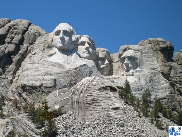
cut out head image and pasted onto rushmore image. blended with erase tool and adjusted with hue saturation tool. (5 years and 3794 days ago)
1 Source:
- 1: source1
Crying... 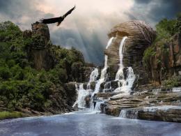 by Clinge 27502 views - final score: 64.8% | The House that Jack Built 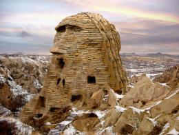 by RickLaMesa 14328 views - final score: 62.3% | Sand Sculptors 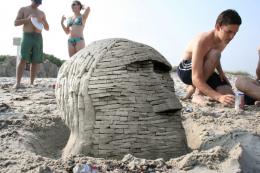 by RickLaMesa 11599 views - final score: 58.1% |
Ancient Enigma 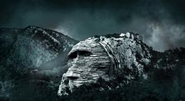 by velkanx 11766 views - final score: 57.7% | Ancient 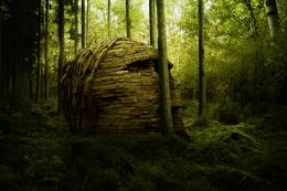 by ponti55 10495 views - final score: 57.2% | Civilization 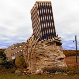 by oana 3898 views - final score: 57% |
Stop Killing Mankind 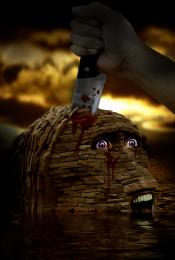 by nasirkhan 5324 views - final score: 55.5% | Change 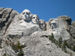 by Hoov 10565 views - final score: 53.3% | Stoned Indian  by momvera 9998 views - final score: 49.5% |
Stone Indian Street Art  by chuxtable 7816 views - final score: 47.6% |
Howdie Guest!
You need to be logged in to rate this entry and participate in the contests!
LOGIN HERE or REGISTER FOR FREE
It would be nice to see a high resolution version of this. I like the idea!
a bit cliché in my opinion, but good colour matching. Perhaps boost up the contrast a bit.
I'd think the metal feather would have to go, but not bad otherwise...
I worked on something similar once I saw your entry I stopped I will post it in forums
nice idea but would love to see the high res for a fair judgement
Howdie stranger!
If you want to rate this picture or participate in this contest, just:
LOGIN HERE or REGISTER FOR FREE