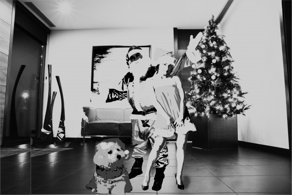
Mr & Mrs Claus and their Doggy Claus in their new home ! (5 years and 3783 days ago)
- 1: Santa Claus
- 2: Santa Woman
- 3: Santa Dog

Mr & Mrs Claus and their Doggy Claus in their new home ! (5 years and 3783 days ago)
Dance of the Dragonflies  by artgirl1935 10822 views - final score: 63.1% | Santa Snapped!  by pixelkid 11402 views - final score: 62.4% | Ulterior Interior  by Barnacle 12496 views - final score: 58.1% |
WHAT IS THIS PLACE ? 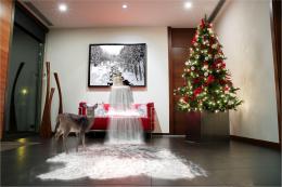 by cterraza 10837 views - final score: 57.7% | underwater 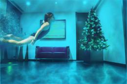 by mohit007 10447 views - final score: 56.1% | Merry Christmas everybody :-) 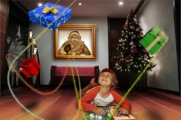 by Clinge 5885 views - final score: 56.1% |
santas little helpers 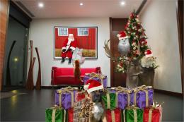 by demi 6131 views - final score: 53.9% | Ooops! Wrong tale.... 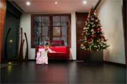 by divair 6974 views - final score: 53.8% | Surrealistic lounge 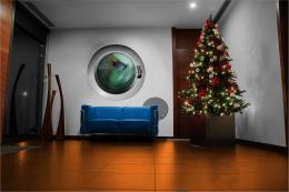 by delma 7065 views - final score: 53.8% |
Red 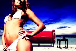 by genex 3915 views - final score: 53.2% | open plan 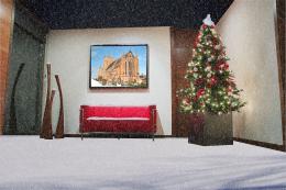 by JEN750 7716 views - final score: 52.8% | santa is coming to good kids 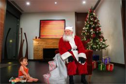 by sebykxxx 7440 views - final score: 51.2% |
Close up of Print. 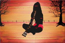 by scratzilla1 4787 views - final score: 51.1% | room 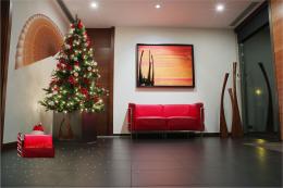 by sihsan 5515 views - final score: 50.7% | Claus Family  by paras 5341 views - final score: 45% |
Howdie Guest!
You need to be logged in to rate this entry and participate in the contests!
LOGIN HERE or REGISTER FOR FREE
your suggestion please !
I suggest giving them shadows and finding a usable source image for the baby...
The sources you are mentioning are only available if you are a member, better is to use the URL like this: http://www.sxc.hu/photo/1121815 , then everybody can see the source
no offence author, but this is very hard on the eyes. Why did you choose to go with this very high contrast image for the people?
Ditto Ray
Ok thanks ! i'll try to fix it and put another baby pic !
sorry ! could not find any baby claus ! i repleced it with a dog ! is it ok now ?
other than the high contrast, I am distracted by how disproportionate the people are to the room. The dog is a giant compared to the size of the people and the seem pretty small in proportion to the tree and the sofa
i;m only a beginner u know... i've just started photoshop since the last few days...
ok, first of all we know you're a beginner, no offence intended but you are obvoiusly playing around with cutting & pasting, different filters etc. What you need to ask yourself is why am I editing the image this way?... Is it to give it an old school b&w photo effect, something more abstract etc. Unfortunately this has just taken what look to be some decent stock images and made them hard to look at. But continue to play and you'll find what looks good - and dont be afraid to ask people here for advice, there are some talented people here (I'm still a beginner too but I hope this helped )
)
Thanks RayTedwell ! I'll try to do so ... :P
:P
Howdie stranger!
If you want to rate this picture or participate in this contest, just:
LOGIN HERE or REGISTER FOR FREE