
This was a bit tricky because there is three light sources.
The circle I duplicated and rotated it around.
Cathrine Langwagen- Thanks for the stock photo of the lady (5 years and 3858 days ago)
Wild Abstract  by CorneliaMladenova 10556 views - final score: 59.9% | Semper Ubi Sub Ubi  by DeltronZ 30984 views - final score: 59.9% | pull,pull  by mariosilva 21108 views - final score: 57.4% |
Snake showpiece  by lahiripartha 9578 views - final score: 56.8% | New at the BBQ Potholders  by Drivenslush 9654 views - final score: 56.7% | Pissed on! 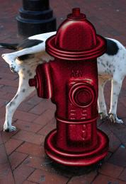 by jawshoewhah 4679 views - final score: 55.8% |
Jet Pack Test 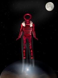 by xwd 8106 views - final score: 55.6% | MP3Player 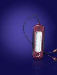 by sophia 4975 views - final score: 55.6% | air plane 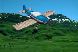 by jaescoe21 7185 views - final score: 55.3% |
string butterfly 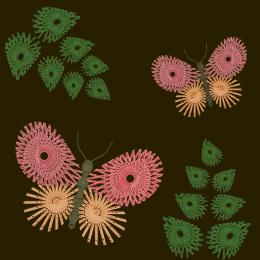 by jaescoe21 11429 views - final score: 54.8% | Three Aching Necks 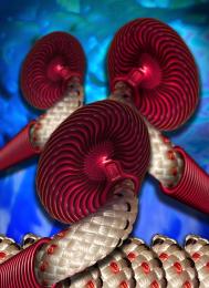 by Drivenslush 5316 views - final score: 53.8% | Through the Door  by blaine2nd 5625 views - final score: 53.3% |
Chained Rainbow 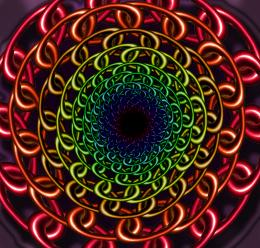 by jawshoewhah 7737 views - final score: 52.9% | Teething ring  by lydyth 7115 views - final score: 51.9% | The escape artist 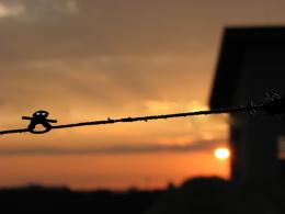 by lydyth 5666 views - final score: 49.2% |
Howdie Guest!
You need to be logged in to rate this entry and participate in the contests!
LOGIN HERE or REGISTER FOR FREE
If you tone down the highlights on the red circle from the source, this would look much better, You have an interesting idea, but it just doesn't fit in this scene light wise or light source wise. The masking could do with a bit of work as well.
try adding some shadow from the head and the stick because you have light and light will make shadows.
Complement colors, nice
Bad, bad edges...clean this up for a better vote...the idea's not bad. Use pen or lasso tool to extract images neatly.
You can also use liquefy/push tool to make the edges strait. You also might want to put a ripple effect where the ring touches the water.
idea is great but croping is not that good...good luck author
Howdie stranger!
If you want to rate this picture or participate in this contest, just:
LOGIN HERE or REGISTER FOR FREE