
Created in Photoshop 8.0 (PS2) (5 years and 3772 days ago)
1 Source:
Some friends from Africa  by mqtrf 24034 views - final score: 64.1% | Shoe 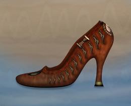 by CorneliaMladenova 16391 views - final score: 63.3% | What is it? 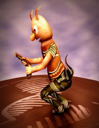 by nasirkhan 15702 views - final score: 62.8% |
Give to me.. 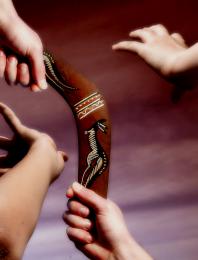 by hidra 17012 views - final score: 55.9% | far away 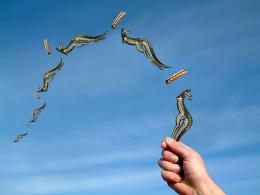 by roon 17012 views - final score: 55.8% | Treasure of Boomerang  by mohit007 6275 views - final score: 55.5% |
Clam Mouth 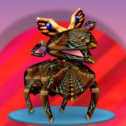 by Drivenslush 5107 views - final score: 52.9% | Useful tool 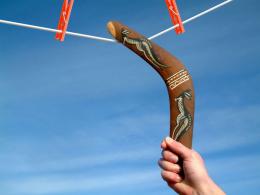 by xxTTcc 5853 views - final score: 52.9% | TribalDesign 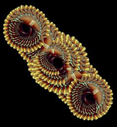 by mysaurav 4740 views - final score: 51.7% |
Tattooed Paradise 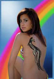 by jawshoewhah 11068 views - final score: 51.2% | WoodCarvings  by mysaurav 4441 views - final score: 51.1% | Yummy...  by JasperTwq 4943 views - final score: 50.2% |
Howdie Guest!
You need to be logged in to rate this entry and participate in the contests!
LOGIN HERE or REGISTER FOR FREE
Try to work on the hair masking...more detail, softer edges.
I'll work in it after I'm done voting. I was thinking the same thing myself when I uploaded it but didn't think it was too noticeable.
EDIT: fixed the hair.
I have a gut feeling this isn't going to do well. I probably shoud have selected a different skin model source for an external. It's ok if anyone doesn't like this for any reason. Won't hurt my feelings. Take a hint from CMYK. Anything is better than nothing.....
The background is very weak in my opinion and i would choose another border colour due to the fact taht this one is too close to the background hue
Pretty good idea but the tattoo doesn't look realistic...You can eithe lower the opacity or you can duplicate it, lower the opacity of first layer and then play with the blending modes on the duplicated layer...
Ponti and Giggles: thanks for the tips. I wanted to keep the original background to eliminate the using of minimal souce. I honestly don't know where to go with the background but I though a black background wouldn't fit either. I guess I need a suggestion. I felt the tattoo was lacking definition and realism as well and I appreciate that tip. I should have an edit by tomorrow if you want to check back. Thanks again!! Comments GREATLY appreciated

Ehh... ran out of time.
Howdie stranger!
If you want to rate this picture or participate in this contest, just:
LOGIN HERE or REGISTER FOR FREE