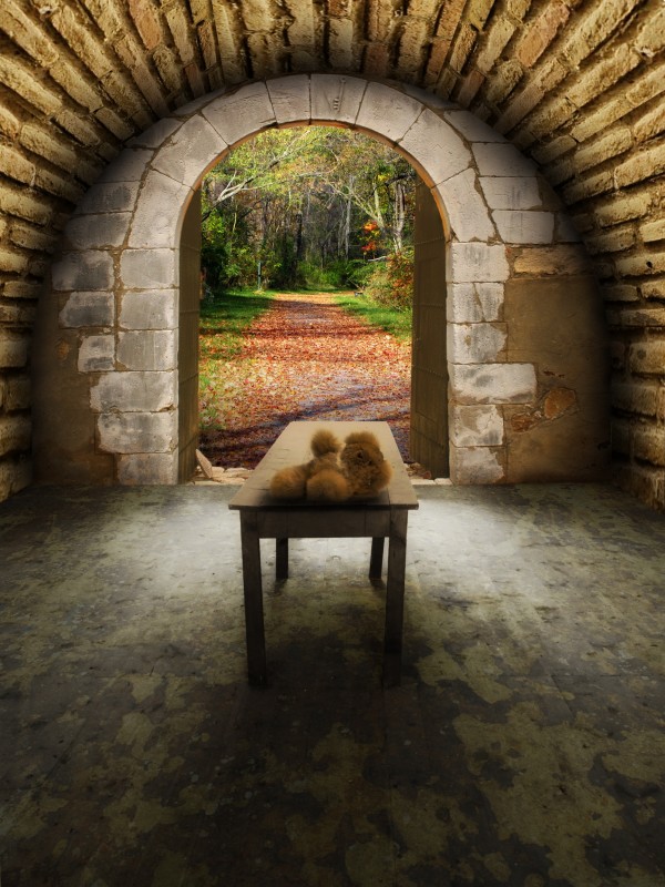
(5 years and 3748 days ago)
5 Sources:
- 1: Medieval door
- 2: Landscape
- 3: Brick wall
- 4: Teddy bear
- 5: Concrete floor

(5 years and 3748 days ago)
Home office  by divair 35679 views - final score: 62.7% | Waiting  by nasirkhan 32763 views - final score: 62% | World  by CorneliaMladenova 31905 views - final score: 61.8% |
Winter Hibernation  by donh 37734 views - final score: 61.4% | "Why?"  by pingenvy 42255 views - final score: 61.2% | The world out there 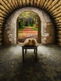 by divair 6827 views - final score: 58.9% |
Prisoner's hope  by marina08 6818 views - final score: 58.9% | Fight for Treasure  by nasirkhan 6675 views - final score: 58.4% | NEW ROOM  by oana 8330 views - final score: 58.1% |
Happy New Year!!!!!  by artgirl1935 4869 views - final score: 56.7% | In full bloom  by divair 5238 views - final score: 55% | Space Invaders in Gray  by Drivenslush 5617 views - final score: 54.6% |
Three Little Pigs  by Drivenslush 11801 views - final score: 54.4% | Butcher  by filantrop 4101 views - final score: 53% | A delicate obscure Perspective  by jawshoewhah 13276 views - final score: 52.8% |
Oh! my fate!! 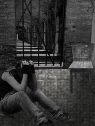 by shaiju1974 4944 views - final score: 50.9% | slaughter 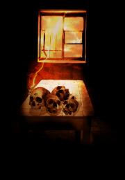 by mariosilva 4315 views - final score: 50.9% | The Observer 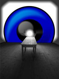 by gotmeamuse 5670 views - final score: 50.1% |
Howdie Guest!
You need to be logged in to rate this entry and participate in the contests!
LOGIN HERE or REGISTER FOR FREE
Maybe the wood & stone shouldn't be the same color, but good job over all...

Thank you CMYK Everything colourized or texturized now...
Wow...really a LOT better now!
i dont know, but the perspective seems a bit wrong from my site of view.. i really don't know .. :p
Well put maXed. There are two things that make for this impression: the table, which is askew, and the path outside. The table bends to the right and the path to the left. I didn't change the original table and the floor under the texture
Its the door that looks askew. I see you were trying to follow the trail but I think it would look better if it was just equally balanced with the same width on both sides. Just my opinion.
Right, I turned round the wall where the door is about -1º. It's the same degree I turned the source image round as to get its horizontal lines straight (It's easy to see the source image is askew when you turn the grides on). I turned the landscape round too, a bit to the right. Thank you
the teddy bear looks out of place i don't know if you can do this lol (but probably just add a new layer) add noise to the room on the inside and leave the forest bright so it catches your eye
Thanks for your suggestion kayaklovergirl, but the idea is not make the forest catch the eye but integrate the whole. As for the teddy bear, I think that an abandonned toy in a place always makes emptiness and loneliness greater. Well, one may assume that there was a child in the room and now he is playing in the forest out there
This image, looks real good. Illumination coming from the outside is good. Probably darkening the wall (front) by the door, a little, and the doors look kind of dark. If light is coming from the outside and the door is open, it would be a "little" more highlight over it. A kind of clear, brownish color will do it, just like you did at the bottom left, by the door stop, (stone). The teddy bear is ok as it is, and it brings a special feeling to your work. Good luck!
Thank you George! Changed...
looks better....
Nice work author. Looks nice
Howdie stranger!
If you want to rate this picture or participate in this contest, just:
LOGIN HERE or REGISTER FOR FREE