My source pic (5 years and 3761 days ago)
Save Me  by jaskier 20627 views - final score: 62.5% | Family Time  by kekskruemel 13554 views - final score: 61% | Think Green  by sjsmiuk 16318 views - final score: 60.7% |
Go Green!  by Brandon 14692 views - final score: 59.3% | Tree of Life  by Graphopoly 15069 views - final score: 58.7% | flip the switch, go green  by jaescoe21 8799 views - final score: 58.2% |
Drain  by ponti55 4108 views - final score: 57.1% | Live Green! 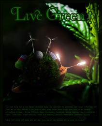 by Lith3on 4134 views - final score: 56.9% | MotherEarth  by genuine2009 4673 views - final score: 56.7% |
don't wanna die  by mohit007 6229 views - final score: 56.6% | Think it over  by divair 5363 views - final score: 54.5% | save earth  by closedeyes 16922 views - final score: 53.9% |
Keep it clean!  by JoeCacia 7692 views - final score: 52% | Harvest Rain 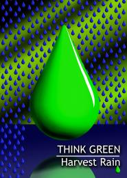 by Drivenslush 5231 views - final score: 51.8% | It isn't ours anymore. 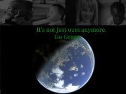 by Suicidesquid 12407 views - final score: 51.1% |
Turbine  by sjsmiuk 3873 views - final score: 50.8% | Time for Solar 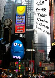 by Drivenslush 4616 views - final score: 48.8% |
Howdie Guest!
You need to be logged in to rate this entry and participate in the contests!
LOGIN HERE or REGISTER FOR FREE
Photography and photoshop contests
We are a community of people with
a passion for photography, graphics and art in general.
Every day new photoshop
and photography contests are posted to compete in. We also have one weekly drawing contest
and one weekly 3D contest!
Participation is 100% free!
Just
register and get
started!
Good luck!
© 2015 Pxleyes.com. All rights reserved.


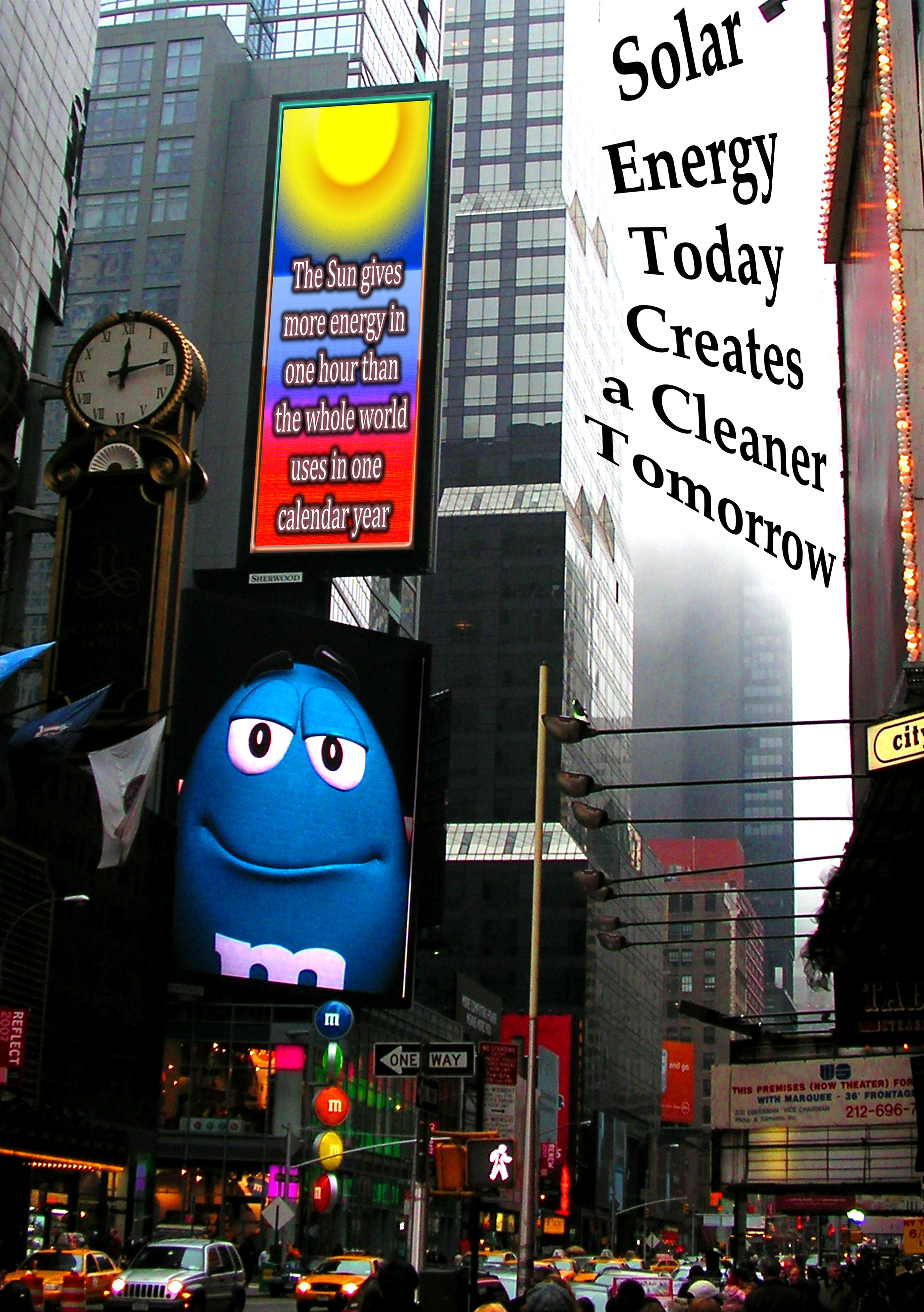
The only thing that doesn't seem to look right is the "Solar energy today creates a cleaner Tomorrow" sign. It seems to be written on the fog in the air.
that's the poster part... unless I read the contest goal wrong (look at the comment area) they said they wanted typography
A poster that blends into the rest of the street? Typography is optional and nothing wrong with it but it just looks like it's floating in air. It doesn't look as real as the other signs.
err Umm.. the whole Image is a poster.. that's why the text is floating
Skewed type doesn't work well, & letters are not uniform sizes...
oooook.
very nice
Howdie stranger!
If you want to rate this picture or participate in this contest, just:
LOGIN HERE or REGISTER FOR FREE