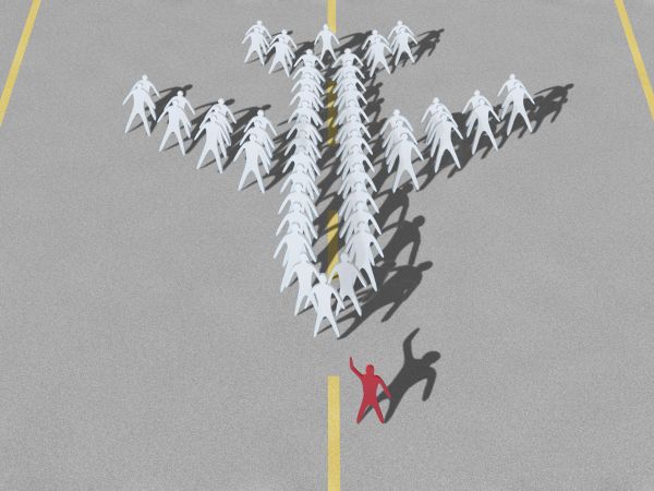
Laborious job. Management elements and their shadows, taking into account size and perspective.
Reference plane shape.
Edit: background surface blur. (5 years and 3757 days ago)
Plane formation  by Goberphoto 19821 views - final score: 60.8% | Prepare for Glory!  by Graphopoly 16569 views - final score: 59.8% | POP!  by buzzy 12538 views - final score: 57.1% |
New Order  by Suky04 11808 views - final score: 56.7% | Paper Dolls  by jawshoewhah 11919 views - final score: 56.1% | There are Men in My Mouth  by Drivenslush 8000 views - final score: 56.1% |
Hold Onto a World Leadership  by anthonysalin 10591 views - final score: 53.6% | Shooting Practise  by Barnacle 5053 views - final score: 50.5% | ring  by sihsan 5194 views - final score: 50.4% |
OUCH!  by buzzy 5624 views - final score: 48.4% |
Howdie Guest!
You need to be logged in to rate this entry and participate in the contests!
LOGIN HERE or REGISTER FOR FREE
very nice,The shadows and the illumination seems to be done with GI!
Clever idea. I'm sure it must have taken you some time to get it just right.
cute idea
Looks like very hard work well done.
Funny idea. Maybe I wouldnt expect darker shadows there where 2 shadows cross each other, since it's all from a same light source. Good luck!
Thank you all for your kind comments. Edit 2: Remove overlapping shadows and add a little blur.
Nice.
nice job with the shadows
great
Congrats, really well done
Congrats for your first place, Goberphoto!
Congrats
Thank you very much for your votes, congratulations and comments. It is my high score. I'm happy.Also congrats the other participants for their great works.
Howdie stranger!
If you want to rate this picture or participate in this contest, just:
LOGIN HERE or REGISTER FOR FREE