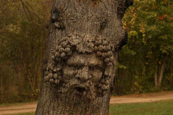
(5 years and 3753 days ago)
1 Source:
- 1: old man
old tree man  by sanky89 28186 views - final score: 60.1% | the eating tree  by jaescoe21 32938 views - final score: 57.8% | Land of the Dead  by Graphopoly 14067 views - final score: 57.3% |
Totem  by Aloisnin 13694 views - final score: 56.5% | Woody Allen 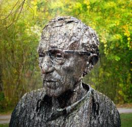 by RickLaMesa 11391 views - final score: 56.4% | Mr. Olderwood 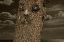 by Poss 3980 views - final score: 55.2% |
Tree Frog 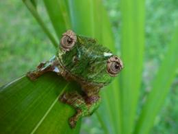 by Eleventy 6143 views - final score: 54% | Say CHEESE!!! 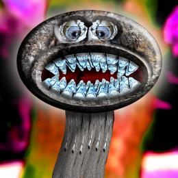 by Drivenslush 4666 views - final score: 52.5% | The men of the forest 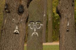 by atallchic 5371 views - final score: 52.1% |
Old Man Dog Called Shot Gun 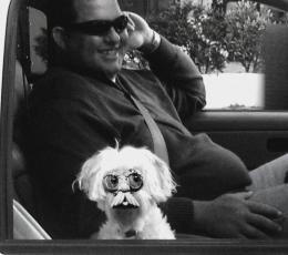 by Drivenslush 11086 views - final score: 51.7% | Inchworm 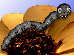 by Drivenslush 3452 views - final score: 51.2% | Old Tree Gallery 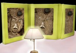 by shaiju1974 5622 views - final score: 50.4% |
E=mc2 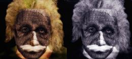 by Aloisnin 4784 views - final score: 49.8% | Treemann 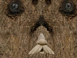 by zahbo 3684 views - final score: 48% | Hi There! 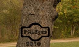 by Chuck 3817 views - final score: 45.3% |
Similar Pieces 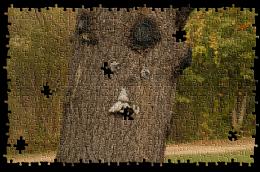 by sjsmiuk 5104 views - final score: 45% |
Howdie Guest!
You need to be logged in to rate this entry and participate in the contests!
LOGIN HERE or REGISTER FOR FREE
Light rays are at wong angle...
You know how on the 4th of July and all the fireworks go off and the people go OOOOO... AWWWWEEEEE.... that's this piece LOL..great Idea!!
EDIT: I thought it was a streaked window not light rays... FYI
CMYK46 you just are being to critical of everybody.... so just be quiet if you don't have anything nice to say
Jeez! CMYK46 is just trying to help. The more realistic the better right? I would want people to point out my mistakes also. If one chooses to change it or not is the author's decision but it is good that CMYK46 is trying to help make the chop more realistic or correct.
BTW author, good job. The chop would be nice without the rays. Are you going for a window effect?
The light rays do give it the illusion of looking through a window. You should do that. Make it look like you're looking out of a window, meaning add an actual window frame from the inside of a home. I think it would add more to the effect. Just a suggestion.
Thanks 4 all ur comments and suggestions.. keep helping me improve...
What happened to the right side of the tree? fixing that and remove the light rays and its will be closer to perfection (in my opinion)
I also get the feeling that the face is floating infront of the tree, and not a part of it. I think sharper edges would make a difference here
I'm agree with CMYK the lights are wrong:S
this looks great now!
Now looks great ...
The correct link for your source is: http://www.sxc.hu/browse.phtml?f=view&id=1159162.
great job
Congrats, nice work
Congrats for another first place, Sanky!
Howdie stranger!
If you want to rate this picture or participate in this contest, just:
LOGIN HERE or REGISTER FOR FREE