no out side sources used (5 years and 3737 days ago)
Welcome to ...  by Eramono 28038 views - final score: 62.5% | Roadsign Mayhem  by Scribble 12630 views - final score: 57.8% | On my way  by divair 11512 views - final score: 57.5% |
Everywhere is Signs!!!  by dollmommy 13128 views - final score: 56.4% | GO UP! by Drivenslush 10289 views - final score: 56% | Beach cabins  by divair 6104 views - final score: 55% |
halloween comes earlyy !!!  by skand 6399 views - final score: 54.6% | Snow in all directions  by Goberphoto 6643 views - final score: 54.4% | Eat Healthy 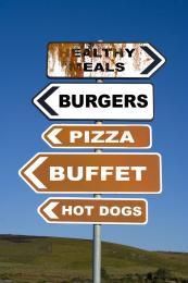 by fatz8016 7388 views - final score: 53.6% |
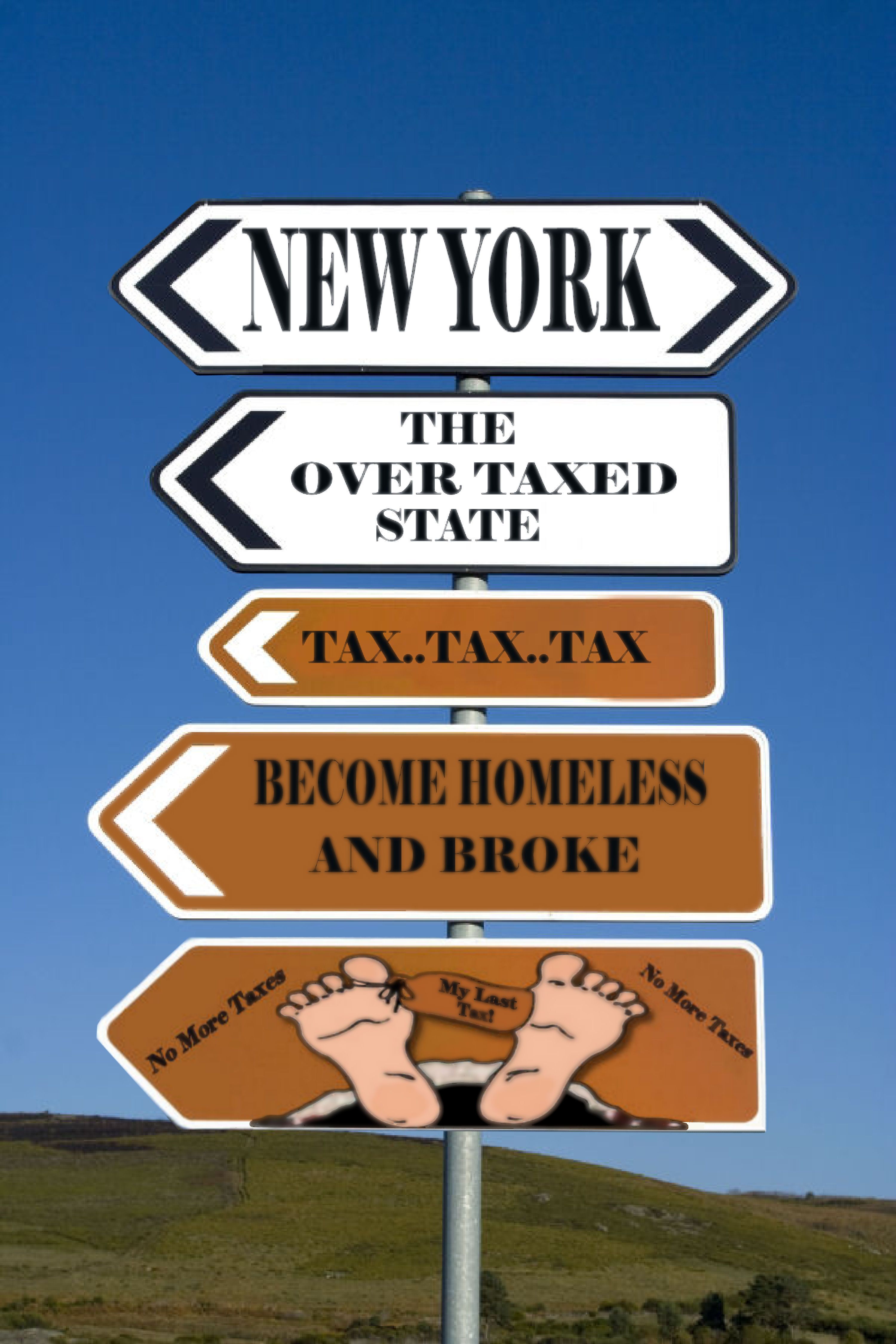
Anywhere provided it's here  by divair 5431 views - final score: 52.7% | windmill 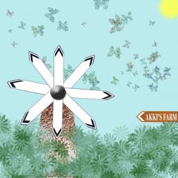 by akshaysvilla 7809 views - final score: 52.2% | Tax.. Tax & More Tax!  by Chuck 5215 views - final score: 51.1% |
LIFE SIGNS 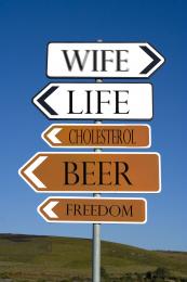 by derdevil 8543 views - final score: 50.9% | FOLLOW THE YELLOW BRICK ROAD 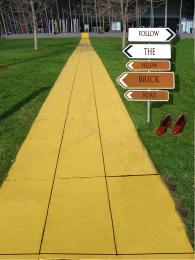 by SHIPLEYGIRL 11625 views - final score: 50.2% | signfire  by Maya3D 3774 views - final score: 50% |
All roads lead to.....  by JEN750 7309 views - final score: 49.4% | Don't tell anyone! 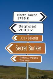 by roymeddy 5320 views - final score: 47.9% |
Howdie Guest!
You need to be logged in to rate this entry and participate in the contests!
LOGIN HERE or REGISTER FOR FREE
Photography and photoshop contests
We are a community of people with
a passion for photography, graphics and art in general.
Every day new photoshop
and photography contests are posted to compete in. We also have one weekly drawing contest
and one weekly 3D contest!
Participation is 100% free!
Just
register and get
started!
Good luck!
© 2015 Pxleyes.com. All rights reserved.


Needs a high res...can't read the red type. (And hey, just be glad you don't live in NJ like me!).
Why exactly did you put "My Lard Tax" on the big toe, because that's what it looks like in this resolution. If you're not going to put much effort into the source, the least you could do it make the fonts clearer and sharper and a little bit more level to the signs. "Home of taxes" is not level, noticeable even in this res.
Thanks guys I guess red wasn't a good idea I hope this is better I also inlarge picture.Oh yea it says My last Tax because even when you leave this world you have to pay a tax...LOL
That's better, but you should blur the fonts a little bit. The resolution of he source is not that clear and it would look more authentic and not so chopped if you did.
Hey again Thanks ! I hope I didn't over blur. It does give it the weathered look I never even thought of that. I did see I had one panel that was not blured like others I took care of that also Thanks.:cool
Better than it was before. You can also take down the olpasity on a font layer for a better effect. GL!
Howdie stranger!
If you want to rate this picture or participate in this contest, just:
LOGIN HERE or REGISTER FOR FREE