
(5 years and 3746 days ago)
Welcome to ... 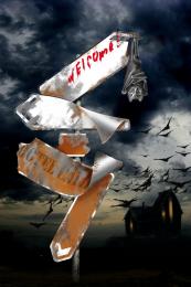 by Eramono 28055 views - final score: 62.5% | Roadsign Mayhem 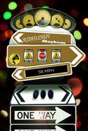 by Scribble 12645 views - final score: 57.8% | On my way 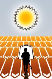 by divair 11521 views - final score: 57.5% |
Everywhere is Signs!!! 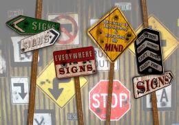 by dollmommy 13143 views - final score: 56.4% | GO UP!  by Drivenslush 10297 views - final score: 56% | Beach cabins  by divair 6114 views - final score: 55% |
halloween comes earlyy !!!  by skand 6405 views - final score: 54.6% | Snow in all directions  by Goberphoto 6648 views - final score: 54.4% | Eat Healthy 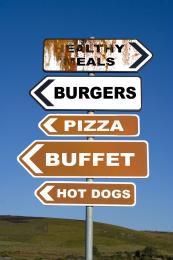 by fatz8016 7398 views - final score: 53.6% |
Anywhere provided it's here  by divair 5437 views - final score: 52.7% | windmill 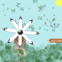 by akshaysvilla 7818 views - final score: 52.2% | Tax.. Tax & More Tax!  by Chuck 5220 views - final score: 51.1% |
LIFE SIGNS  by derdevil 8557 views - final score: 50.9% | FOLLOW THE YELLOW BRICK ROAD 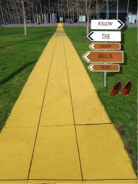 by SHIPLEYGIRL 11638 views - final score: 50.2% | signfire  by Maya3D 3781 views - final score: 50% |
All roads lead to..... 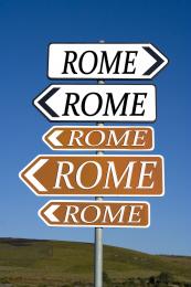 by JEN750 7318 views - final score: 49.4% | Don't tell anyone!  by roymeddy 5326 views - final score: 47.9% |
Howdie Guest!
You need to be logged in to rate this entry and participate in the contests!
LOGIN HERE or REGISTER FOR FREE
Good idea, but try to make the post look like it's actually in the road, not just pasted on top...it should have a shadow, too.
agrees with cmyk. You should also place the signs more off to the right.
Bravo, Wonderful, Fabulous, is there anymore to say?!?!
Wow I get brozed but yet you used my suggestion. By the way, the shadows on the sign are wrong. They would be like the one on the left but try drop shadow, not whatever you did. Also shoes need a lot of work on the edges and a shadow too.
well honestly speaking i don see any logic in this..you've jus written one simple note in a direction board which is going all places..you could have used the source image in a much better way..
Don't take my comments on this as rough criticism, just constructive, well meant suggestions.Good imagination on this, but there are several things that you could do to improve on it. I think the shoes have been mentioned by others, and the cloning on the grass next to the pathway needs to be cleaned up a bit. Changing the signs to point all the same direction could really be a plus. Overall you did have a good concept, it's your execution that needs some improvement.
Those kids of yours must really be occupying your time but the sign shadow is not hard to create. I wish you at least tried,,
Howdie stranger!
If you want to rate this picture or participate in this contest, just:
LOGIN HERE or REGISTER FOR FREE