
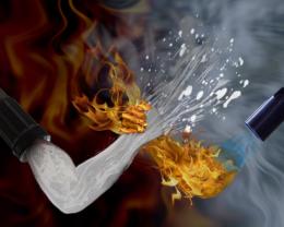
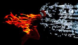
Created in CS2. All sources have been mentioned. Please view in high resolution before voting.
I have made some major edits since I first entered. I think it looks much better now. (5 years and 3733 days ago)
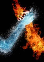
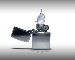
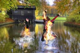
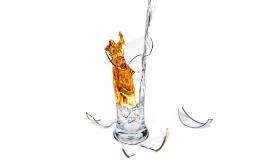
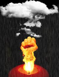
- 1: arm wrestlers
- 2: Fire 1
- 3: fire 2
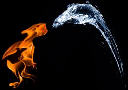
- 4: Water
- 5: Hose
- 6: Flame thrower
- 7: Water Spray



nice
very original
I am thinking that something is missing. Any constructive criticism is welcome but suggest some techniques so I know what to do.
nice thought.. that hand of water could have been better
Shivthink: that's not contructive criticism and I disagree.
Maybe some water splash around the water arm?
That's what I was thinking as well. I was thinking maybe some fire around teh hand or even maybe some steam where the two meet. Thanks for the suggestion
Yes author, that would improve it
fire against the milk....lol
Edits made.
Maybe some more water source images or bubbles etc overlayed on the arm with added transparency? Just for a bit more depth? Steam?? Keep at it..
i think you should add some more water around the arms and not just in front n
n
Actually, I've given up on this entry. I've already been outdone. Vote now I'm not making anymore edits.
you should. i like this better than ur copycat
Thanks MaXed but I don't think they copied it. I originally got teh idea from a drawing of nature and time arm wrestling, but I appreciate taht . Thanks. At least it took the top 8 slot.
Howdie stranger!
If you want to rate this picture or participate in this contest, just:
LOGIN HERE or REGISTER FOR FREE