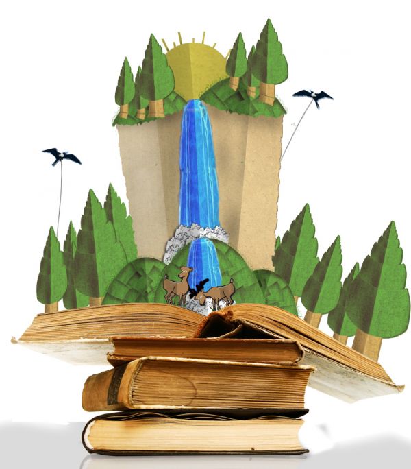
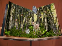
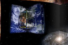
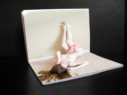
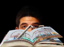
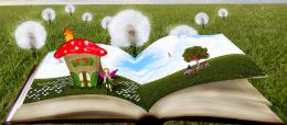
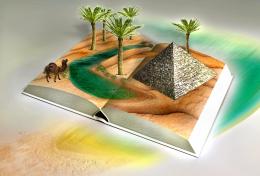
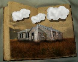
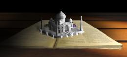
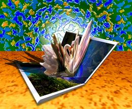
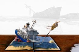
Entire Entry is made of the 2 stock images in the links. with color overlays, dodge and burn and a little free hand.
has been about 8 months since I had an entry, got caught up with work, hope you all enjoy it!
source 1 - pieces where used to build the scene.
source 2, books in image, with pages removed (5 years and 3747 days ago)




Really I like this one. Maybe you could choose other theme for the pop up, a older theme, like the books, anyway good work.
good work.
Like it
SBS would be nice...
Sbs Added CMYK
perfectly on theme and nicely put together. Well done.
Great entry, and nice to see you back, author
Great job! And for sure a book I would have loved, as I was a child. It looks really convincing and what is especially good, is that you thought about making folds in the different elements. That makes it even more realistic. Good luck and welcome back!
Thanks Great to see some familar faces Lelaina,ponti55,Bob
  Ps, congrats on the mod position lelaina!
probably the most on theme entry so far looks great, i like that the pop out is the same texture as the paper and that the colours look a tad faded
  top vote, well done!
Surely a good imagination, the result looks pretty real couldn't say this has been made on ps
really nice!
nice work a bg would make it cool
nice but i don't think the trees on the outside would have a central crease... good idea though
Very nicely done
This is very nice......G/L Author.
Congrats for your second place, Evan! And also thanks a lot for your congrats for my mod position
thanks
Congrats on your placement!
congrats!! glad it was top 3!!
Congrats!!
Congrats
Howdie stranger!
If you want to rate this picture or participate in this contest, just:
LOGIN HERE or REGISTER FOR FREE