
(5 years and 3745 days ago)
1 Source:
DRAGON CANDY 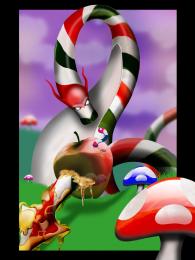 by JamesD 17437 views - final score: 65.4% | Doorway to Candyland 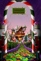 by artgirl1935 16952 views - final score: 63% | Candy Cane Furniture 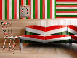 by fatz8016 16470 views - final score: 60% |
Fire Dragon 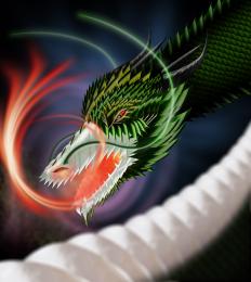 by langstrum 11838 views - final score: 59.4% | Boxer 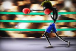 by petersheep 10688 views - final score: 58.5% | Candy Mask 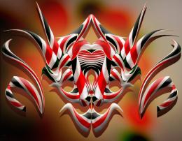 by lahiripartha 5624 views - final score: 58.4% |
candy hook 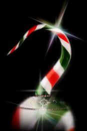 by fercho 7073 views - final score: 58.2% | TWO BROKEN CANDY BONES 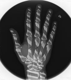 by cterraza 10231 views - final score: 57.6% | Candy cane lighthouse 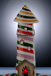 by Goberphoto 10362 views - final score: 57.7% |
Try the Neighbors 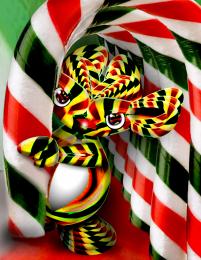 by Drivenslush 5015 views - final score: 57.1% | She Loves Me, She Loves Me Not 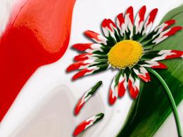 by DigitalPro 8009 views - final score: 56.5% | Clown candy 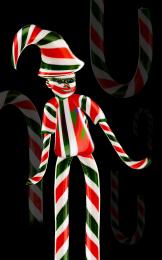 by shaiju1974 6222 views - final score: 55.8% |
Duckandy  by lahiripartha 3942 views - final score: 55.5% | Hungarian flag  by szudi 9154 views - final score: 55.5% | bonsai cane  by runsterboi 8294 views - final score: 54.5% |
Saleslady of the Candy Shop  by teor2008 6645 views - final score: 53.5% | mmm....minty  by JEN750 8373 views - final score: 53.1% | Candycane cocoa. 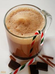 by Jgrafix 7014 views - final score: 50.8% |
Candy snake 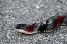 by Gransbergis 7234 views - final score: 50.1% | Children like candy 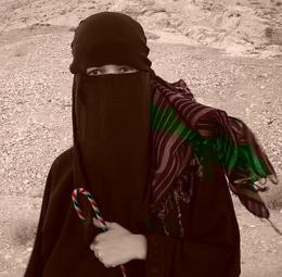 by Maya3D 10215 views - final score: 49% | Barber Shop 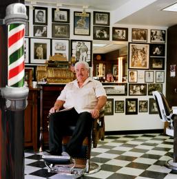 by DigitalPro 14748 views - final score: 48.9% |
walking stick 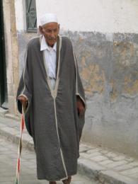 by JEN750 6456 views - final score: 48.8% | Broken Candy 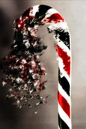 by Gransbergis 7501 views - final score: 48.7% | I Used To Hate My Nose 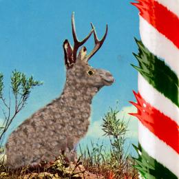 by DigitalPro 7121 views - final score: 47.1% |
Howdie Guest!
You need to be logged in to rate this entry and participate in the contests!
LOGIN HERE or REGISTER FOR FREE
The idea is good, but your source is blurry and the stick is sharp. Besides, I think you should get rid of the white edges you left after cuting the cane out. Reducing the vibrance (or luminosity, depending on your PS version) and adding some shadows will help to give your work a natural look.
I'm sure that this man is egyptian,lol!
Agrees with Divair
Have changed luminance as suggested, haven't added shadows as there are no shadows of the stick on the original source picture.
the stick is too blurry... imo
much better!
too simple man.. and need more work to realism......more time to work too thx
Howdie stranger!
If you want to rate this picture or participate in this contest, just:
LOGIN HERE or REGISTER FOR FREE