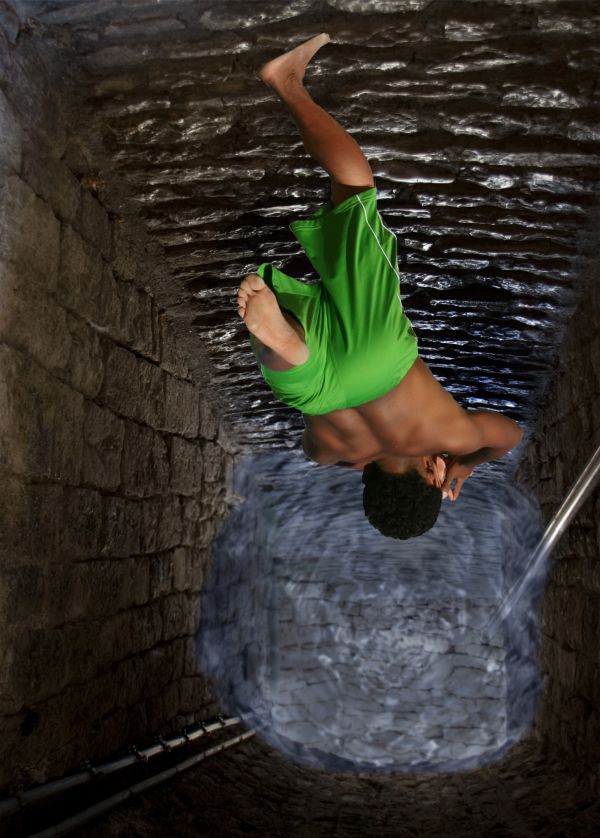
its simple used pic for passage and added water effect to it masked the source and now he is jumping in (5 years and 3738 days ago)
1 Source:
- 1: source1
sleeping 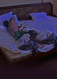 by basem11361 22507 views - final score: 61.4% | Sleeping guard 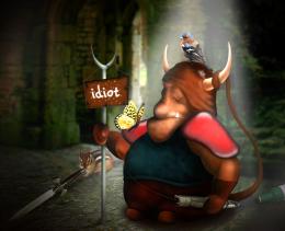 by langstrum 20874 views - final score: 60% | Cliff Diver........ 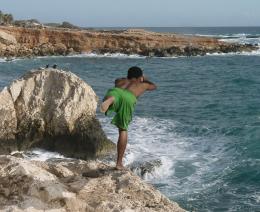 by adeincyprus 25275 views - final score: 57.8% |
The Final Fly 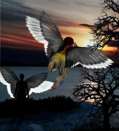 by Widiar 27651 views - final score: 57.3% | Dangerous Curves 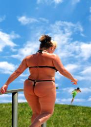 by lchappell 21311 views - final score: 56% | Angel on the move 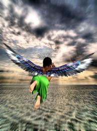 by maclu2iaf 7752 views - final score: 55.8% |
Cant watch! 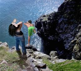 by freejay 4323 views - final score: 55.8% | B.B.B.B.B.B.Surfboard CO.NN  by Drivenslush 4911 views - final score: 55.3% | Lovers Leap  by lchappell 6174 views - final score: 54.9% |
well Jumper  by weso 6270 views - final score: 54.4% | Virtual Love  by teor2008 6156 views - final score: 54.2% | Pole Vault jump  by shaiju1974 5770 views - final score: 54.2% |
Diver 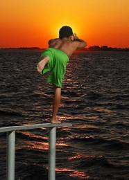 by Jgrafix 6170 views - final score: 52.7% | The Prey  by arnold 8105 views - final score: 52.3% | Last attempt  by Mozzafan07 6118 views - final score: 52.2% |
Stop big bull  by shaikhookh 4905 views - final score: 52.1% | INTRUDER 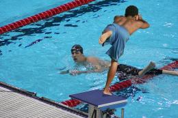 by HavingFun 3933 views - final score: 51.9% | Rehearsal 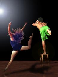 by erikuri 3715 views - final score: 51.7% |
Trapped 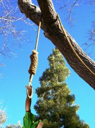 by maXed 4257 views - final score: 50.6% | I Tawt I Taw a Footy Tat 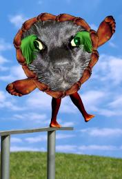 by Drivenslush 4997 views - final score: 49.7% | Ballerina  by Jellopudding 4125 views - final score: 48.8% |
Summer hottest trend  by gayongmaarifat 5819 views - final score: 48.2% | Oh! I tried but failed!!  by shaiju1974 6923 views - final score: 48.2% | 3 Pointer  by DigitalPro 3350 views - final score: 46.9% |
Howdie Guest!
You need to be logged in to rate this entry and participate in the contests!
LOGIN HERE or REGISTER FOR FREE
cool idea and good job too
The water looks really fake but it's a really good idea You should put it more transparent.
the water, as well as looking fake, is also too light for the depth it is at!
You could have selected a better source picture for the background.. a picture of a well or something. I like the idea, but a lot of more work needed.
great,gl
Well nice idea and nice use of the source but the water beneath if would have been made sort of a twister then it would have been the best....a superman tag on the fellow would also have added some funny part i guess....
Not bad, blur the wter edges a bit, and use the smudge brush to make them, look like they are actully touching the walls...also try making the water a bit darker and his shadow a tad smaller..GL
so what about it now hope to be good than the first one
yes thats better ..good job
Howdie stranger!
If you want to rate this picture or participate in this contest, just:
LOGIN HERE or REGISTER FOR FREE