
Created in Photoshop 7.0. All sources are mentioned. (5 years and 3738 days ago)
- 1: New Sky
- 2: Golf flag and hole
- 3: Golfer 1
- 4: Golfer 2
- 5: Female Golfer

Created in Photoshop 7.0. All sources are mentioned. (5 years and 3738 days ago)
light  by sophia 13590 views - final score: 64.9% | Energy Gathering  by Akassa 14225 views - final score: 61.5% | Erizus II  by Suky04 14083 views - final score: 60.6% |
Life Star  by buzzy 12133 views - final score: 60.5% | Observatory  by genuine2009 15119 views - final score: 59.2% | Blowing in the wind  by MrHack 5799 views - final score: 58.1% |
Autumn  by sophia 3974 views - final score: 57.9% | PXL2D2  by genuine2009 3848 views - final score: 57.7% | See Ya-Bye  by robk 6341 views - final score: 57.5% |
Rise of the Robots  by Graphopoly 7033 views - final score: 57.3% | Futuristic Building  by oana 9448 views - final score: 57.1% | Automatic Chewer 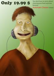 by MrHack 4195 views - final score: 56.4% |
Escape From The Laboratory 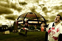 by fatz8016 6634 views - final score: 55.6% | School Time  by Drivenslush 4585 views - final score: 55.4% | UFO 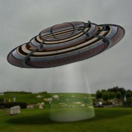 by Goberphoto 5644 views - final score: 54.7% |
Hostile Planet  by donh 4148 views - final score: 54.6% | Parr for the Course 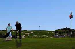 by jawshoewhah 6586 views - final score: 53.8% | What Was Then  by lchappell 5461 views - final score: 53.7% |
Hear It  by refleksi 4510 views - final score: 53.6% | Past and Future Domes  by DigitalPro 8212 views - final score: 53.4% | The Great Gastropoda Escape 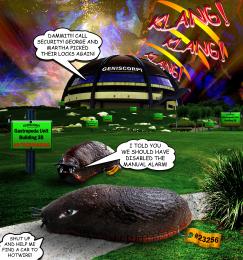 by Drivenslush 5253 views - final score: 53% |
Dome Star  by dmspaulding07 6105 views - final score: 49.9% | BusyBee 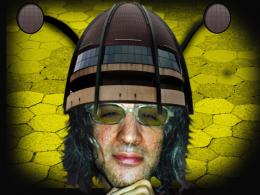 by Maya3D 3774 views - final score: 49.3% |
Howdie Guest!
You need to be logged in to rate this entry and participate in the contests!
LOGIN HERE or REGISTER FOR FREE
this is a good idea, I think you would benefit by checking the scale of your golfer in the background though. Good Luck with this, it's a nice looking image. Edit: removing the golfer in B/G is an improvement. As for the shadows well my opinion is that they do not need to be as long possibly...
Good work, just try fixing the shdow a but, by locating the direction which the light hits, 2nd, get rid of the man walking in the distance... or rescale him.. GL.
I removed the golfer but I am not sure why you see the shadow as wrong.
hmmm idea is great,work too just few minor observations...woman is to bright for this lighting,shadow is to define,with this lighting u cannot have that define shadow...if u fix that u could have fantastic work...very realistic image
I made some changes.
Howdie stranger!
If you want to rate this picture or participate in this contest, just:
LOGIN HERE or REGISTER FOR FREE