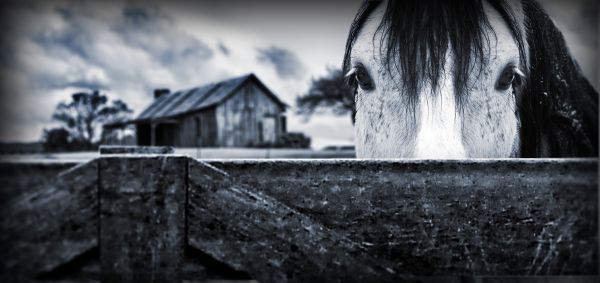
(5 years and 3729 days ago)
2 Sources:
- 1: Wooden Fence
- 2: Background
She loves me ... 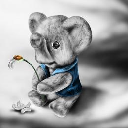 by loopyluv 16792 views - final score: 64.4% | On The Farm  by fatz8016 14187 views - final score: 61.4% | not_cute_animal :) 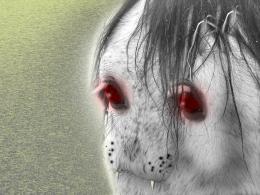 by basem11361 14703 views - final score: 56% |
Watcher 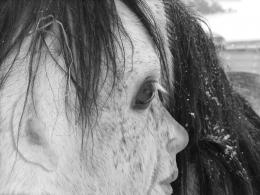 by VitalExpressions 15710 views - final score: 54.4% | chimpnzee in horse 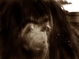 by shaikhookh 13886 views - final score: 53.2% | I think I saw a bear... 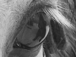 by erikuri 5445 views - final score: 52.7% |
Tree of Portents 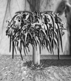 by Drivenslush 4229 views - final score: 52.3% | Ginger 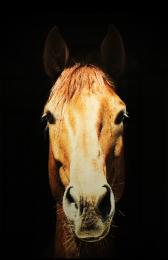 by Suky04 3833 views - final score: 52% | the grunge 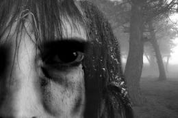 by runsterboi 6888 views - final score: 51.7% |
t shirt 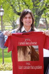 by demi 3637 views - final score: 51.5% | Sad horse 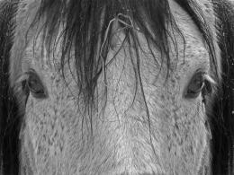 by teor2008 7903 views - final score: 51.2% | Teddy Bear 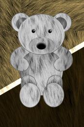 by holyise 5979 views - final score: 50.8% |
horse hair 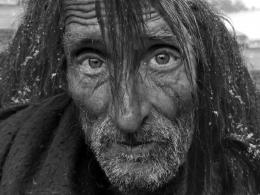 by kathyw 6529 views - final score: 50.5% | ABERRANCY 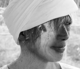 by HavingFun 3867 views - final score: 50.2% | It is Snow Horse ! 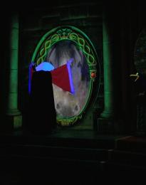 by DigitalPro 4562 views - final score: 49.5% |
Satan's Minion 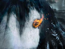 by arnold 8845 views - final score: 47.2% | Face 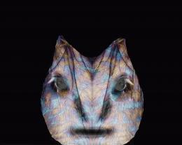 by weso 4033 views - final score: 47% | Snow Storm 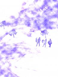 by Mozzafan07 4507 views - final score: 46% |
horse 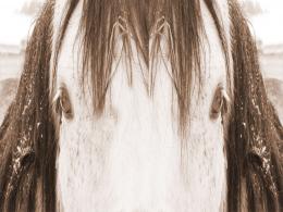 by javeedahamed 4534 views - final score: 45.1% |
Howdie Guest!
You need to be logged in to rate this entry and participate in the contests!
LOGIN HERE or REGISTER FOR FREE
Looked almost photography, except the house, the part behind the horse should be blurred, instead of the right part.
Thanks for the comment..i've updated it now
Very nice shop, looks really beautiful too!
grwat work, you got good thinking skill
Best one so far GL
GL
great work
Beautiful work....And it really seems as if its a photograph...Too good...
Yes, much better. You can improve even more in some details: (1) to make the DOF more shallow, you need to blur the fence layer a little bit, so the main plane will be on the face of the horse. (2) Instead of Gaussian blur, you should use lens blur, which have the blur pattern similar to the real lense, and don't forget to add a small amount of noise, (3) in photography, you should avoid the continuous horizon because it cut your photo into 2 pieces, so you can make one more layer of something to disrupt this horizon (I mean the fence)
I think you over blurred the fence now. But this is still one of the better entries. And author, not all constructive criticism is... right. You're the ultimate critic. You decide.
nice job
Thanks for all the comments!..langstrum thanks for your comments, they were very helpful..and i actually did use lens blur not gaussian...and jawshoewhah thank you for your comments and the advice..i did leave it as is after i made changes to the background
Good work!
Nice idea from source...perhaps heal brush areas on one side of face to remove 'mirrored' look. Eyelid area should be different and maybe remove some strands of hair to make each side a bit more different (random). Nice work author!
I believe this is the best one..... GL. Very nice idea and work.
Congrats for your second place, Fatz!
Congrats!
Congratulations for 2nd
Congrats on 2nd palce Fatz! Great work
Congrats!
Howdie stranger!
If you want to rate this picture or participate in this contest, just:
LOGIN HERE or REGISTER FOR FREE