
(5 years and 3814 days ago)
1 Source:
Rocker 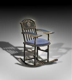 by buzzy 7570 views - final score: 61.4% | Handcrafted Iron Works 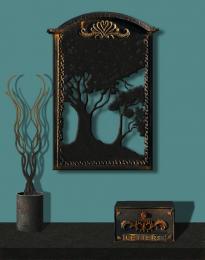 by George55 8340 views - final score: 60.7% | Pinocchio and the Blue Fairy 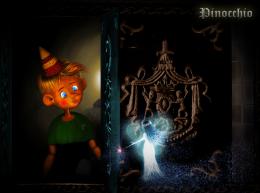 by langstrum 11776 views - final score: 59.9% |
V.I.V.  by divair 5432 views - final score: 58.8% | Immortal....  by hereisanoop 7795 views - final score: 57.5% | Empty  by fatz8016 3276 views - final score: 57.3% |
RIP 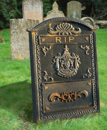 by Draco 6239 views - final score: 57% | Locked Dreams  by George55 5264 views - final score: 57% | Birdie Inn 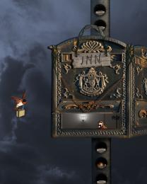 by spygirl1978 5167 views - final score: 56.6% |
GO BACK!!-Wrong One!  by donh 4856 views - final score: 55.5% | Leaving Eden 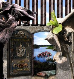 by Drivenslush 5212 views - final score: 55% | Pandora  by IDt8r 3565 views - final score: 54.8% |
Flood Gates  by blaine2nd 4786 views - final score: 54.7% | With Love and Kisses  by artgirl1935 6593 views - final score: 54.6% | Vulcan Mining Ship  by lchappell 5894 views - final score: 53.8% |
letter delivery  by shaiju1974 5085 views - final score: 52.4% |
Howdie Guest!
You need to be logged in to rate this entry and participate in the contests!
LOGIN HERE or REGISTER FOR FREE
Photography and photoshop contests
We are a community of people with
a passion for photography, graphics and art in general.
Every day new photoshop
and photography contests are posted to compete in. We also have one weekly drawing contest
and one weekly 3D contest!
Participation is 100% free!
Just
register and get
started!
Good luck!
© 2015 Pxleyes.com. All rights reserved.


love it, great idea.
Good idea, but source link doesn't lead to image used...
need to improve on shading & lighting bro!
Good idea... link is wrong thou...
you need to make it look like its sticking out from the ground... otherwise... good idea... maybe also match the shadows in the background.. as the other stones aren't creating any...
A little shading and the thing if comes from the ground.....it would be even better...
From some reason I can't modify my entry so I will place the rightLink here: Thanks To giselaroyo for http://www.sxc.hu/photo/758903
Some problems with the perspective here, as it looks like it's a bit twisted.. also doesn't match with the angle of the other stones. Like the idea, maybe you could add also some name or something to it.. (And yes, blending with the ground needs more work..I vote later if you decide to improve this..)
I would improve this chop but from some reason, I don't know why, I can't reedit my entry, so I can't change anything, nor the source of the image, nor the chop. I hope some moderator will take a loot at the settings and do something about it.
I agree with CMYK,u dont need shadow at this toomb stone...everything else is great...
I have to disagree here erathion, if you look at the strong shadowing on the sign/tombstone, there should be a shadow behind it. The trick will be to match the light and shadow on the rest of the background image so it doesnt look 'pasted on'
why is the grass behind the gravestone blurred/smudged?
very nice RIP and realistic the texture!
You can't edit an entry after Friday, say 2:00 MST. I honestly think the only thing wrong with this image is the fact it doesn't look like it's sticking out of the ground (like it's just leaning on a stilt or something) that's all. You'll get the editing thing figured out in time, if you keep submitting. GL!
great
Howdie stranger!
If you want to rate this picture or participate in this contest, just:
LOGIN HERE or REGISTER FOR FREE