(5 years and 3732 days ago)
Somewhere Else... 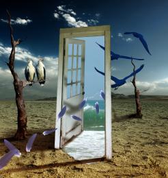 by Clinge 19698 views - final score: 63.2% | Evil house 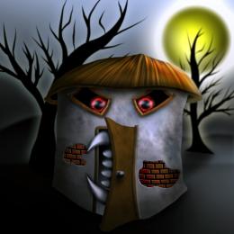 by oana 13437 views - final score: 60.9% | Helloooooo! 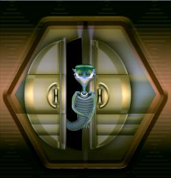 by CorneliaMladenova 9535 views - final score: 60.9% |
Sorry... closed  by robvdn 11049 views - final score: 60.7% | Universe Locked  by CorneliaMladenova 10985 views - final score: 60.7% | DOORWAY TO HEAVEN  by cterraza 11069 views - final score: 59.5% |
Dinosaur trap  by langstrum 8129 views - final score: 59.3% | Bed & Breakfast Host 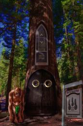 by donh 7947 views - final score: 59.2% | The Ice Cave Entrace 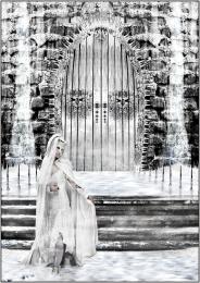 by Akassa 6224 views - final score: 58.6% |
door mania_4b70754e1eba1 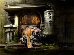 by genuine2009 3259 views - final score: 58.1% | Monumental 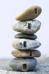 by RichieMB 7173 views - final score: 56.5% | Door To Happyness 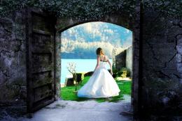 by fatz8016 5499 views - final score: 56.3% |
So near but so far 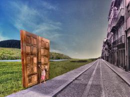 by DML 9241 views - final score: 56% | Star Lifter 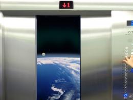 by lchappell 4453 views - final score: 55.9% | Doorus Maleficus 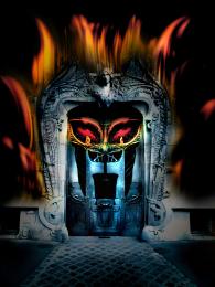 by genuine2009 3858 views - final score: 54.5% |
Root Cellar 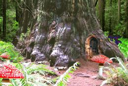 by lchappell 7251 views - final score: 54.3% | WELCOME ! 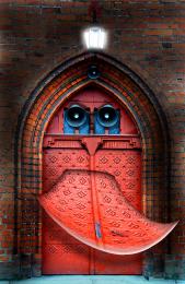 by lolu 5287 views - final score: 54.1% | A Radial Gradient Door 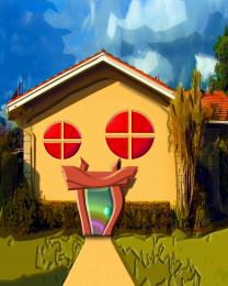 by Drivenslush 6239 views - final score: 52.9% |
A new life 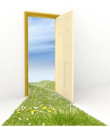 by sjsmiuk 4840 views - final score: 52.7% | 4 Elements 4 Doors 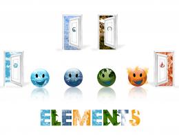 by erathion 8306 views - final score: 52.3% | Interstitial  by RichieMB 4444 views - final score: 52.2% |
At Deaths Door 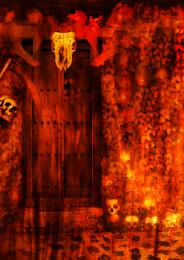 by sjsmiuk 5890 views - final score: 51.4% | nOt as tHink as yoU dRunk i aM 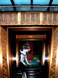 by Drivenslush 3693 views - final score: 50.3% |
Howdie Guest!
You need to be logged in to rate this entry and participate in the contests!
LOGIN HERE or REGISTER FOR FREE
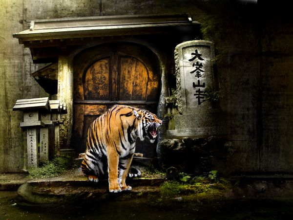
Lots of distortion compared to source pics...
agree about the distortion, but still a nice composition and choice of elements.
I like what you are trying to do in this composition. IMO the tiger needs some shading and proper shadowing to help tie him into the background. His chest has a bright reflection coming from an unknown light source on the right..I think if you get him to become more a part of the background it would really improve your image...Best of Luck =)
The tiger needs more shadows.
Very good composition!
Not bad at all. As the major light source is on the left side of the image, you could brighten up the right section just a little, and maybe add gentle shadows for the (mail box looking?) pillars. Also remove the light grey spots on both (bottom) sides of the tiger. As the colours on the door are quite striking/strong too, you could maybe add some level enchantment for the tiger with a colour/level tool or similar. Now it's just a little bit 'pale' .. Good job with the overall design.
The year of the tiger !
Nice work.....
Simply Very Nice...
agrees with Widiar. Too dark on the right.
Howdie stranger!
If you want to rate this picture or participate in this contest, just:
LOGIN HERE or REGISTER FOR FREE