
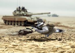
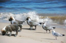
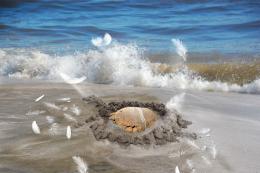
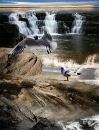
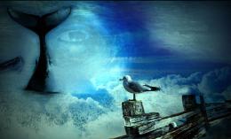
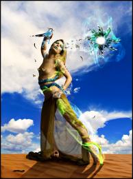
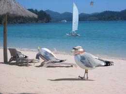
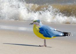
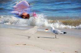
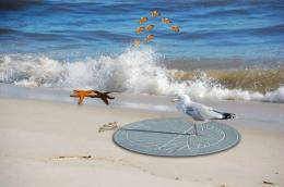
Just a huge amount of handwork, with blending all the layers and finding a way to make them match each others. Tried to do a clean cut with the bird (seagull) and give it a better coloring too.
I gave some colours for the bird(s) and spend a lot of time altering the colours for different source pictures, as the colour palette was very different in each.
Tools used: layer blending, masking tools, warping tool, perspective tool. Hue/saturation and colour balance tool+channel mixer. Clone tool and render/lightning effect.
A slight gaussian blur added finally with some colour tweaking, to remove excess colour from the lower part of the image (mostly red). (5 years and 3723 days ago)



nice done
Good work, but maybe make the flying seagull a tad bigger, for depth...coz at the moment the gull on the ground looks like it is the same size...GL
this looks great in high res....nice work!
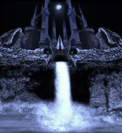
I love the work you've done. Colors and blending are great! It seems that the horizon over the falls is far too high for the angle of the source bird. I would like it with just what you've added in the foreground. GL to you.
good work, but the bird thats on the ground is huuuuuge
I think some of you guys are seeing the lower part of the image as some kind of mountains or something.. it tries to be just some bedrock under the water/sea. It's true, the horizon doesn't really match perfectly with the original bird view, but the flying bird is very close to the original bird in my idea, as well the original is close to the viewpoint.. So it's not some sort of freakish giant bird really But thanks for the comments, I can see you problem here. I think if I would have cut off the very lower part, the perspective would have been more 'realistic' looking for you.
Good one.....
very nice
Howdie stranger!
If you want to rate this picture or participate in this contest, just:
LOGIN HERE or REGISTER FOR FREE