
Design base for a menu
Border for the name of the company etc
source and my photos (5 years and 3726 days ago)
CMYK4600-T2  by spaceranger 9883 views - final score: 63.9% | Warrior  by shaiju1974 11098 views - final score: 59.6% | 3rd Wheel  by Widiar 13859 views - final score: 58.8% |
Dancing Java Party 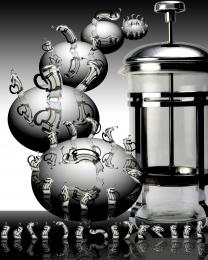 by Drivenslush 9347 views - final score: 58.3% | Potter Train 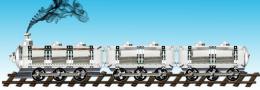 by sajith 10531 views - final score: 57.3% | Warrior Helmet 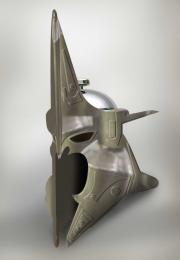 by swordfish 7103 views - final score: 56.7% |
Lost, Alone, Trapped 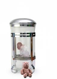 by Jellopudding 7145 views - final score: 55.3% | Garden 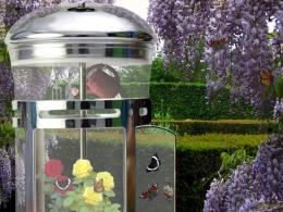 by erikuri 3835 views - final score: 54.2% | Eating the Young 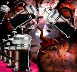 by Drivenslush 6311 views - final score: 53.6% |
Elevator 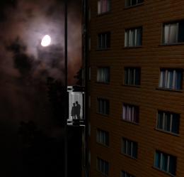 by Goberphoto 3958 views - final score: 53.5% | helicopter 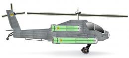 by XphotoshoperX 5468 views - final score: 53.4% | Set for Breakfast 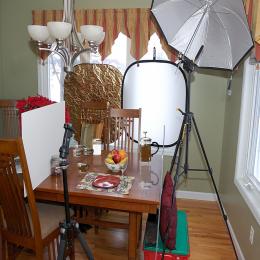 by Chuck 4876 views - final score: 52% |
Coffee House Menu Template 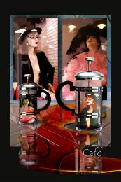 by Drivenslush 6997 views - final score: 51.8% | Circus 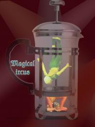 by erikuri 3106 views - final score: 50.7% | coffee  by ivankokuti 4060 views - final score: 50.3% |
Help Me!  by Chuck 3435 views - final score: 49.7% | Pole dancer 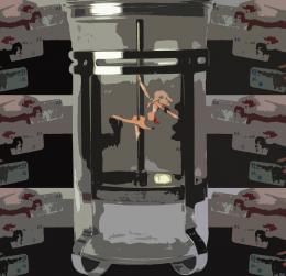 by Mozzafan07 5112 views - final score: 49.4% | whiskey 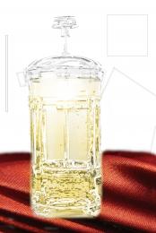 by akshaysvilla 5498 views - final score: 49% |
Howdie Guest!
You need to be logged in to rate this entry and participate in the contests!
LOGIN HERE or REGISTER FOR FREE
Photography and photoshop contests
We are a community of people with
a passion for photography, graphics and art in general.
Every day new photoshop
and photography contests are posted to compete in. We also have one weekly drawing contest
and one weekly 3D contest!
Participation is 100% free!
Just
register and get
started!
Good luck!
© 2015 Pxleyes.com. All rights reserved.


Good colours and elegant generic design, very poster like. I would have definitely either removed the handle or at least made a clean cut for those finger dips.. they look so 'fake' and ugly - also in the original image, not your fault really. I would also remove the pouring tip, it looks like a mistake, for the same reason. Nice job overall.
Pretty much artistic.....Good work....
really nice work on this!
Good work!
I like the design factor in this. The spilled coffee and reflections look great. I think it would have looked better without the smaller press. One you would have stuck with the rule of three then, and two because it is very obvious it is the same press and the reflections and shine got flipped with the press so it made the lighting seem off. Minor details on a very nice image though.
Definitely one of the best uses of the source I've seen. GL!

EDIT: wow, once again author, you fooled me. Never knew it was you.
Howdie stranger!
If you want to rate this picture or participate in this contest, just:
LOGIN HERE or REGISTER FOR FREE