
Dedicate to my childhood...
Just the source was used. The remaining is painting. (5 years and 3727 days ago)
Rocker  by buzzy 7471 views - final score: 61.4% | Handcrafted Iron Works  by George55 8181 views - final score: 60.7% | Pinocchio and the Blue Fairy 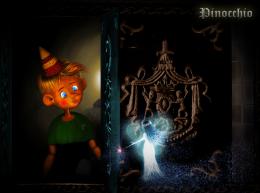 by langstrum 11595 views - final score: 59.9% |
V.I.V.  by divair 5364 views - final score: 58.8% | Immortal....  by hereisanoop 7659 views - final score: 57.5% | Empty  by fatz8016 3188 views - final score: 57.3% |
RIP  by Draco 6015 views - final score: 57% | Locked Dreams  by George55 5153 views - final score: 57% | Birdie Inn 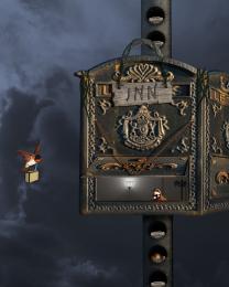 by spygirl1978 5024 views - final score: 56.6% |
GO BACK!!-Wrong One! 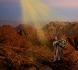 by donh 4681 views - final score: 55.5% | Leaving Eden 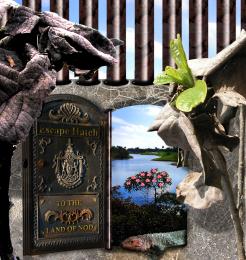 by Drivenslush 5096 views - final score: 55% | Pandora 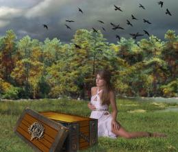 by IDt8r 3490 views - final score: 54.8% |
Flood Gates  by blaine2nd 4689 views - final score: 54.7% | With Love and Kisses  by artgirl1935 6448 views - final score: 54.6% | Vulcan Mining Ship  by lchappell 5755 views - final score: 53.8% |
letter delivery  by shaiju1974 4995 views - final score: 52.4% |
Howdie Guest!
You need to be logged in to rate this entry and participate in the contests!
LOGIN HERE or REGISTER FOR FREE
very good
excellent job and brilliant result... good luck... I don't really think you need the lettering since it's in the title already... unless you used the letters to balance out the brightness of the fairy.. just a really nice job all round
EDIT.. I figured that was why it was there... GOOD LUCK!!!
Thank you demi, Drivenslush. @Drivenslush: yes, you're right, I use that for balancing the brightness of the fairy. After finishing, I realized that the light of the fairy is a little bit too strong, so... ^^
Nice image, GL
I love the drawing portion of this one, I just wish that the source and drawing fit together a bit better, but it's very nice.
Thank you Clinge and annabat. @annabat: it's true, they don't fit well, I tried some ways but not desirable. Hope that I can fix them before the deadline.
Yeah, have to agree that your painting and the source/rest of the image don't blend very well. The source looks just blurry and noisy now, you could try to keep some clarity on the source even if filtered. Your Pinocchio is awesome btw.. gonna check this out later for voting.
add a bit color to source image parts and u will have great final result...good luck author,this is very nice work
More works on the source, including the coloring like erathion mentioned, were done. Thank you very much Widiar, erathion for your suggestions.
Great work!
Beautiful! Pinoc looks so cute here
good job
Congrats for 3rd place !!
Congrats for your third place, Langstrum!
Congrats
Thank you very much, I'm trying to do better ^^
Howdie stranger!
If you want to rate this picture or participate in this contest, just:
LOGIN HERE or REGISTER FOR FREE