No outside image used in the making of this entry. Just the one provided by pxleyes.
UPDATE: CMYK: Thanks for your observation obout my wrong shadows. I corrected them. (5 years and 3726 days ago)
Rocker 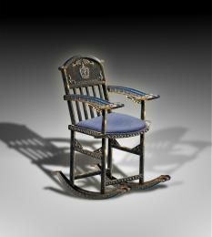 by buzzy 7471 views - final score: 61.4% | Handcrafted Iron Works  by George55 8180 views - final score: 60.7% | Pinocchio and the Blue Fairy 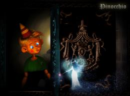 by langstrum 11594 views - final score: 59.9% |
V.I.V.  by divair 5363 views - final score: 58.8% | Immortal....  by hereisanoop 7657 views - final score: 57.5% | Empty 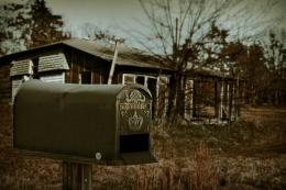 by fatz8016 3188 views - final score: 57.3% |
RIP 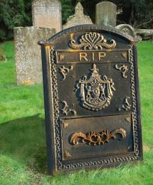 by Draco 6010 views - final score: 57% | Locked Dreams  by George55 5152 views - final score: 57% | Birdie Inn 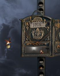 by spygirl1978 5023 views - final score: 56.6% |
GO BACK!!-Wrong One!  by donh 4680 views - final score: 55.5% | Leaving Eden  by Drivenslush 5095 views - final score: 55% | Pandora  by IDt8r 3489 views - final score: 54.8% |
Flood Gates  by blaine2nd 4688 views - final score: 54.7% | With Love and Kisses 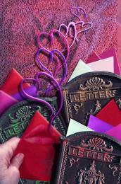 by artgirl1935 6447 views - final score: 54.6% | Vulcan Mining Ship  by lchappell 5753 views - final score: 53.8% |
letter delivery 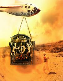 by shaiju1974 4994 views - final score: 52.4% |
Howdie Guest!
You need to be logged in to rate this entry and participate in the contests!
LOGIN HERE or REGISTER FOR FREE
Photography and photoshop contests
We are a community of people with
a passion for photography, graphics and art in general.
Every day new photoshop
and photography contests are posted to compete in. We also have one weekly drawing contest
and one weekly 3D contest!
Participation is 100% free!
Just
register and get
started!
Good luck!
© 2015 Pxleyes.com. All rights reserved.


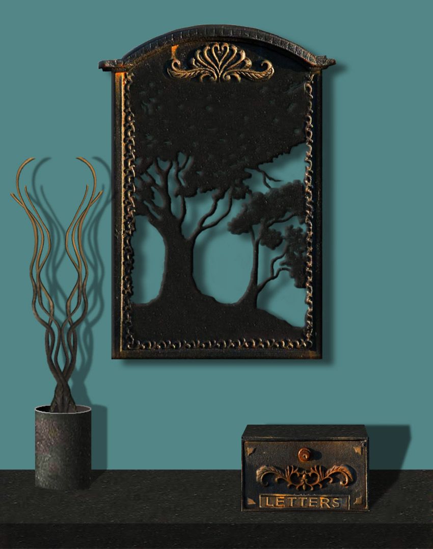
Great idea, but really look at the colors of the edges on the original pic...the edges of the tree form wouldn't be whitish. Also, the light source on the letter box in the source pic is opposite the one you've created. Look at the original shadows...
not sure if all the shadows match, but I like this, good use of source.
Thank you CMYK, pearlie. My weakness is working with shadows. I think, the letter box, looks ok (to me). Corrected the color for highlights on tree forms, making a little darker. Pearlie, I moved the shadow on the frame a little higher.
Really nice
Author, please look at the small box you've created. The shadows on the face are on the left. The light source you've created has opposite shadows...
CMYK is right about the shadows. Just try and adjust the shadows on the box going the other way. GL
Tweak on the shadows and this will be a killer entry
Thanks again guys: CMYK, I appreciate your suggestion about shadows on letter box. Sometimes I try to do things in a hurry, that I forget the minimum details. Learning from you all, good luck!
Excellent
Very nice image GL
GL
lots of fun
very nice!
Better. GL!
Excellent idea and good job Author......G/L.
great job
Congrats on 2nd place george
Congrats for your second place, George!
Thanks, loopyluv, Lelaina...(CMYK for your wise advise)!
Thanks George...congrats!
Congrats
Howdie stranger!
If you want to rate this picture or participate in this contest, just:
LOGIN HERE or REGISTER FOR FREE