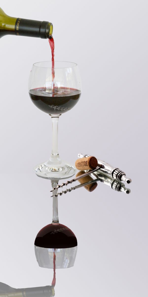
1. used original
2. used own photograph
(5 years and 3705 days ago)
Attack of the Mole Men 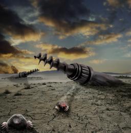 by CMYK46 15377 views - final score: 64.1% | Voyage to the Cork Nebula  by pearlie 12582 views - final score: 60.9% | Waiting.............. 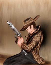 by swordfish 11758 views - final score: 58.7% |
Battlefield...Nobody survives 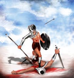 by hereisanoop 12022 views - final score: 58.7% | hi-tech 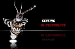 by closedeyes 9062 views - final score: 58.6% | The Venus of Willendorf 2010 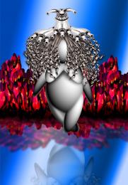 by Drivenslush 7556 views - final score: 58% |
Best with Cheese 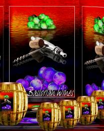 by Drivenslush 5981 views - final score: 55% | Slight Accident 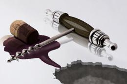 by Martrex 5730 views - final score: 54.6% | Where are they? 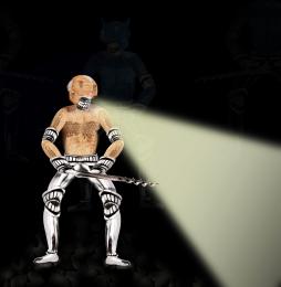 by shaiju1974 4835 views - final score: 53.8% |
pouring wine 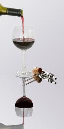 by friiskiwi 6732 views - final score: 52.4% | Leaning Tower of Purple Pisa 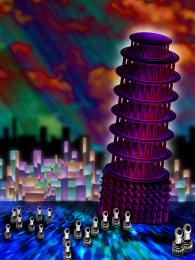 by Drivenslush 7874 views - final score: 52.2% | Spare Pawns 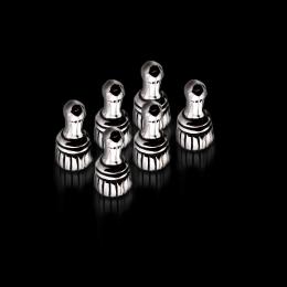 by lydyth 7227 views - final score: 51.5% |
Aouch  by sunzet 3712 views - final score: 51% | Let us live! (updated)  by erikuri 4380 views - final score: 50.6% | Arcane  by trum 3821 views - final score: 47.5% |
Howdie Guest!
You need to be logged in to rate this entry and participate in the contests!
LOGIN HERE or REGISTER FOR FREE
The reflection need more opacity.
ramid; less opacity? .. This is no reflection; only a copy paste underneeth the original
One the other hand there is almost no opacity at all in the original photo, so this might just be a corkscrew photographed on a mirror, and if that´s the case no opacity is needed. But it would though look better and more realistic if the glass and bottle faded away.
sunzet, I believe the original photo (corkscrew) was photographed on a mirror.
Well, there you go then! But...if I can be picky (or just tippy) that would require a different angle of the mirrowed picture - wich is almost impossible to pull off if you don´t have that source as well. I know I wouldn´t anyway.
  GL
GL
Even on a mirror, if yoy pay attention, there's a little difference between the images (a bit, just a bit of low opacity is welcome...)
Reflection need a lot more work...effect is nice but for the reflecyions need one good gradient layer and a slight changing position of the reflection....good luck
Made some changes according to suggestions. Hope this is better.
It´s more opacity, but the wine in the mirror is darker than the other. There are some more changes that could be done, I just don´t know how explain that in english.
There should be some sort of horizontal plane depicted here, even if just slightly, and the reflections should have a little less value. Still, this is a good idea...
too bad the reflection sucks..
Howdie stranger!
If you want to rate this picture or participate in this contest, just:
LOGIN HERE or REGISTER FOR FREE